
U/1ST by Lavernia & Cienfuegos
posted by retail design blog on 2023-10-20
Add to collection
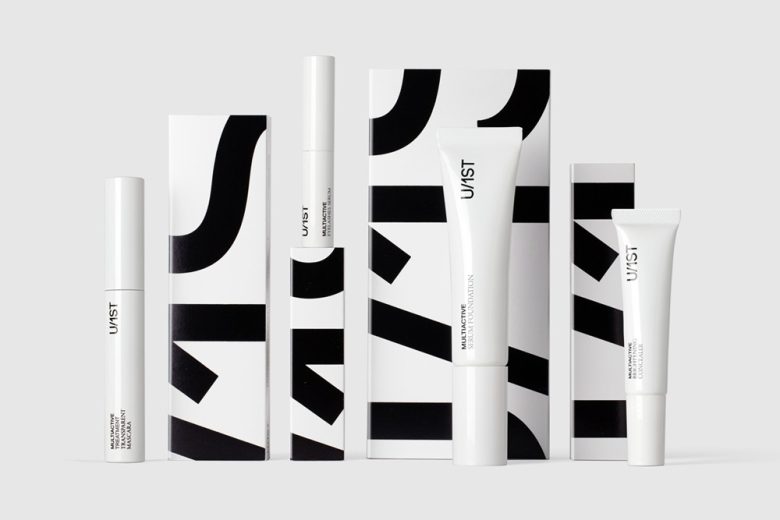
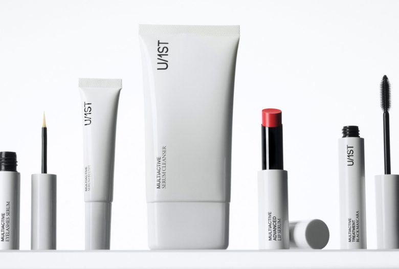
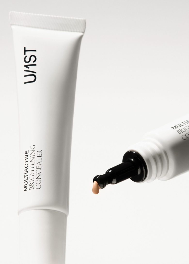
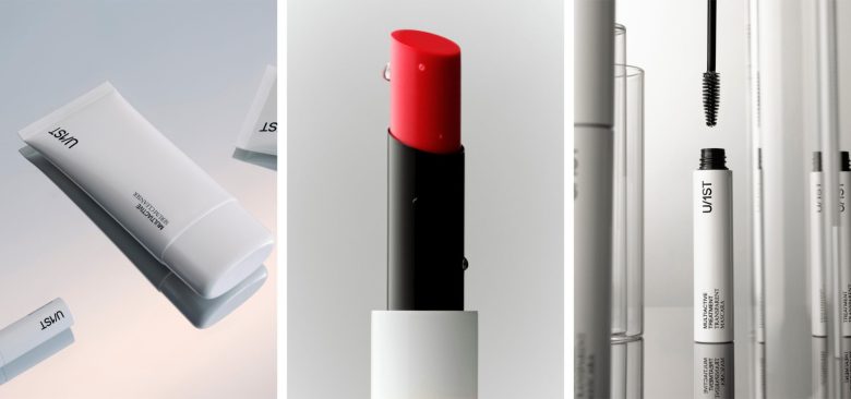
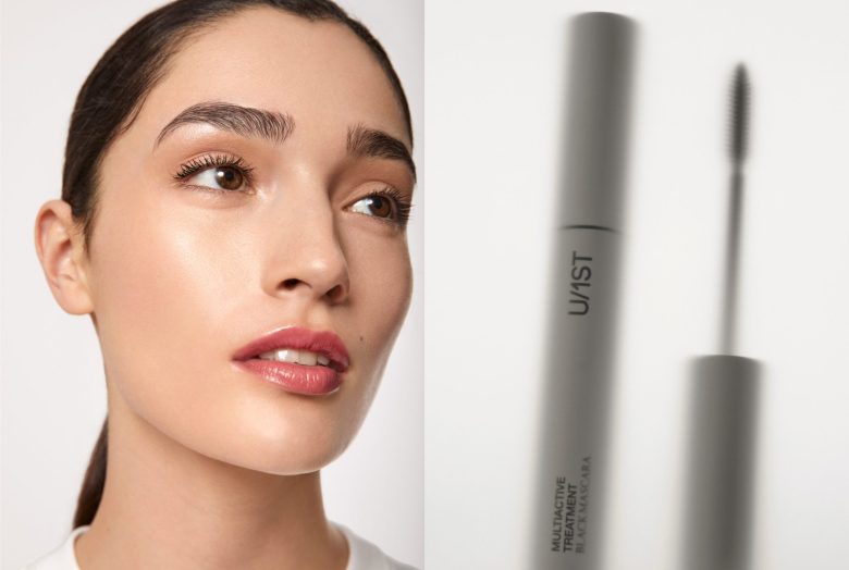
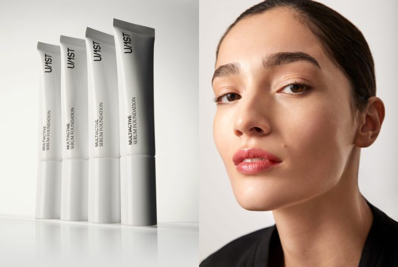
U/1ST is a brand that was born with the purpose of creating a makeup line with properties and ingredients that care for the skin, not only focusing on beauty.
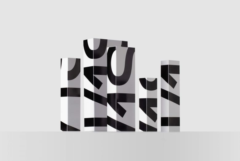
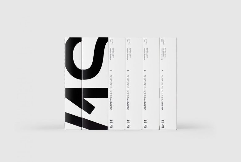
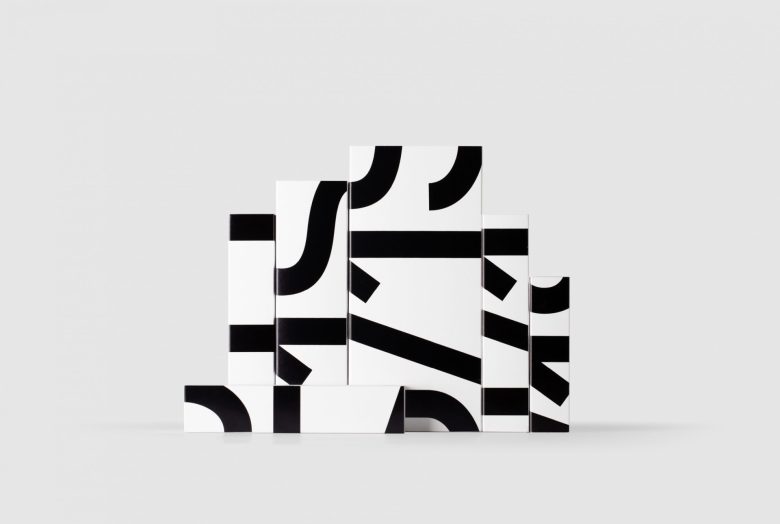
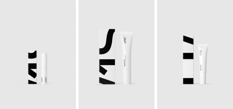
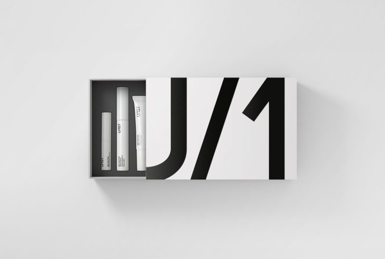
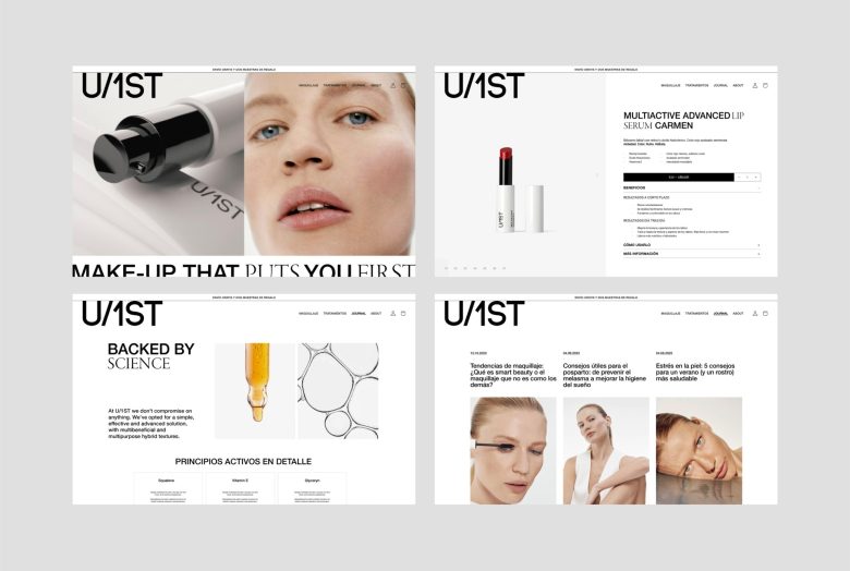
Products designed for active, confident, and straightforward individuals seeking practical, realistic solutions. The presence of the logo overflowing the limits of the boxes is a reflection of its personality: powerful, even challenging. This approach is evident in the design of the boxes as well as in the use of the brand on the web, social media, and all visual communication.
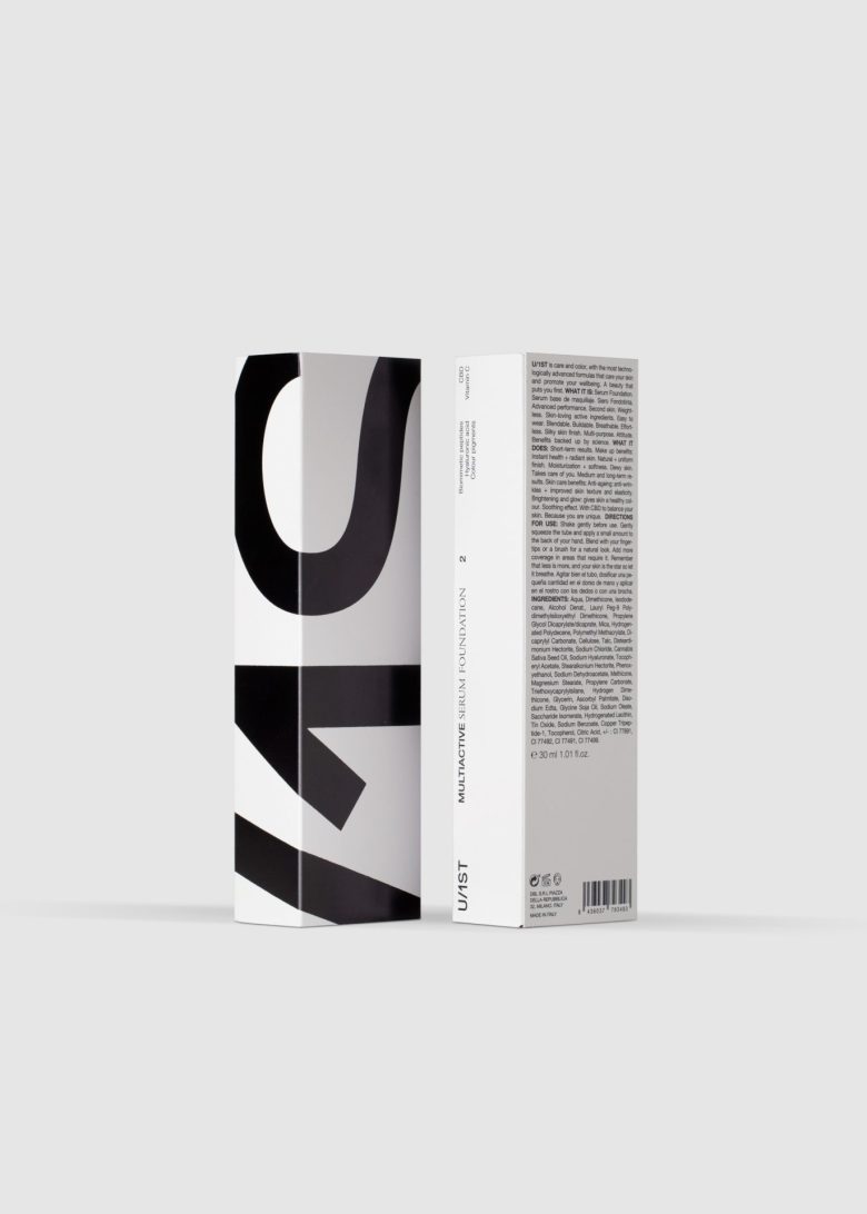
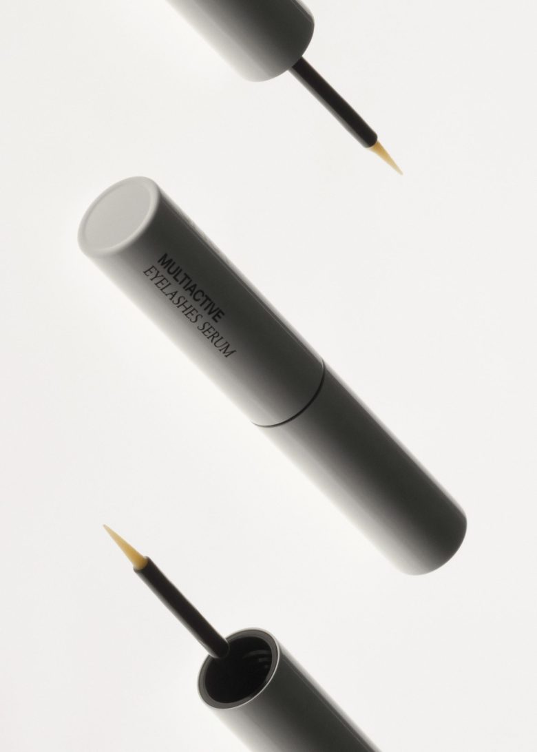
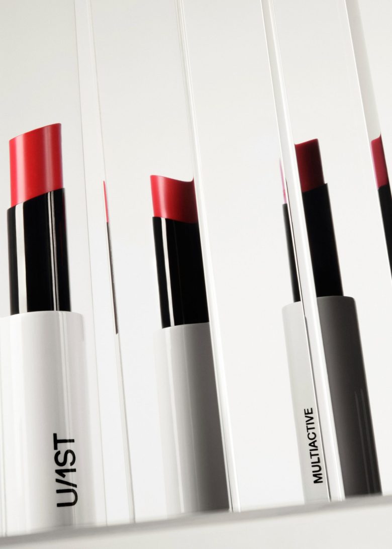
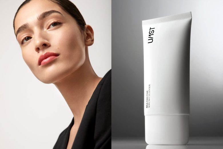
The logo is composed of a sans-serif typeface, which complements the high technology behind the products. It is presented in black on white because the strong contrast emphasizes visual power and sets the brand apart from conventional solutions, which often rely on color, as seen in the packaging of competitors.
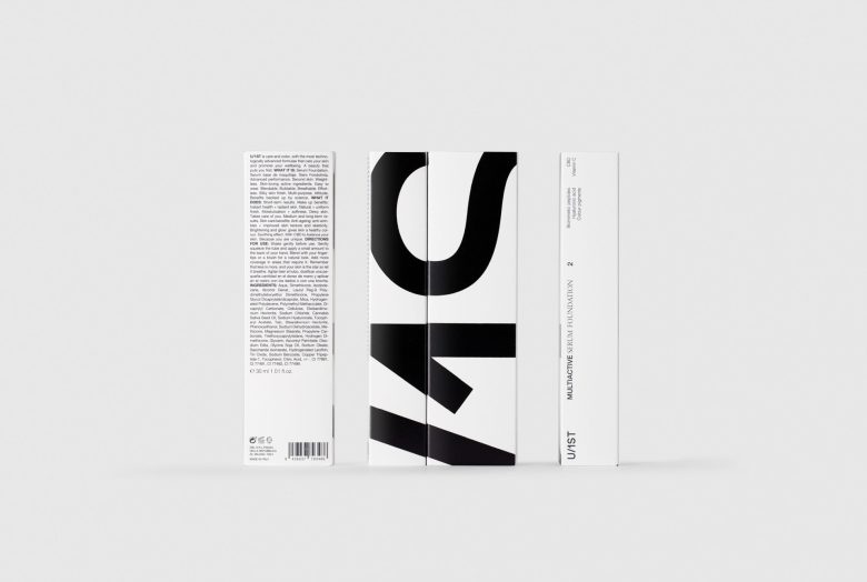
A special text composition has also been considered, combining a sans-serif typeface (indicative of technology and modernity) with a serif typeface (closer to the beauty world). This combination allows for hierarchy and influences the reading of messages.
In the design of the boxes, there are two sides with a large logo, while the other two sides feature the descriptor and other information. This way, when displayed on the shelf, one can choose which side to use as the front – the most eye-catching and emotional, the informative, or perhaps a combination of both.
Designed by Lavernia & Cienfuegos
Add to collection