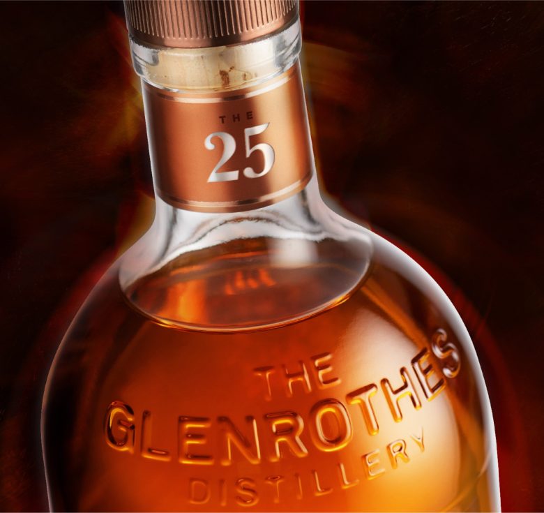
Hot on the heels of the launch of The 42, leading brand design agency Lewis Moberly has created the structural and brand design for The 25.
The 25 is the latest pillar of The Glenrothes rare whisky portfolio, all deeply connected to The Glenrothes private estate in Rothes, Speyside. The 25 year old wait is rewarded with an evolution of flavour as the sophistication of the whisky intensifies with luxurious depth.
Lewis Moberly was briefed to design The 25 bottle and gift carton. The key objective was to retain the familiarity of The Glenrothes bottle and celebrate the whisky within.
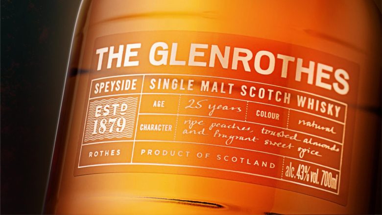
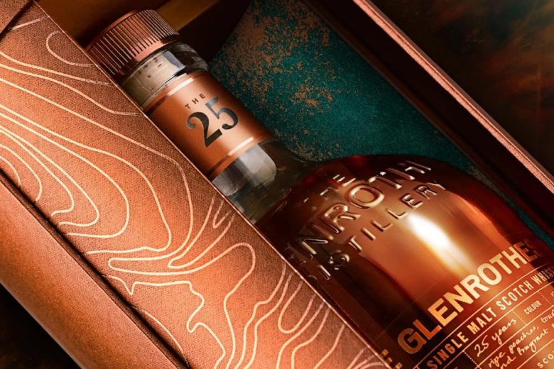
The classic Glenrothes bottle has been evolved, introducing a taller elegant body profile. The straight neck allows the precious liquid to pour more smoothly. The Glenrothes Master Whisky Maker, Laura Rampling, lends her handwritten tasting notes to gild the clear front label. Lewis Moberly has designed a bespoke gift secondary canister featuring a dual layered turning cylinder that opens to reveal the whisky within. The new structure enables the bottle to be proudly displayed without removal from its gift box.
The secondary packaging was developed on the principle of using paper, card, and pulp-based materials only. There is now no plastic, metal, or leather. With minimal use of foil, the new core structure is 100% recyclable.
Mary Lewis, Creative Director at Lewis Moberly commented:
“The 25 is a visual feast. From the gilded contours of the gift carton to the sensuous reveal of the bottle. A rich tactile experience.”
Wendy Espie, Global NPD Manager, The Glenrothes added:
“The 25 deserves a plinth on which to be presented. The Lewis Moberly cylindrical canister design (a lovely metaphor for the casks in which the whisky has aged) offers just that. The contours on the outer pack are a nod to the location of our Rothes Estate in Speyside, whilst the twist playfully reveals the whisky inside.
It’s always a pleasure to work with Mary and the wider Lewis Moberly team.”
Designed by Lewis Moberly
