
Add to collection
Uzbekistan is a country with a great history and peculiar cuisine. Plov, kurut, navat and other unusual representatives of national cuisine have always attracted tourists. But among them, navat has always remained without a package that could attract more attention.
This product itself is very mysterious and interesting. Although the homeland of this sweet is considered to be Iran, Uzbeks consume it daily and consider it native.
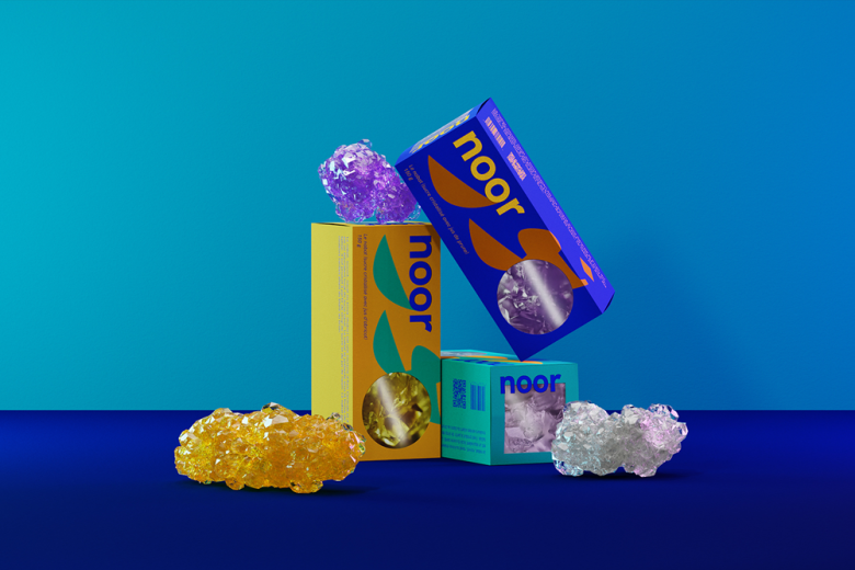
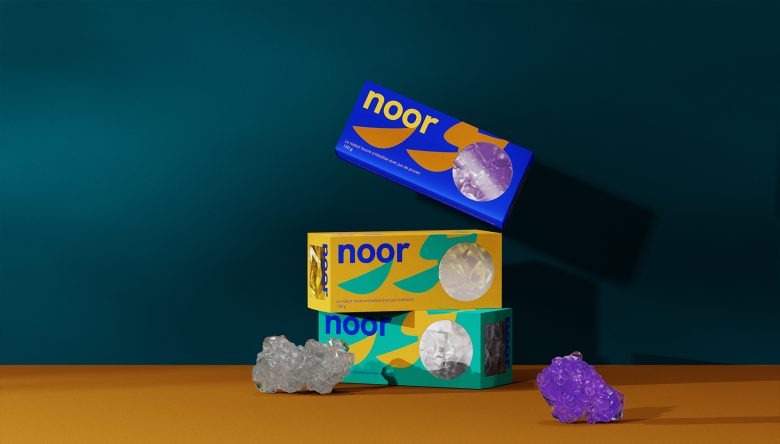
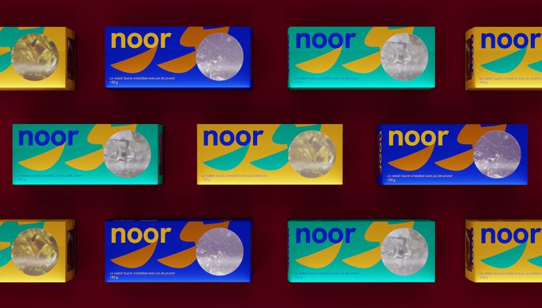
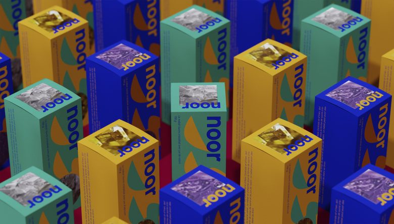
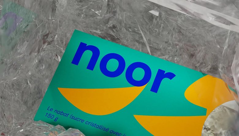
We developed a packaging project specifically designed for export and aimed at a young audience. We chose the word “Nur” as the name, which means “light” in Uzbek and Persian. The Persian spelling of this word, which is perceived as a pattern, became an element of the identity.
In addition, we used the image of nawat under a microscope by placing it in geometric cutouts on the packaging. The sweetness under the microscope resembles the complex pattern of a gemstone.
Different colors are used to indicate the taste of navat: blue – plum, orange – apricot, etc.
Curator’s Insight
The use of contrasting modern colors simplifies the selection process for consumers and adds a vibrant and playful element to the design.
Designed by Taboo Branding
Add to collection