
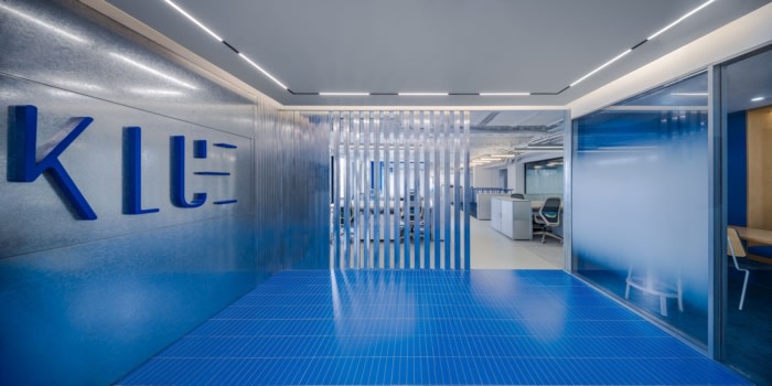
pronounced design created a space that honors the KLUE Creative brand identity at their offices in Shanghai, China. KLUE is a Shanghai-based creative agency that has provided brand service for many internationally recognized companies, and they are renowned for their strong focus on experiential branding design and obsessive pursuit of details. Recently, KLUE invited PROUNCED DESIGN to design the working space for its new headquarters, hoping that the new space would be both efficient and flexible to meet the fast-paced, high-frequency changes of creative work and to keep the possibilities for the future.
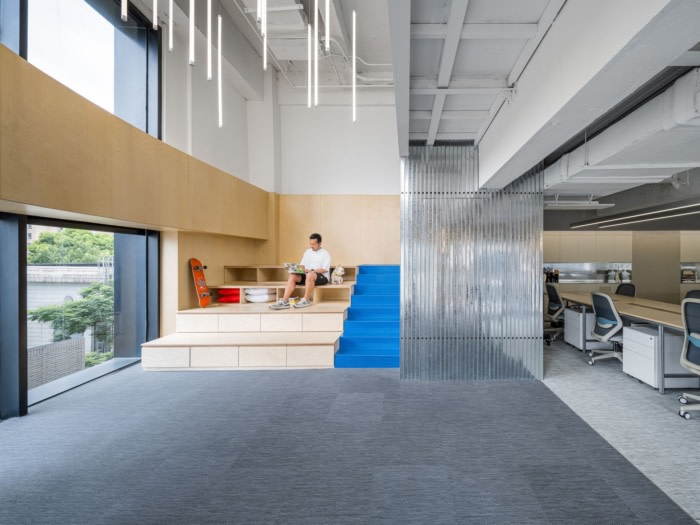
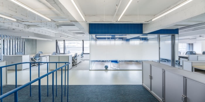
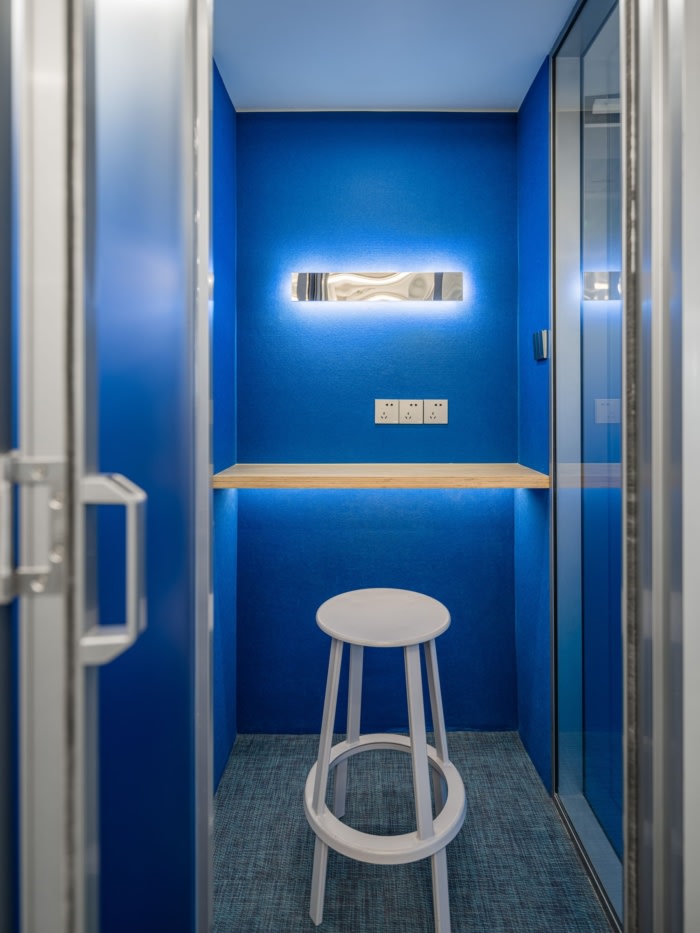
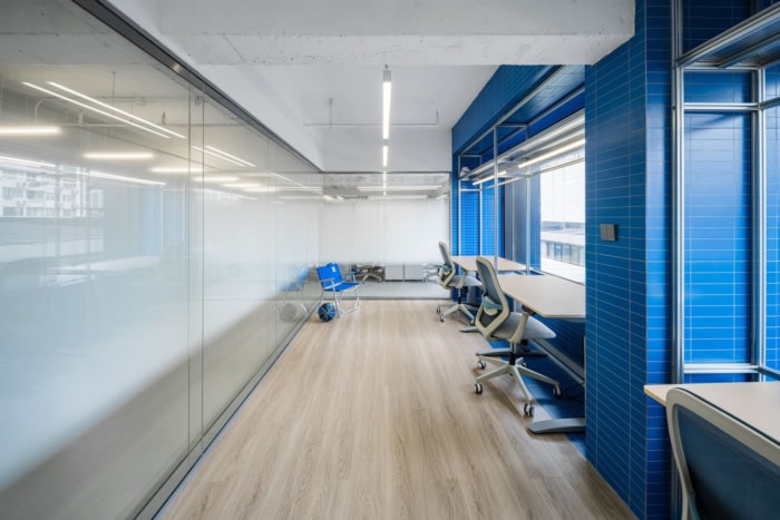
The project occupies the fifth and sixth floors of a creative park. It has a long and narrow floor plan, with a curved edge and a staircase at the end. As the depth of the space is too short, it is easy to form a traditional “cubicle” layout, which is not suitable for creative companies. However, this challenging difficulty has actually become the entry point of the design. The designer starts from analyzing the circulation of the users, then sets the upper floor with the small main entrance, communications room, the founders’ office and the compact working functions; while goes down to the lower floor, there are the integrated and flexible offices for teams, pantry, printing room, telephone booth, and other spaces for administrative auxiliaries.
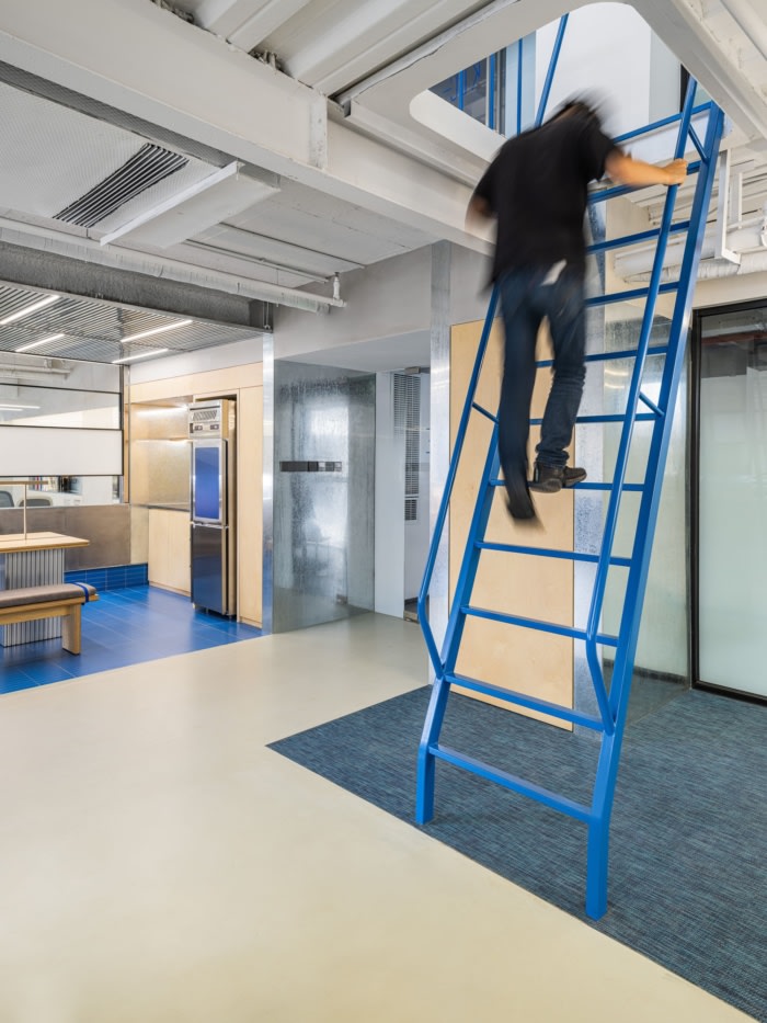
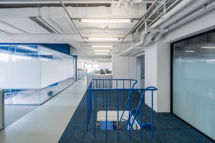
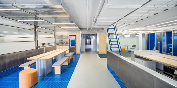
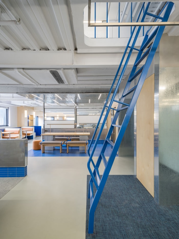
In terms of rhythm, the design uses the ways of dislocation, retraction and concealment, constantly injecting a variety of changing forms, adding fun and readability to the effective working order, and dissolving and breaking down the fixed feeling of the long and narrow plan. The crawling ladder in the middle is a fun way to move up and down the as fast as possible. People can be just like in the game of “Super Mario”, which is extremely convenient for creative workers: when inspiration strikes, they can move along with the ideas immediately.
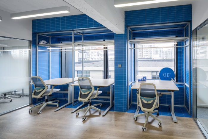
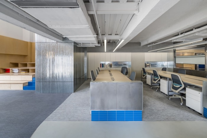
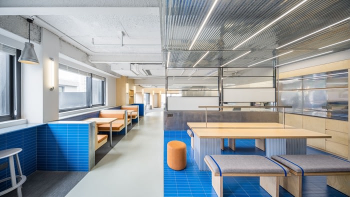
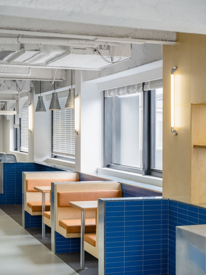
PROUNCED DESIGN’s precise control of the colors and materials is another highlight of the project. The royal blue is KLUE’s brand color, so being used throughout the whole space. Meanwhile, it is paired with rigid and primitive materials, such as aluminum plate, galvanized plate, light steel keel, etc., and retains its exposed coarseness in order to balance the overall tonality of the space. The woven carpet on the floor is interspersed with gray micro-cement, which serves to guide the visual fluency of the direction.
The furniture is also one of the most practical feelings to enhance the well-being of employees. PROUNCED DESIGN has developed customized desks, cabinets and other furniture for KLUE, all of which are made of pre-fabricated 4×4 aluminum square tubes that can be freely assembled and combined, which not only allows the team to collaborate in a variety of ways, but also sets aside unlimited possibilities for the future development.
In the high-intensity and stressful working scenario, how to use design to help people better accomplish their work is the focus of PROUNCED DESIGN. In KLUE’s new office, efficiency and speed are balanced with flexibility and ease, and people can see details full of novelty, fun and pleasure everywhere, in this way, they may better carry out the creative work in a space full of creativity.
Design: pronounced design
Design Team: Andy Lin, CiCi Wang, Quincy Zho
Photography: Alessandro Wang
Add to collection
