Garcia Coffee by Mohammed Dorgam
posted by retail design blog on 2024-02-16
Add to collection
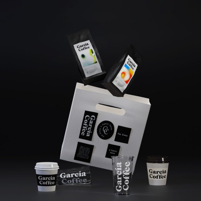
The brand borrowed its name from the name of the great Spanish poet Federico García Lorca, and from his beautiful poetic works, the visual direction that was produced for the brand in general, and for the packaging design in particular.
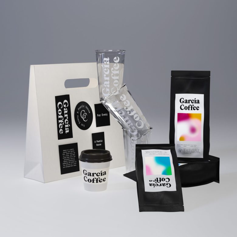
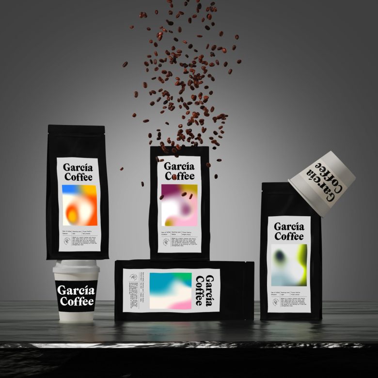
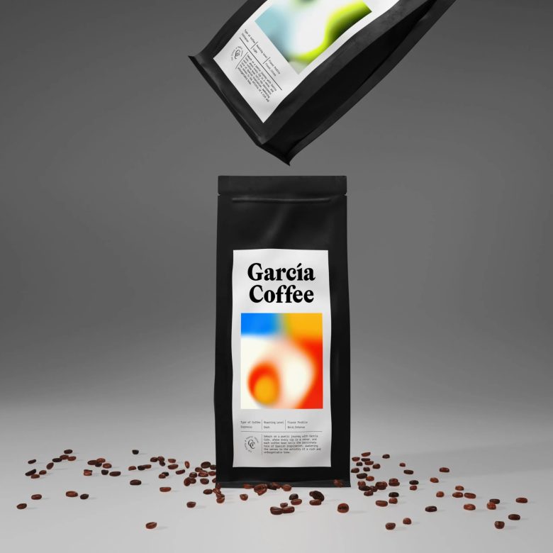
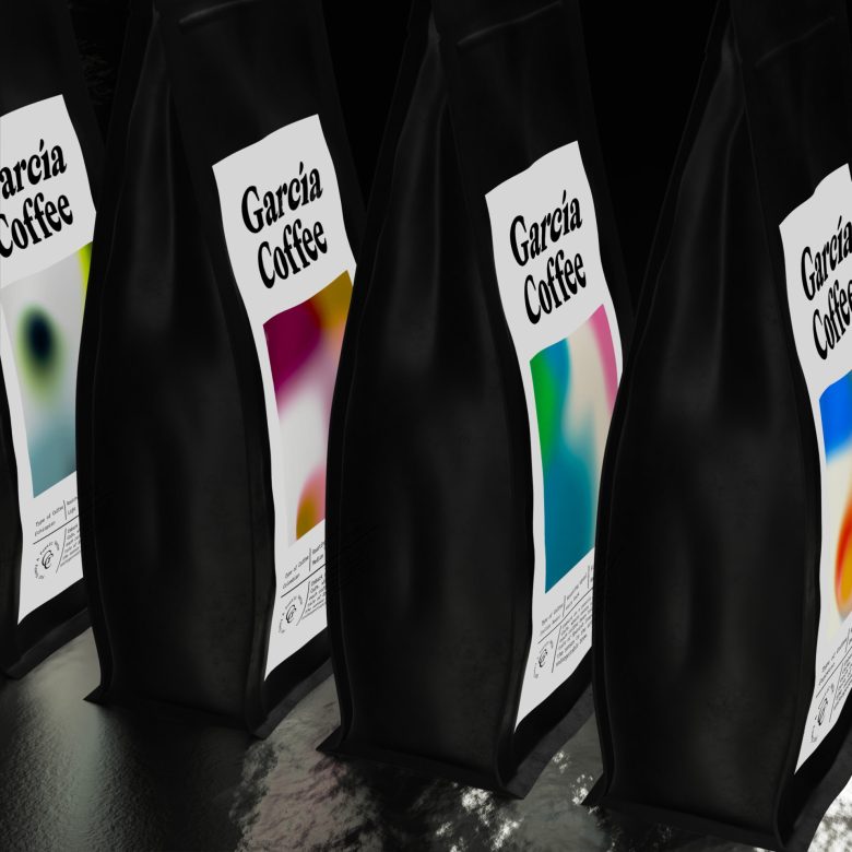
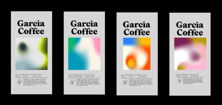
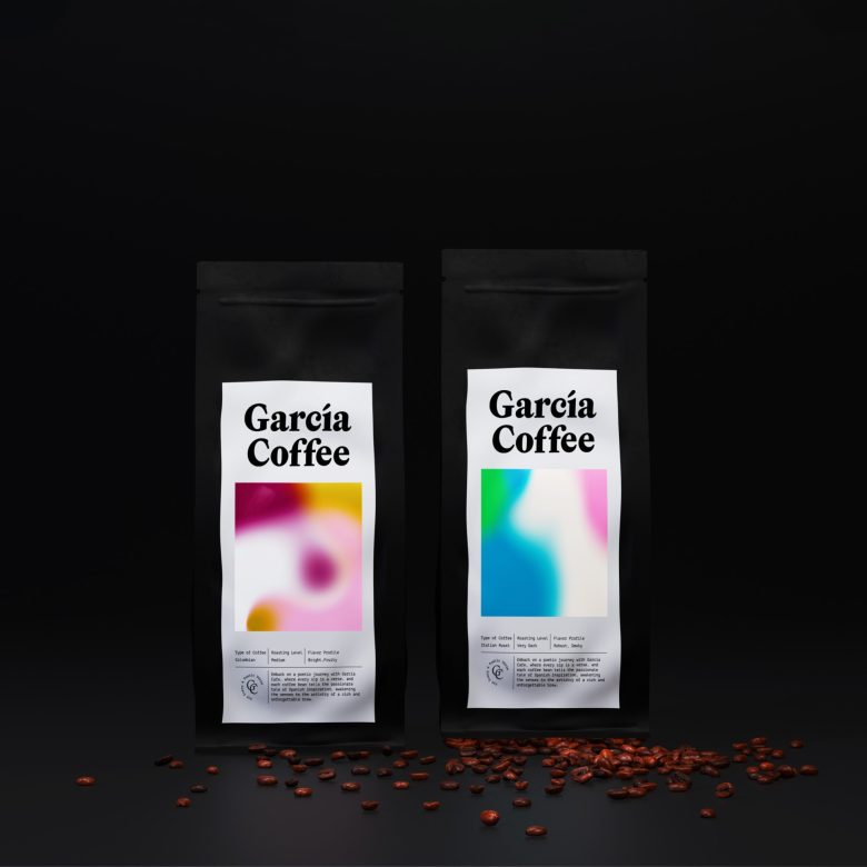
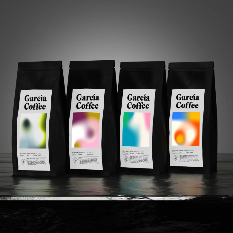
The brand produces 4 types of coffee, each type has its own name and a detailed description as well. During the journey of searching for a visual link related to the work and approaching something similar to the spiritual and historical connection with Lorca the poet, we found that the diverse color mixture with its distinctive and beautiful interlacing is a beautiful and appropriate thing to be used in Packaging design, giving each type of coffee its own distinctive character.
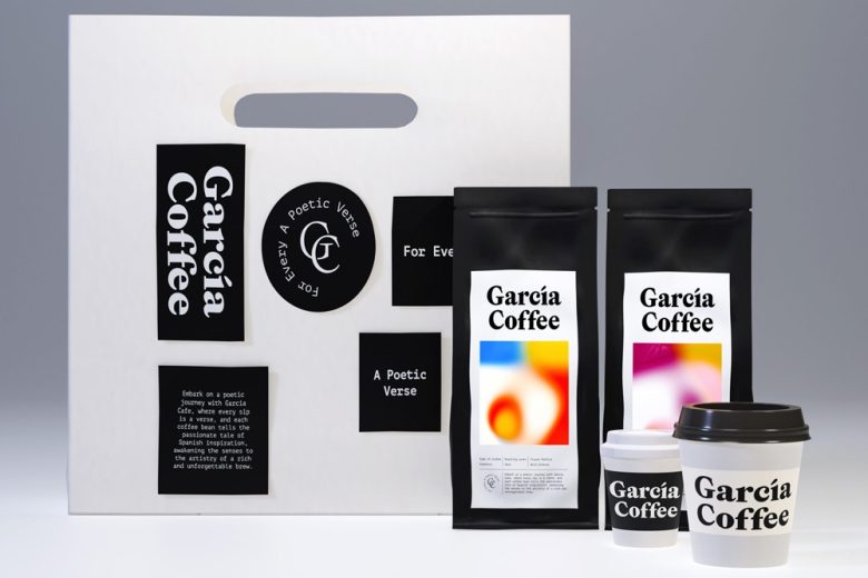
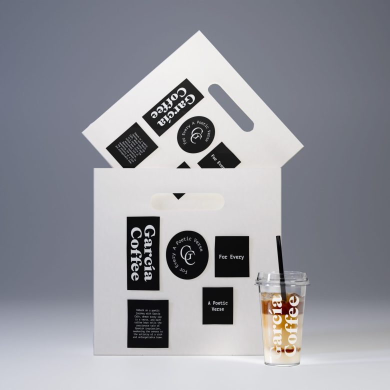
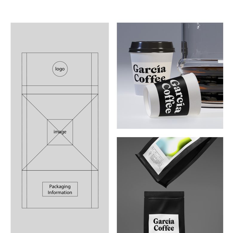
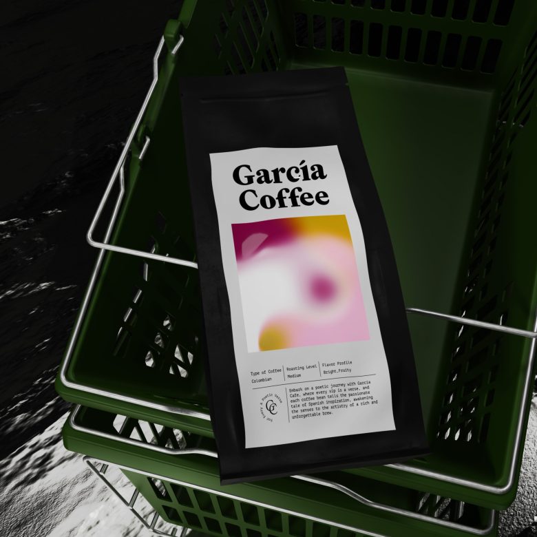
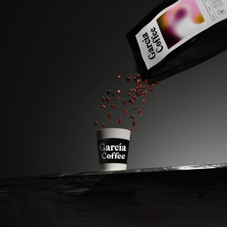
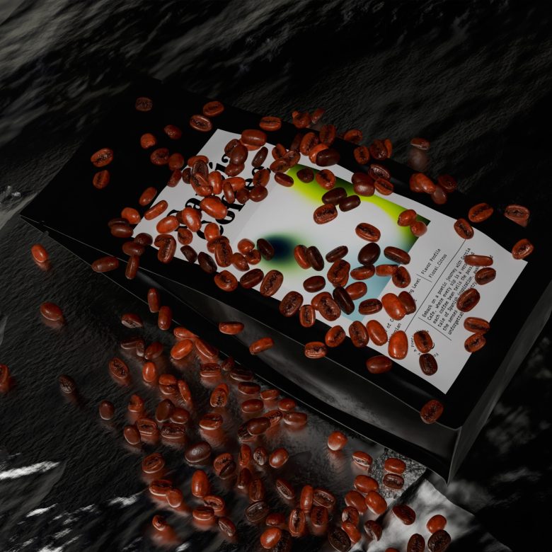
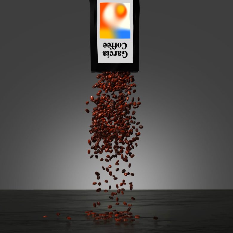
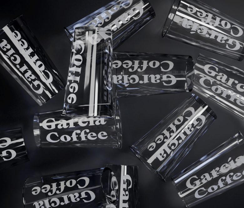
We started from the spirit of simplicity in choosing the industrial materials from which the coffee bag is made, and we chose black as a neutral color that goes with the artistic painting and works to highlight it intensely, making each packaging clearly visible on the shelf.
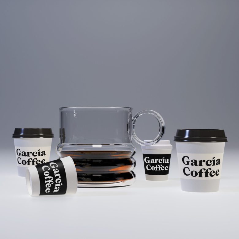
We also tried to work on an abstract visual line, away from many details, in the design of the cups and bags, and focus on highlighting the name of the brand, the essence of its brand, and its culture, which we summarized with these lines:
“Embark on a poetic journey with Garcia Cafe, where every sip is a verse, and each coffee bean tells the passionate tale of Spanish inspiration, awakening the senses to the artistry of a rich and unforget brewtable”
Designed by Mohammed Dorgam
Add to collection