
Add to collection
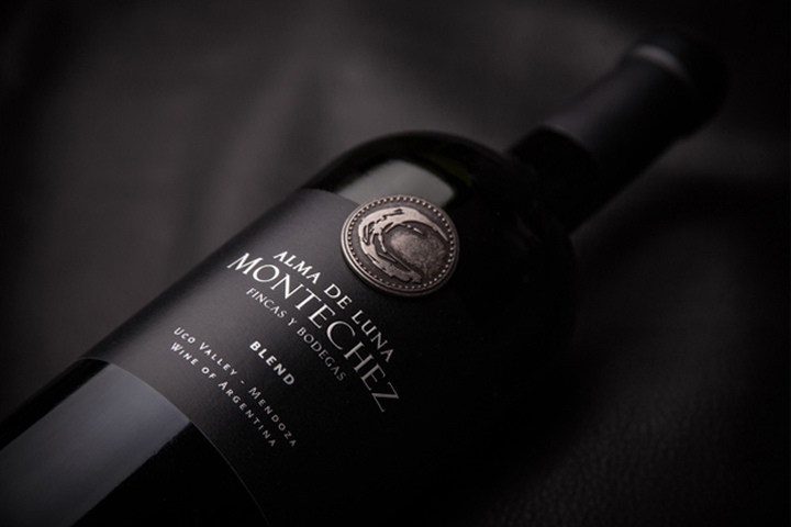

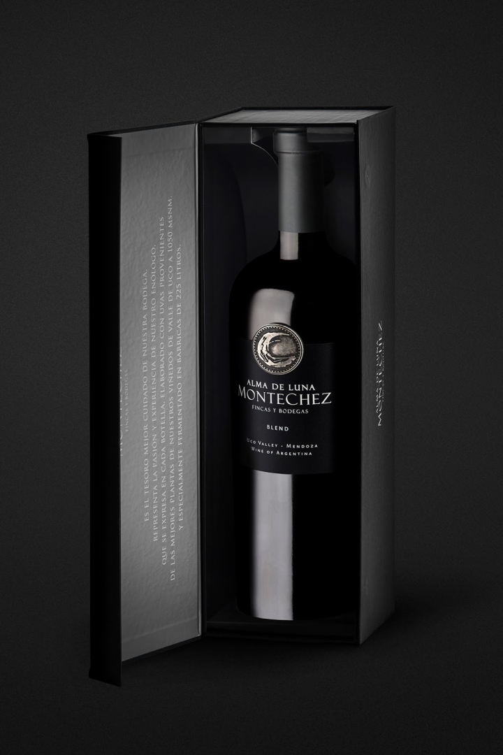
Literally, “Montechez” means “Mountain and Moon”.

It’s the place where the romance between these elements was born. When Caliptra designed this packaging, the goal was to represent the light & the bright moon in the dark immensity of the night. To do so, they used a metallic label working with reliefs of the moon. “There is a moment when the mountain and the moon join in a magical communion. It is the instant when the warm days give way to cool nights to afford strains which express all their potential and give the grapes a sublime character.”
Design: Caliptra


Add to collection