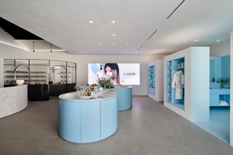
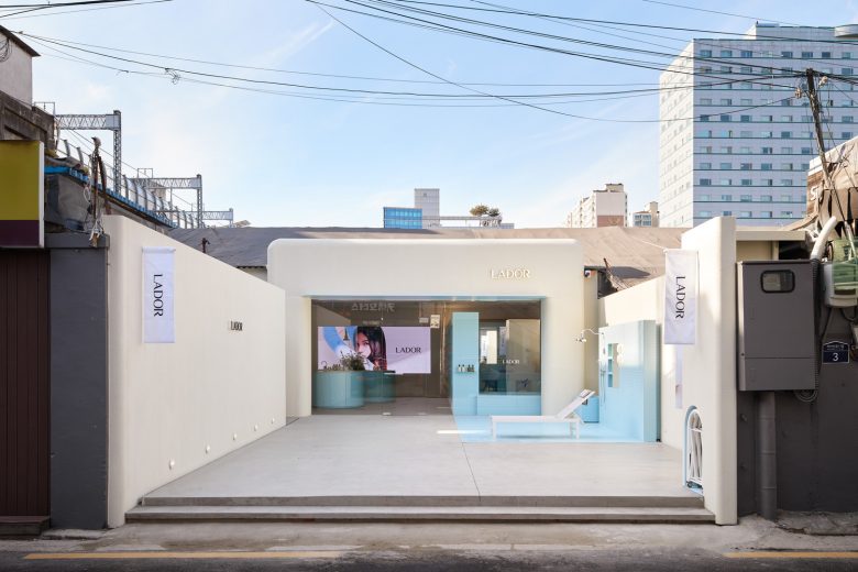
We took charge of the first flagship store project of LADOR, a Korean hair product brand. The client wanted a resting place in the space of LADOR where they could comfortably receive hair care. Here we proposed a space filled with architectural devices incorporating LADOR’s brand philosophy, based on a comfortable home of LADOR.
1. Comfortable LADOR house (Curve of embrace is reflected in the space of serving clients)
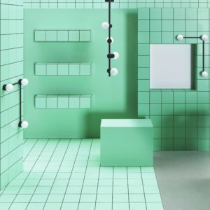
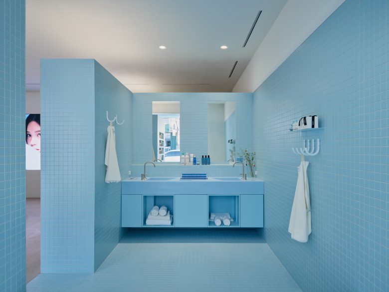
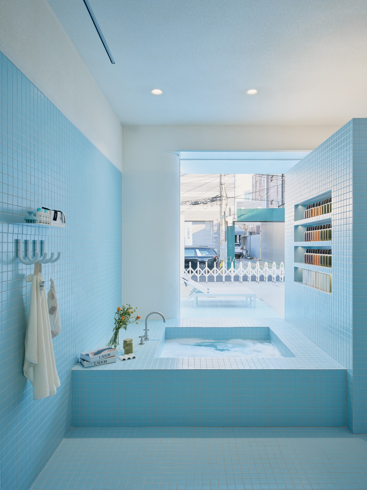
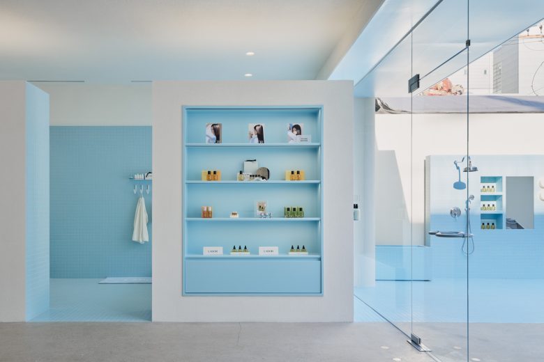
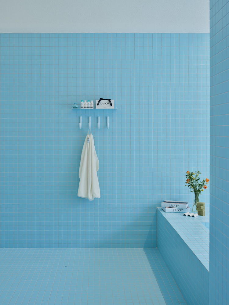
2. Sky blue-coloured bath cube
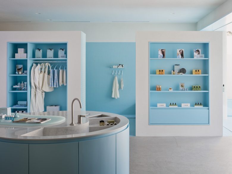
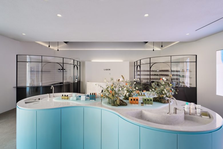
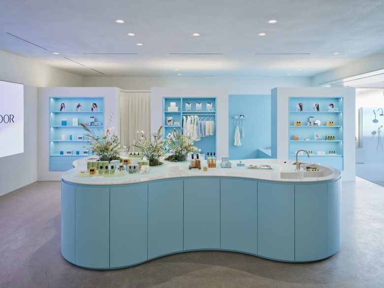
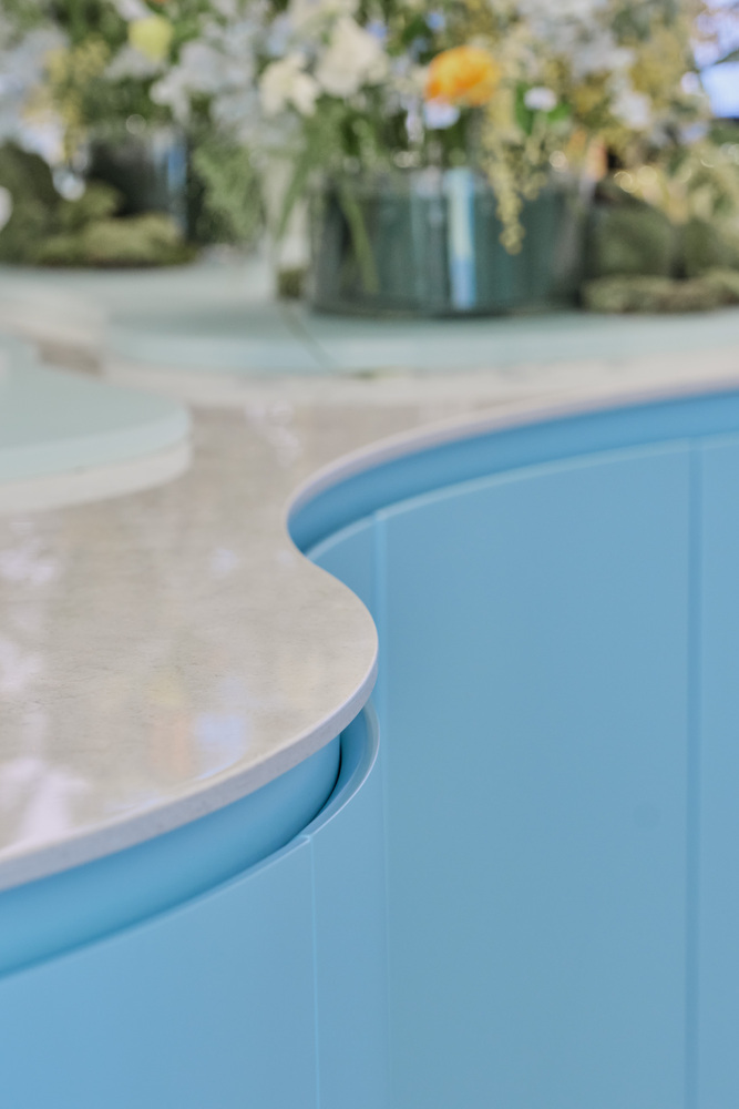
3. Oasis table
(1) The bath cube is inserted in the entire space of 2) LADOR to give the brand identity and the (3) oasis table at the point where the curve of the house and the bath cube meet are placed in the center of the space to create a flow line. This newly extends the territoriality of the flagship store that experiences the lifestyle of LADOR.
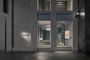
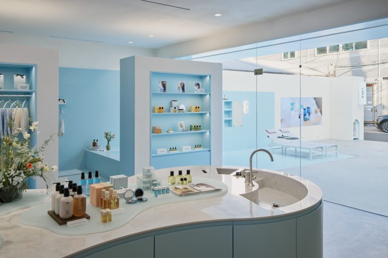
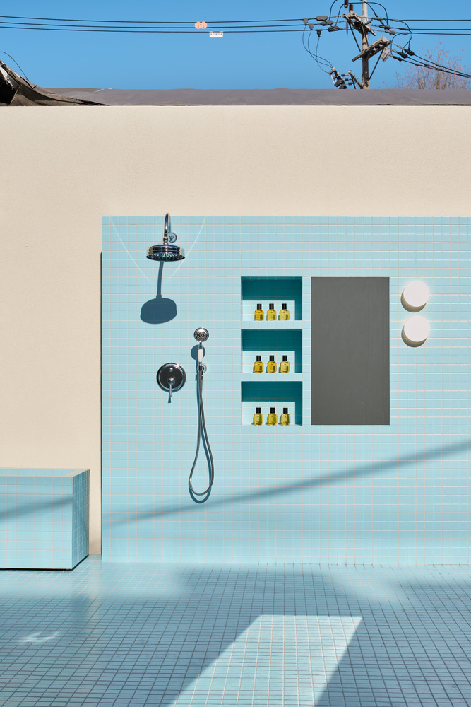
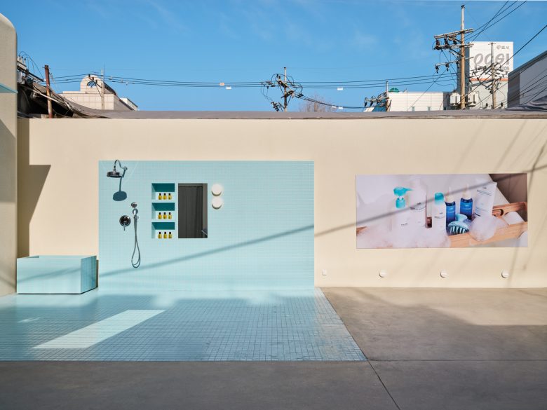
Space device for client experience – We tried to solve the problem of the entrance that was hiding deep inside through the connection of the interior and the exterior of the space. We intended to connect the entire space of the house to the external height of the concrete floor, naturally bringing the passerby’s gaze to the interior and the inflow of clients from the outside. With the bath cube that connects the boundary between the outside and the interior, an eye-catching outdoor shower room was installed to induce the interest of visitors, creating the process of entering the house after taking a shower.
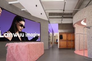
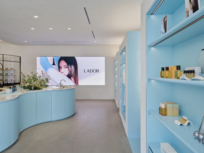
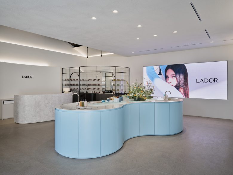
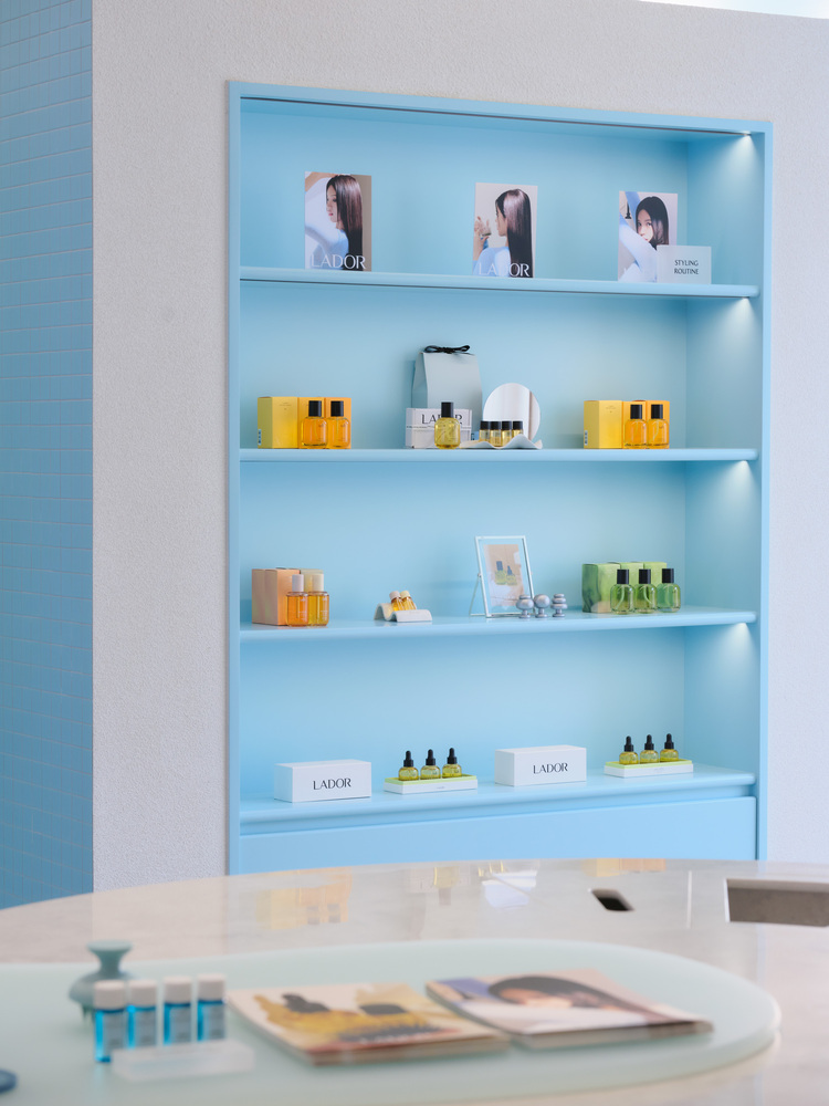
We thought about how to lead the brand’s store experience efficiently while making the inside of the store feel like a residential space of LADOR. We built the identity of LADOR by separating the interior space largely from the oasis table in the middle, booth space, and bath cube hidden behind the wall. The first space you can see when you enter the entrance is an oasis table, the signature design of an Indiesalon. Every facet of the table has a drawer that can load a lot of goods, and the user’s flow line was naturally induced through flexible curves utilizing the characteristics of liquid hair products and products and sinks displayed on top of the table. This creates a variety of sequences from entering and leaving the space.
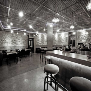
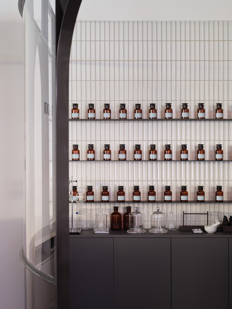
As you follow the path of the oasis table, you will find the perfumer’s room made of black window frames and thin metal. With this design, the café’s booth is symmetrically arranged, and we tried to provide clients with the atmosphere of a luxurious mansion by creating the feeling of a salon and lounge in Europe with a classic glossy black finish. As the two booths and the counter between them, we created a three-dimensional outline in the shape of wall-bearing wings utilizing the meaning of the Seongsu store concept (hugging blue).
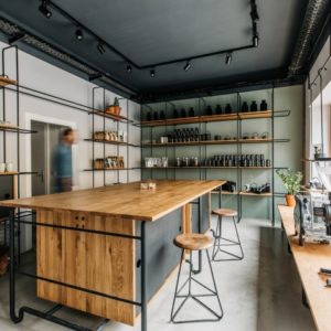
Following the oasis table, you will be able to see the brand experience of LADOR more clearly from the moment you enter the bath cube hidden behind the wall. A bath cube is a place where clients experience hair products with five senses, which is a place to entertain clients’ eyes and noses by placing a DP bathtub filled with the scent and bubbles of the product. It consists of a light blue custom-made sink, a towel rack, a bathtub overlooking the yard, and an outdoor shower space connecting the exterior and interior.
Architects: Indiesalon
Lead Architect: Seokjoon Jang
Photographs: Donggyu Kim




Add to collection
