
Pyunkangyul Cosmetic is an herbal medicine skincare brand that minimizes artificial ingredients and uses ingredients from nature to find the natural healthy beauty of the skin, with the slogan “filling beauty with emptiness.” At Pyunkangyul’s flagship store located in Bukchon, Seoul, we wanted to convey the healthy beauty of Pyunkangyul by incorporating elements of Korean tradition and interpreting them in a modern way.
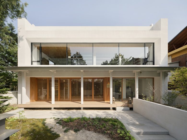
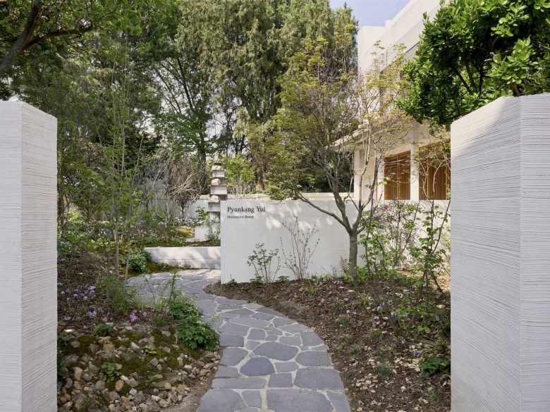
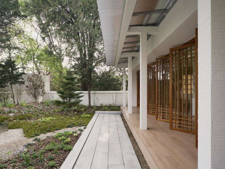
First, by building a fence and making the entrance path longer, we encourage brand immersion through an architectural walk. The stepping stones in the driveway were made from stones from the existing yard, cut into small pieces to maximize the value of reuse. The external façade expresses the values pursued by the brand through experiential elements so that you can feel comfortable while sitting on the main floor and coexisting with nature under the eaves. This is also a point that penetrates the characteristics of oriental architecture.
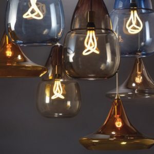
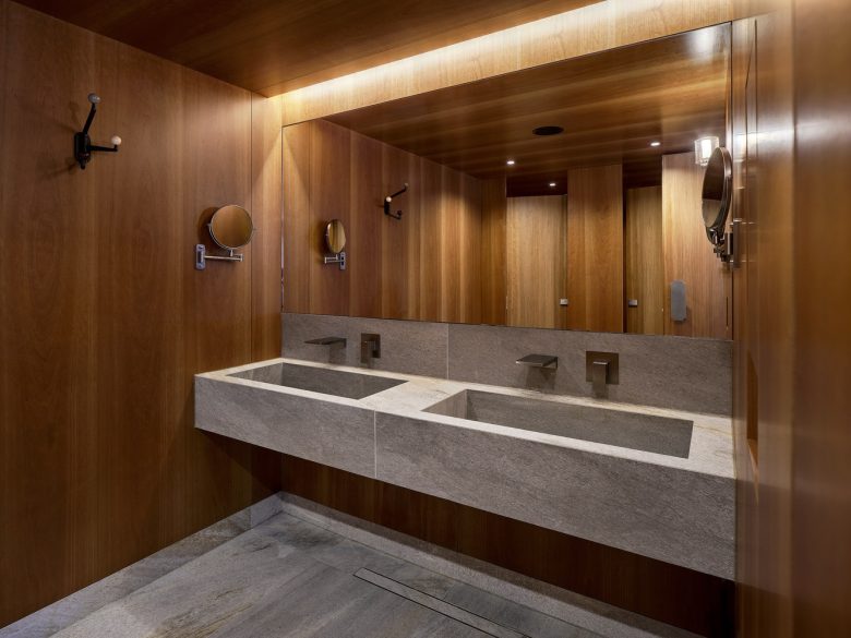
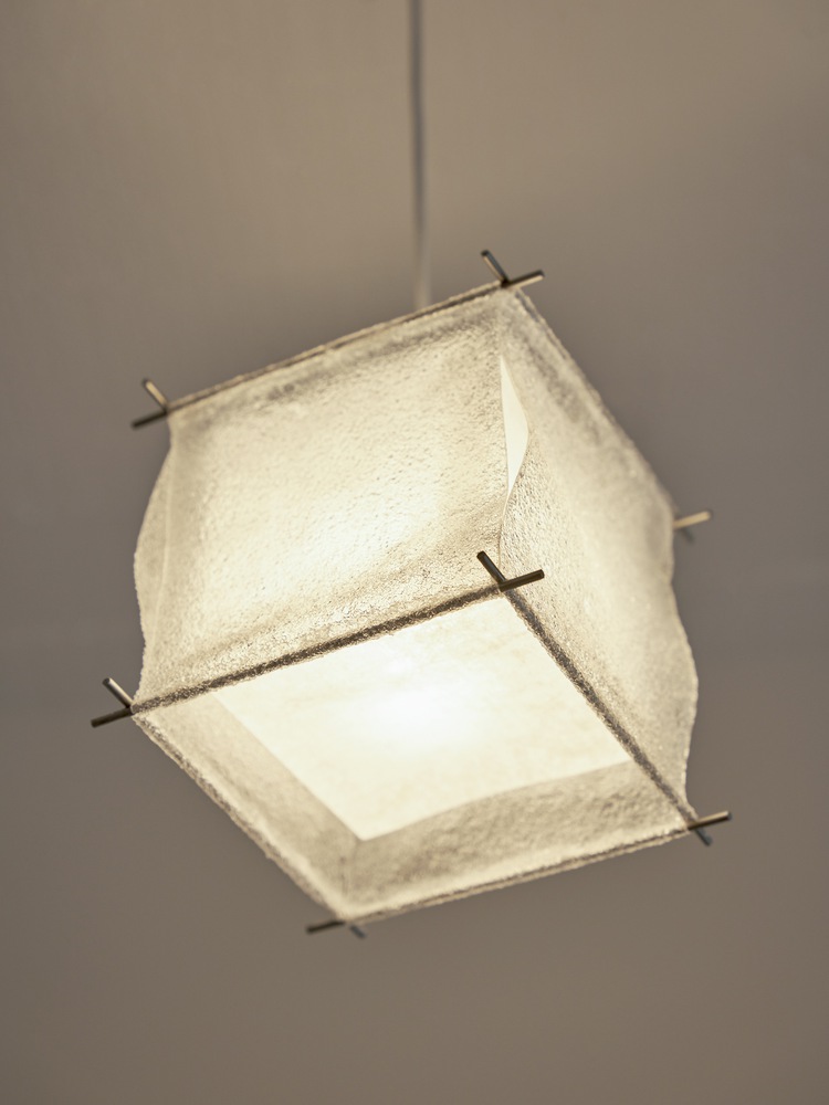
Most of the materials used in Pyunkangyul’s flagship store come from nature. The intention was to indirectly show the brand identity through the material and allow it to be felt through the five senses. Wind bells, plaques, and handles made through brass casting work first demonstrate the language of space through auditory, visual, and tactile senses. The route was planned so that upon entering the 1st floor, you would first be guided through the reception, use the products freely, and participate in the exhibition space. The lights hanging from the ceiling are made of polyvinyl alcohol, a material that disappears when exposed to water. It serves to circulate messages about the environment. The shape borrows the shape of a lantern and combines it with Hanji to guide Pyunkangyul’s flagship store.
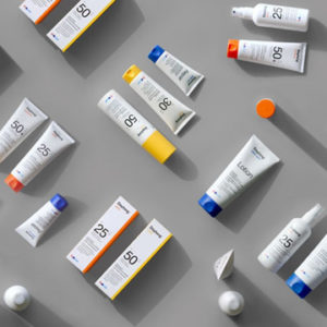
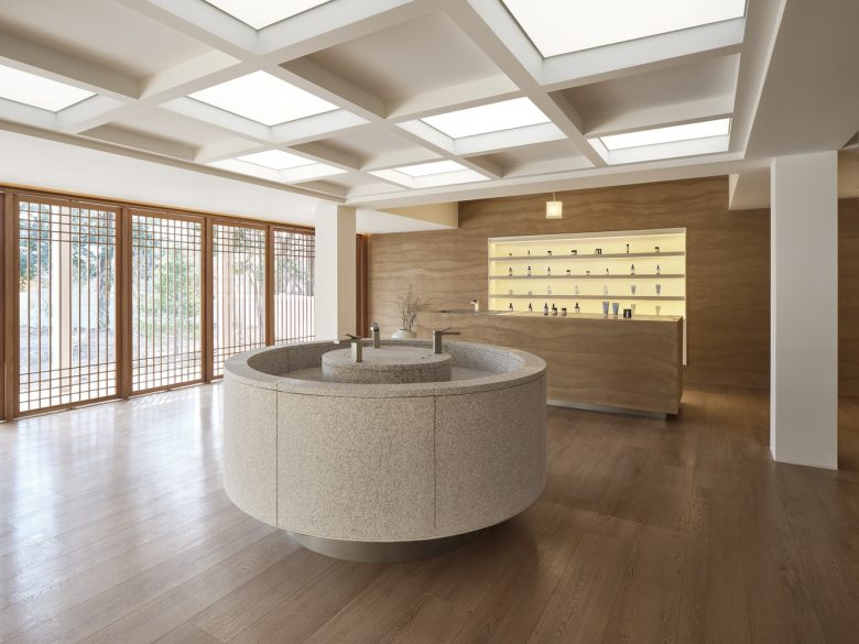
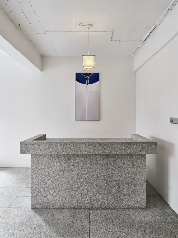
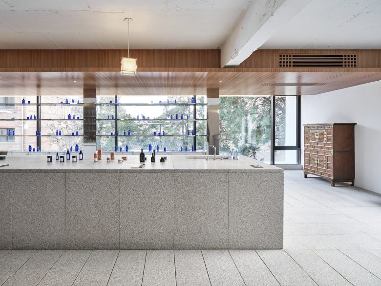
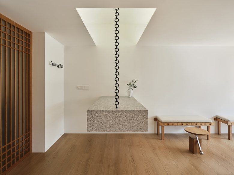
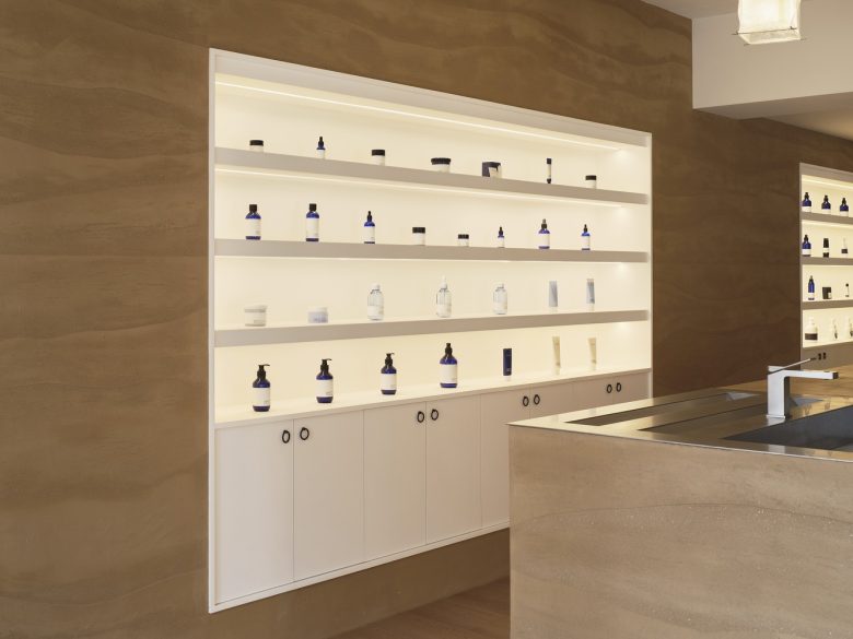
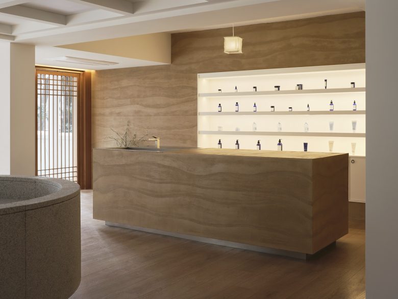
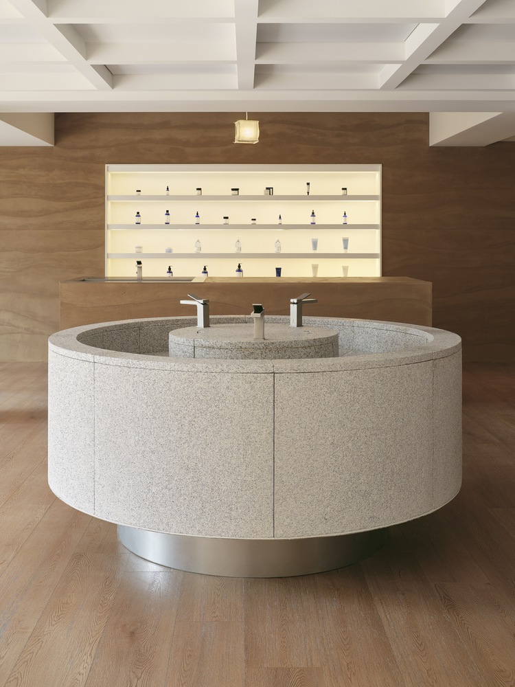
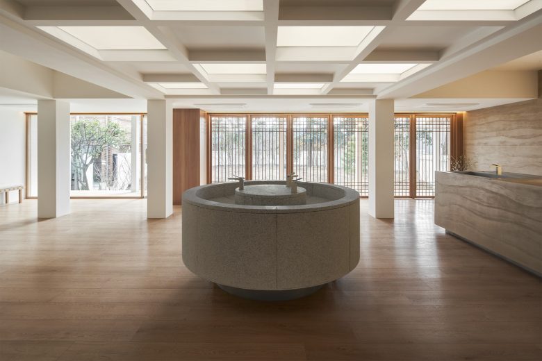
In the main display, a well-shaped barisol light illuminates the main display made of Pocheon stone. It adopts the shape of a well. The wall across from it and the reception area were plastered with natural clay mixed with mother-of-pearl. Products are listed in the clay plaster, which indirectly conveys products from nature. In addition, the windows inside were made of gansal doors, borrowing traditional window patterns. When the sun is good, the entire area is open, and the boundaries between inside and outside have been removed so that we can coexist with nature.
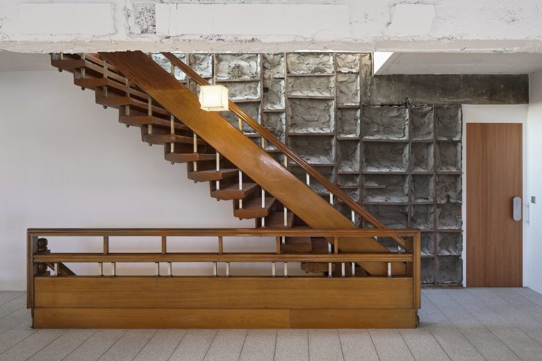
Inside, there is an exhibition space containing Korean-style fabrics using landscape painting techniques and folding screens used in the royal palace. After fully experiencing the product and the heritage of Pyunkangyul, you will go up to the 2nd floor through the internal stairs. This staircase was adopted as the staircase that the existing building had. Also, some of the walls going up to the 2nd and 3rd floors exposed the demolished walls of the existing walls. It is about preserving and continuing the legacy of the building. The sustainability pursued by Sherpa is to allow the charm of the raw, which cannot be embellished, to naturally coexist with new products.
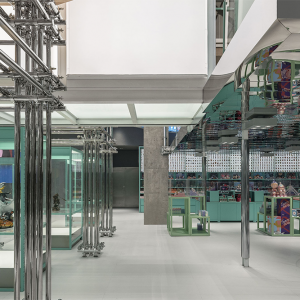
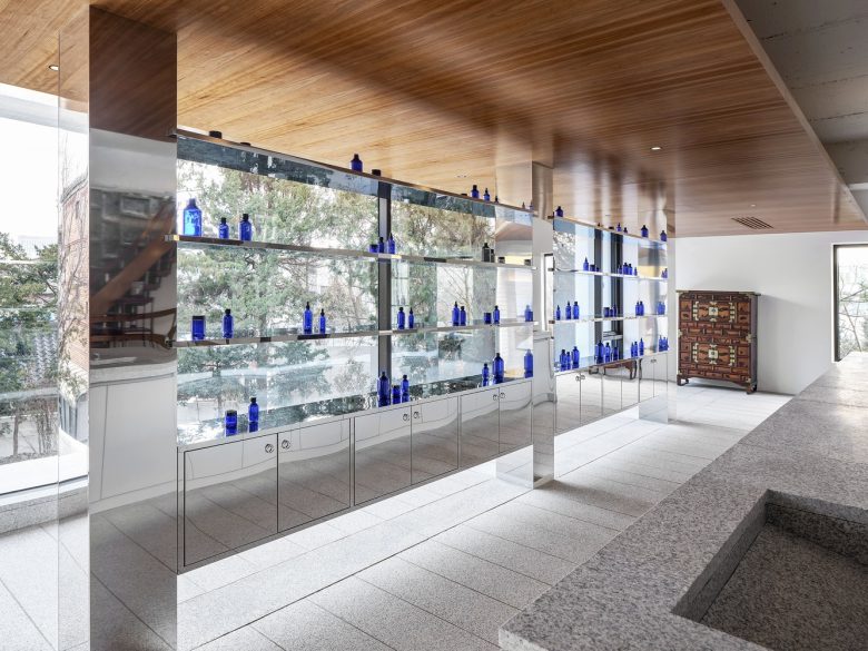
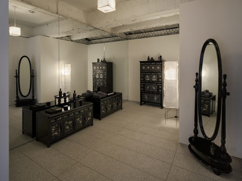
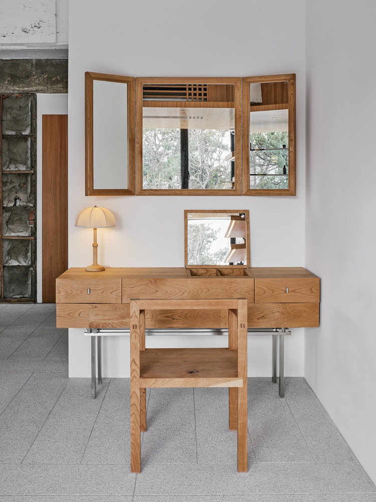
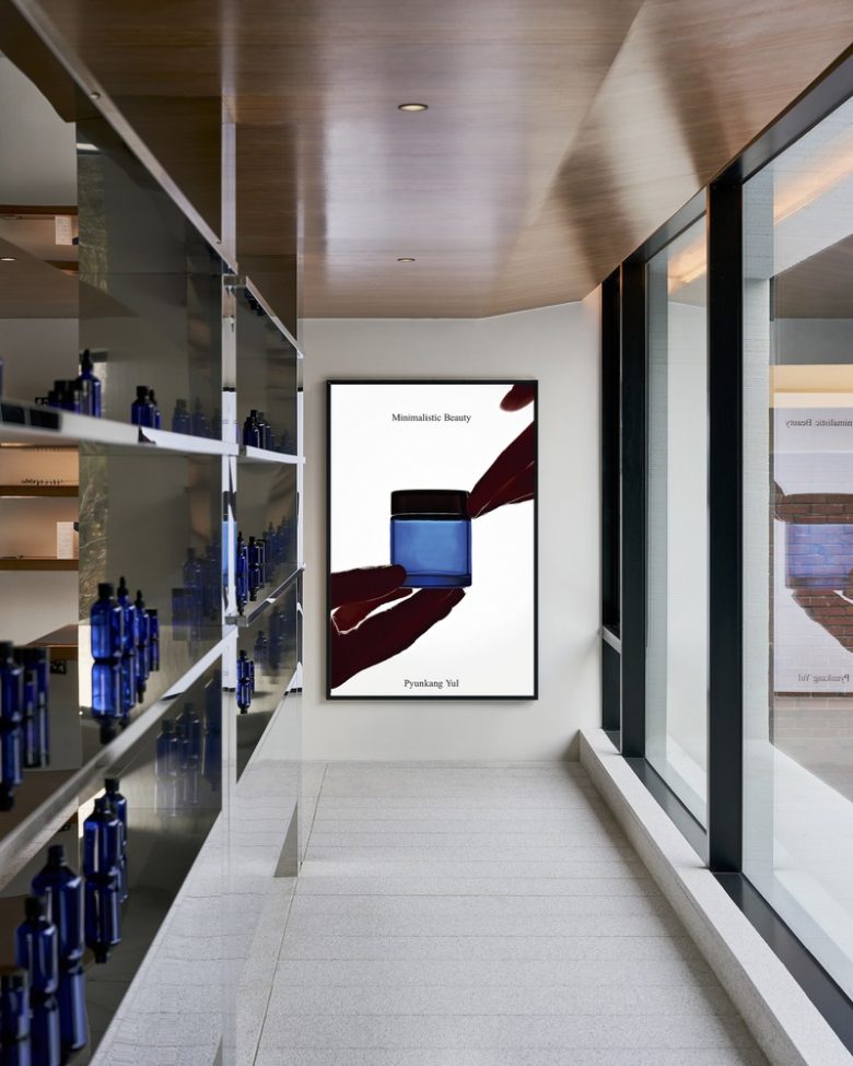
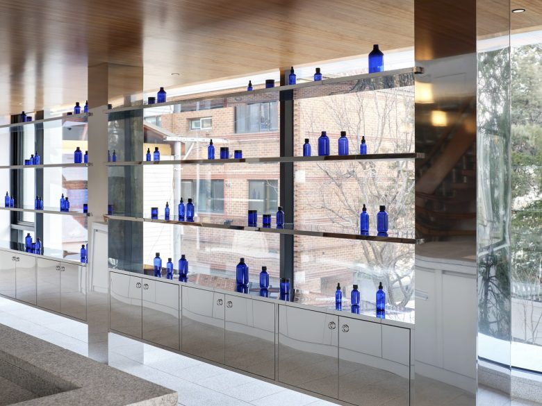
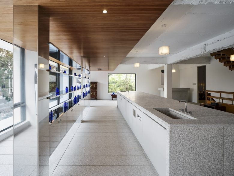
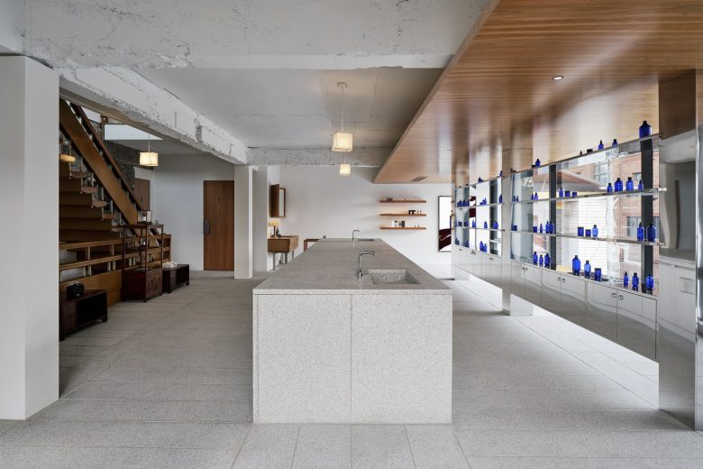
2F interpreted Pyunkangyul’s brand identity in a modern way. The floor was patterned using the shape of a well floor and continued to create the reception and product tables. Afterward, products are listed on stainless steel polishing shelves. The intention is for the pillars and shelves to reflect nature outside and to visually bring the products into nature. In the inner space, you can experience Pyunkangyul’s heritage in the exhibition space through mother-of-pearl, as well as furniture made from cherry wood and traditional furniture.
On the B1 floor, there is an exhibition where you can learn about the ingredients and effects of all the products. We also created a space at Pyunkang Oriental Medical Clinic where you can experience philosophy and history. The rooftop, which offers a panoramic view of Gyeongbuk Palace, provides a space where you can feel the beauty of Korea and relax comfortably.
Architects: Sherpa
Landscape & Garden Designers: Lee Daegil Studio
Spatial Designers: Sherpa
Exhibit Designer: Lee Sisan
Photographs: In and Out



Add to collection
