
Add to collection
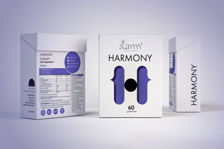
The brand identity and packaging design for Slayyyy was inspired by harmony and finding the perfect balance for each individual. Message of the brand: “Illuminating every life with innovative herbs & heartfelt support.”
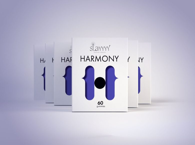
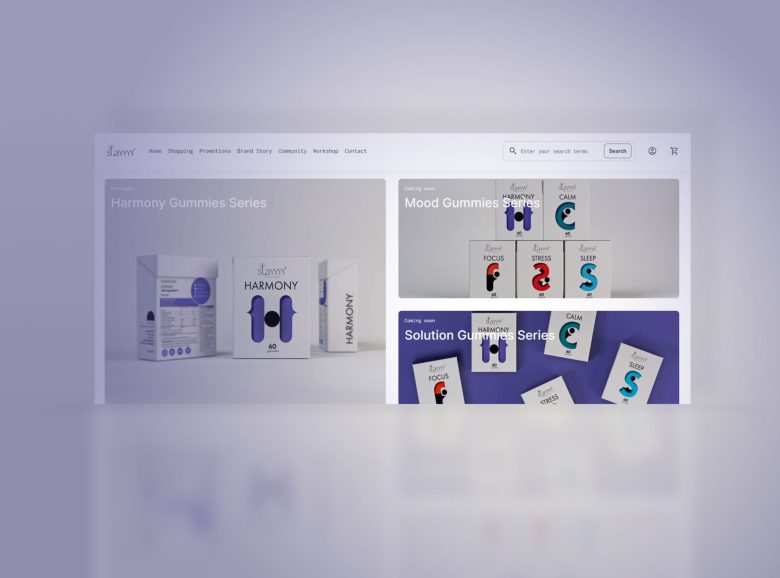
We concentrated on customization & flexibility in order to deliver a dynamic design solution that captures all the complexity of the brand.
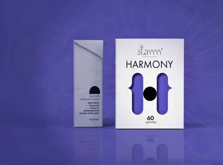
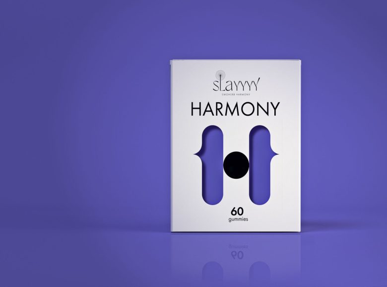
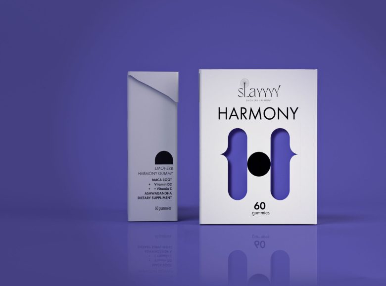
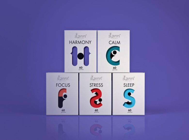
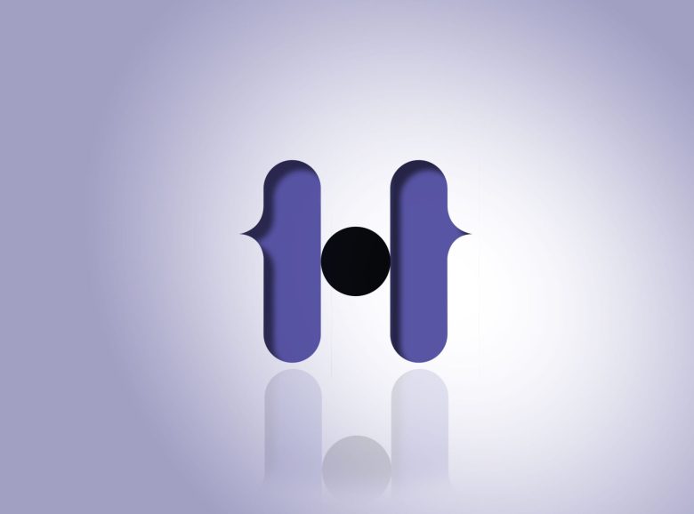
The brand design and packaging explore the brand idea: “Beauty of Individuality: Each person is a unique work of art” and translates it in a modern and minimalistic logo, a clean color palette, and a unique typographic family. Each product is represented by a unique letter/symbol.
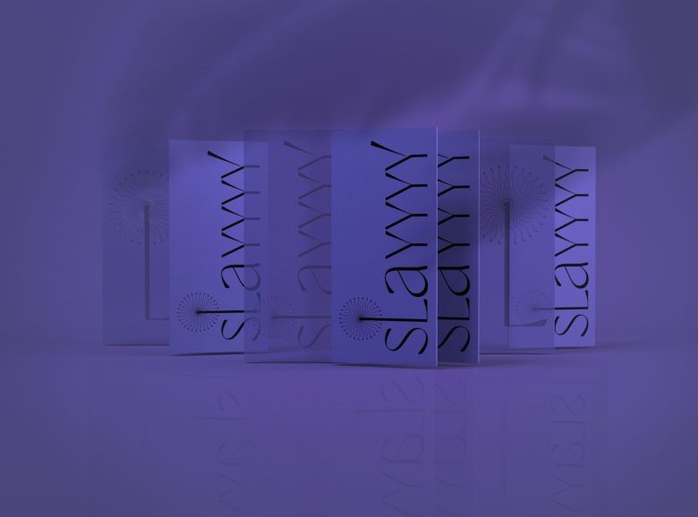
We looked to nature for inspiration and explored the fragility of the dandelion in a modern and unique logo design. This humble plant is also a symbol of hope, healing, and resilience in many cultures around the world from Europe to Asia.
The audience of the brand includes New Middle-Class Women, Yoga Enthusiasts, Creative Professionals, and Artists.
We used the identity visual elements like the logo and packaging design to connect with the brand’s audience while utilizing a design language that conveys a feminine style and brings up an emotional level, building a strong bond between the brand and the customers.
The packaging design conveys the minimalistic style of the brand while also offering flexibility that can be extended in the future for a new line of products.
The design choices and branding strategy embody the essence of a modern approach dedicated to a younger audience looking for healthy solutions to improve their everyday life.
Designed by CreativeByDefinition
Add to collection