
OOTOO coffee by Empatía
posted by retail design blog on 2024-08-19
Add to collection
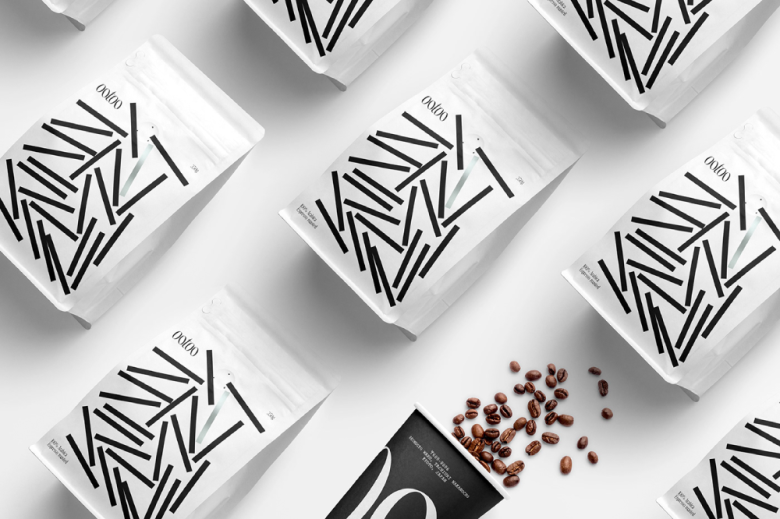
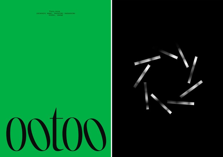
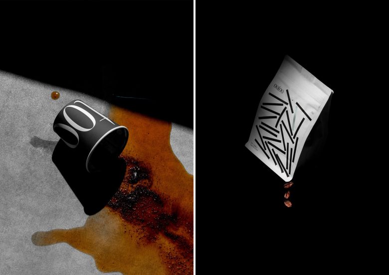
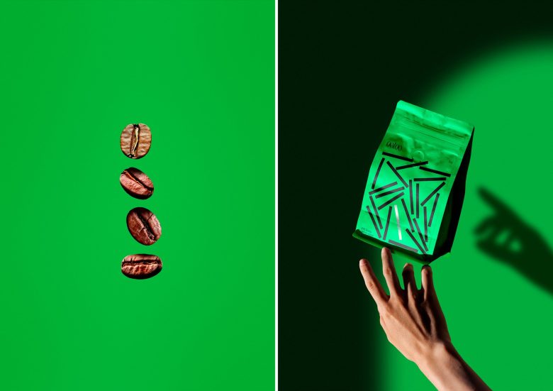
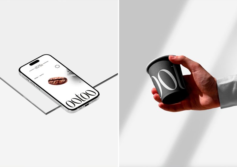
OOTOO is a Kyoto-based coffee brand and we embarked on a journey to create its brand identity, wanting to encapsulate the essence of Japanese culture and the rich, artisanal nature of their coffee. At the heart of this new identity is the packaging, inspired by traditional Japanese kanji and the iconic torii gate—a symbol of transition and sacred spaces in Japan. We deconstructed the torii into distinct elements, integrating them into the packaging and logo. This creates a visual narrative that is both rooted in tradition and forward-thinking, blending cultural symbolism with modern design.
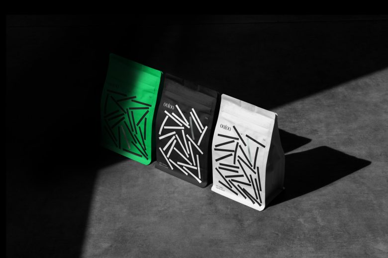
The packaging design is an ode to minimalism, reflecting the Japanese appreciation for simplicity and understated elegance. Clean lines, ample white space, and a restrained color palette allow the focus to remain on the coffee itself—a product crafted with care and precision. Typography, color and forms. By marrying these elements, we’ve crafted a brand identity that is not only visually striking but also rich in cultural significance. The result is a design that honors the heritage of Japan while celebrating the artisanal quality of OOTOO.
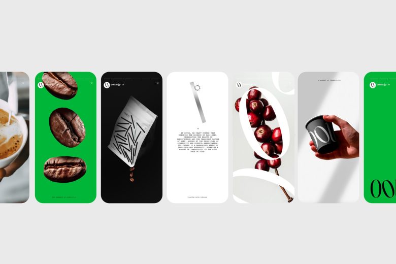
The design invites consumers to savor the rich flavors and aromas of the coffee with a sense of calm and contemplation, mirroring the careful, deliberate process of traditional Japanese craftsmanship.


Add to collection