

CroWn Chocolate by Camo Creative
posted by retail design blog on 2024-10-24
Add to collection
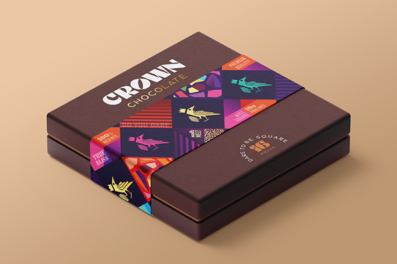
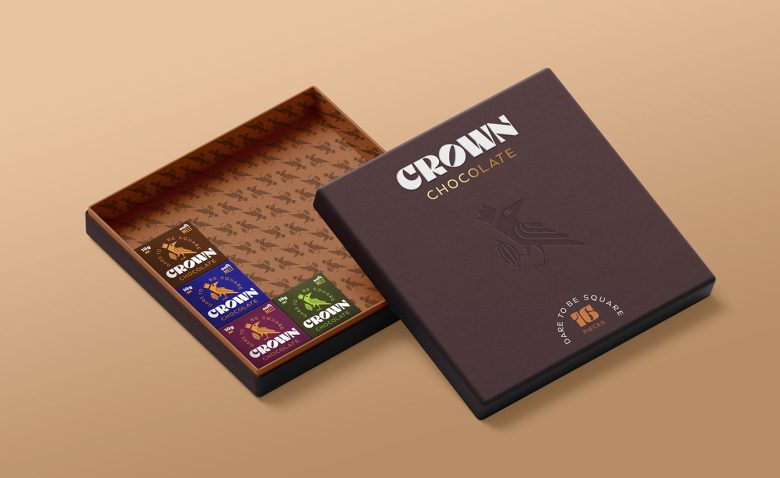
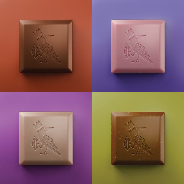
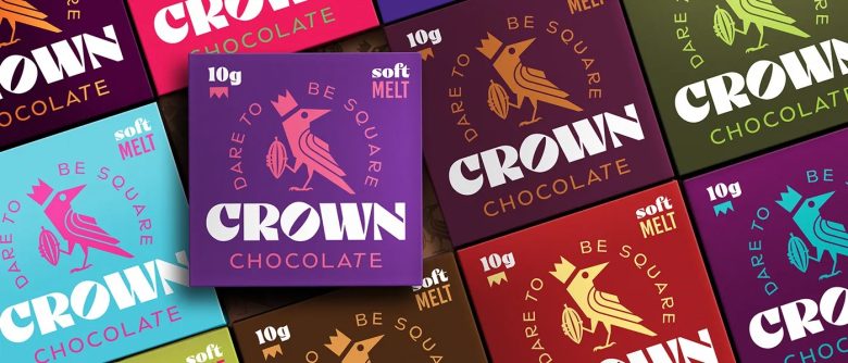
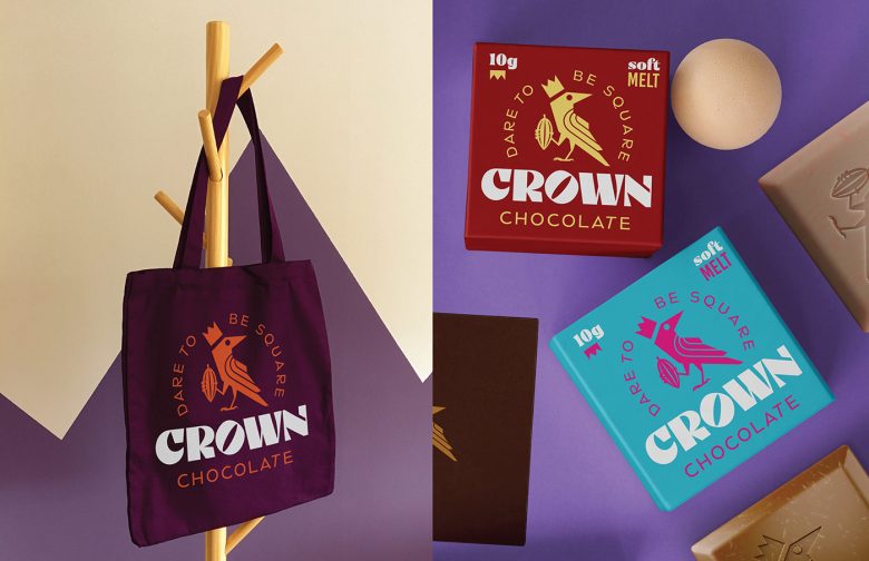
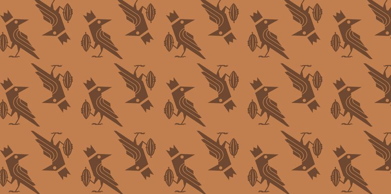
The CroWn Chocolate packaging design is a visual treat that really knows how to stand out while keeping things simple and premium. It has this quirky, bold personality that draws you in right away. The most striking part is the bird logo, wearing a crown and holding a cocoa pod — a fun twist that feels playful yet regal. It immediately tells you that this chocolate brand dares to be different. The slogan “Dare to Be Square” is equally cheeky, challenging the typical rectangular chocolate bar concept and giving off a rebellious, forward-thinking vibe.
The color palette is very adventurous, moving away from typical brown tones that you often see in chocolate packaging. We see rich, bold hues like deep purples, teals, and vibrant reds that scream premium but with a twist of fun. Each package feels like it could belong to a collector’s set — different colors for different flavors, perhaps? This makes the brand feel more dynamic and exciting.
One unique aspect of the design is how it combines minimalism with bold graphic elements. The clean lines of the bird illustration and the minimalist use of text (just the essentials like “soft melt” and “10g”) make the product feel uncluttered, but still visually powerful. The typography is sharp and modern, with the brand name “CROWN” taking center stage. The oversized font gives it a presence, almost like it’s shouting out confidently from the shelves, “Pick me!”
There’s a lot of symmetry in the design, but it’s broken in just the right way by the bird and cocoa pod, giving the eye something interesting to follow. The square shape of the packaging itself further amplifies this uniqueness, stepping away from the traditional chocolate bar shape and encouraging customers to “dare” to try something new.
In my personal view, this design is a fantastic example of how premium can also be fun. It appeals to a wide audience — people who appreciate high-quality chocolate, but who don’t want something stuffy or overly serious. This balance of sophistication and whimsy makes CroWn Chocolate packaging truly unique and memorable!
Designed by Camo Creative
Add to collection