

Add to collection
Last semester at university we were given a really cool task. We had to choose an existing company that distributes teas, and we had to redesign both the packaging and the brand. The goal was to make the final result look premium and luxurious. I have always been sympathetic to Turkish culture, so there was almost no question of choosing a brand with a Turkish nationality. So I chose Doğuş Çay.
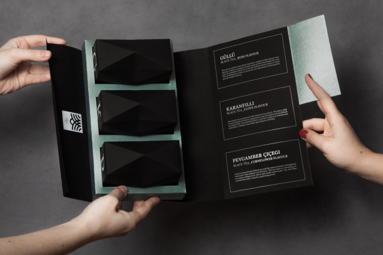
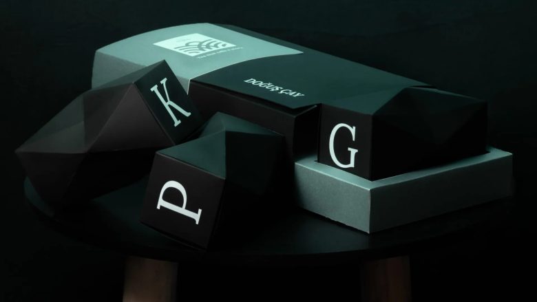
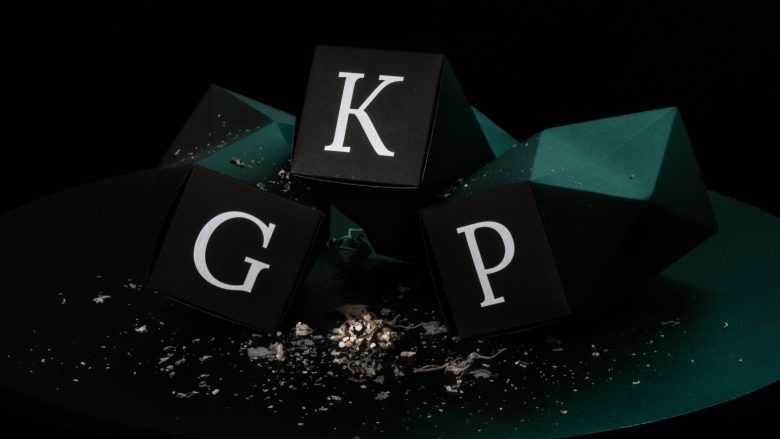
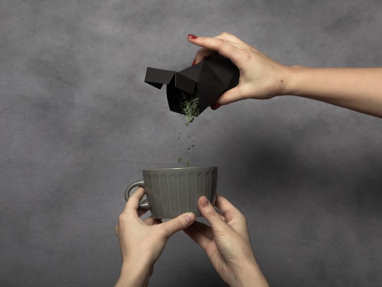
After a long period of research on the company and culture, I decided that although Turkish art is very colourful and decorative, I would like to represent a clean line. In Turkish tea culture, the tulip-shaped cup, or “Ince Belli”, from which tea is consumed, plays a very important role. Hence, part of my concept was to use a stylized cup as the shape of the tea packaging. With this shape I brought back the very essential glass from the culture of the Turks.
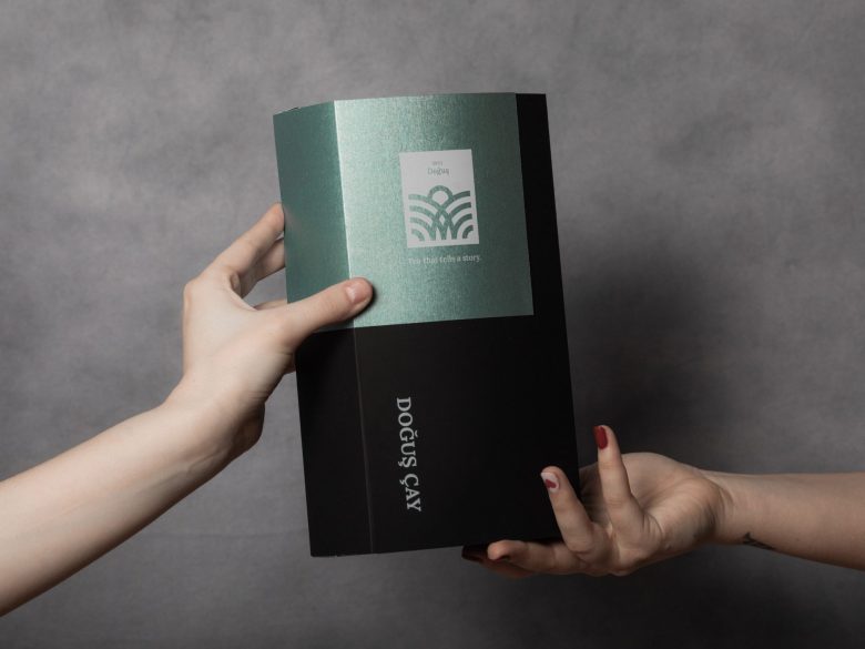
I chose a beautiful matte black paper for the collector’s packaging, which also contains the three flavoured teas, complete with names and descriptions. The matte black contrasts perfectly with the turquoise and metallic colours and the digital white print completes the overall look. This trio makes the packaging premium quality.
Finally, not only the packaging but also the logo has been redesigned and the brand has a new slogan: “Tea that tells a story”.
Made by: Kocsis Kata (@katkagraphics)
Made at: Budapest Metropolitan University, Hungary
Consultant: Brittnek Andrea
Add to collection