
Add to collection
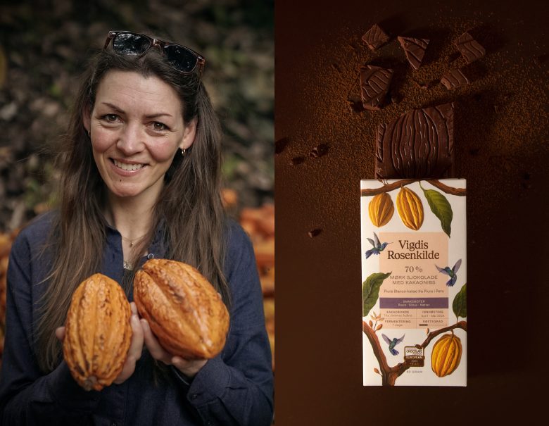
Vigdis Rosenkilde is a Norwegian fine chocolate brand using cacao from the Peruvian Amazon. Its rebranding aimed for greater visual impact and to reflect its founder’s adventurous spirit. To achieve this, a concept was created that connects the sensory experience of chocolate with nature, developing an illustrated packaging system that highlights the Amazon in an original way, successfully setting the brand apart in the market.
Fibra designed the brand years ago, and the time came for a rebranding. The minimalist design that once worked in Norway was now struggling to stand out against bolder competitors. Additionally, with the brand’s growth and entry into new markets, this was the perfect opportunity to refresh its identity, adapt to the current market, and boost its expansion.
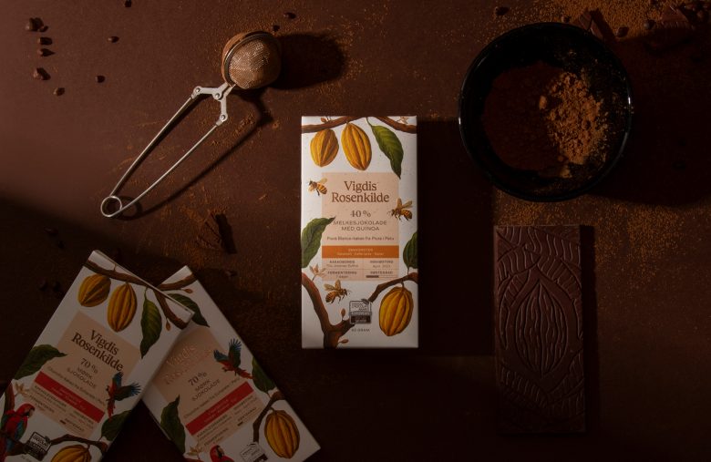
We focused on the essentials: Vigdis Rosenkilde is a minimalist chocolate that, with only two ingredients, creates a complex sensory experience. This led to the concept Nature’s Quiet Complexity, highlighting how simple things can awaken the senses—like a song that gives you goosebumps or a scent that transports you through time.
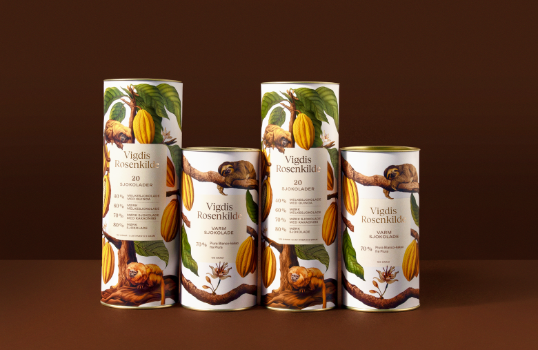
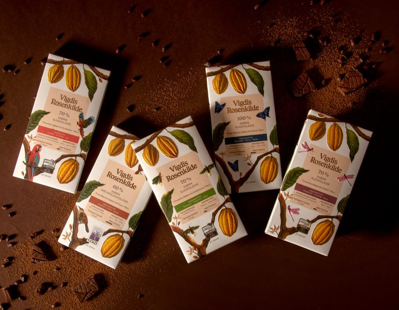
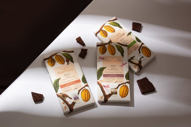
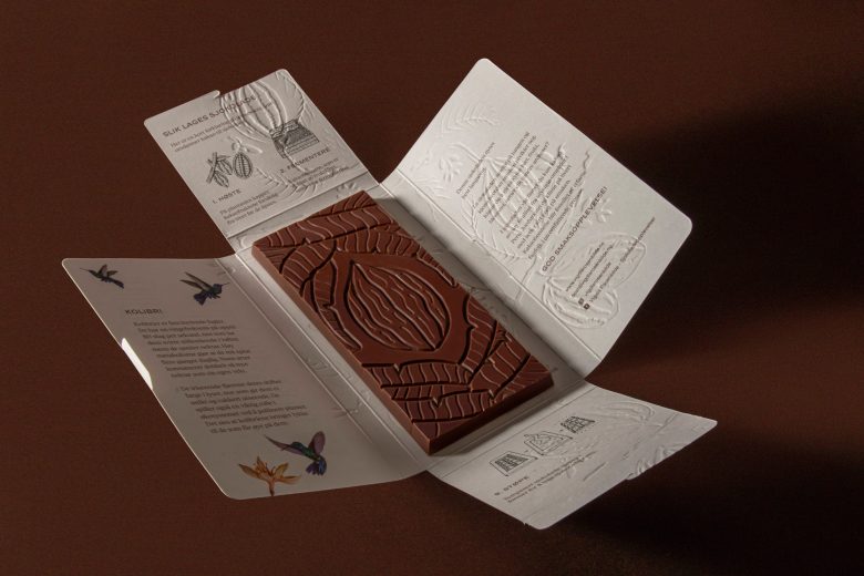
To express this, we created a surreal universe where the Amazon comes to life with giant cacao plants and fused botanical species. Amazonian animals interact with the ingredients, emphasizing the contrast in scale. Each package features a single tree on an off-white background, with illustrations inspired by vintage botanical and zoological books, achieving a believable magical realism.
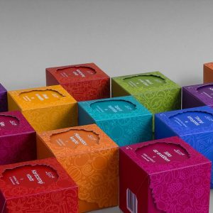
The chocolate’s technical information was systematized into structured panels with a pastel earth-tone palette, while the finishes enhance the perception of quality: textured paper, foil on the logo, and embossed details that bring the elements to life on the packaging, completing the experience.
Designed by Fibra Branding
Add to collection