




Every Half by NYFsaigon
posted by retail design blog on 2026-07-08
Add to collection
Every Half Coffee Roasters briefed a packaging system redesign*: A brand that needed to read louder than its own SKU names, scale across a growing range of origins and roasts, and stand out at thumbnail size on shelves dominated by all-over-the-World specialty coffee. The guardrail was clear: distinctly Vietnamese culture, without falling into cliché.
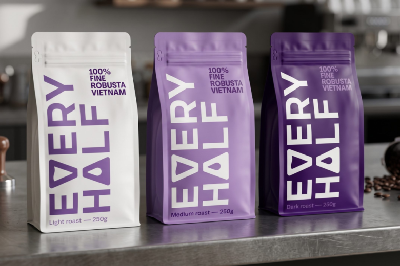
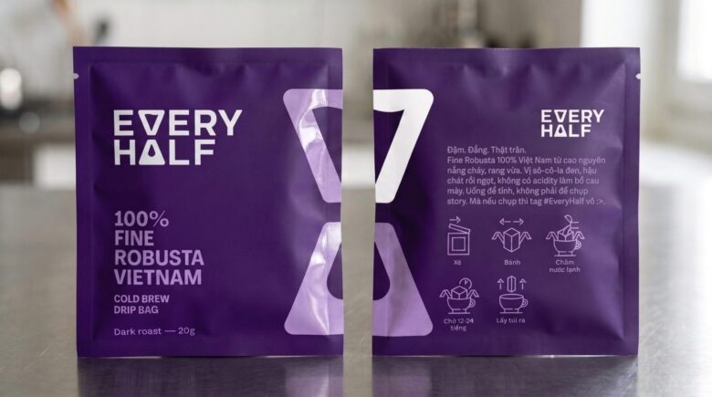
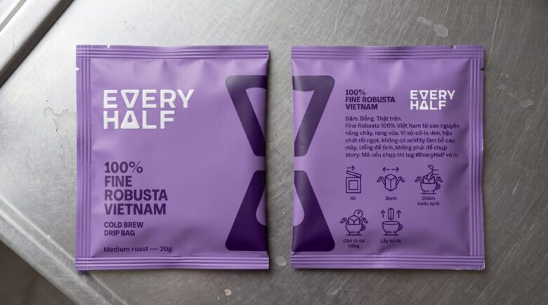
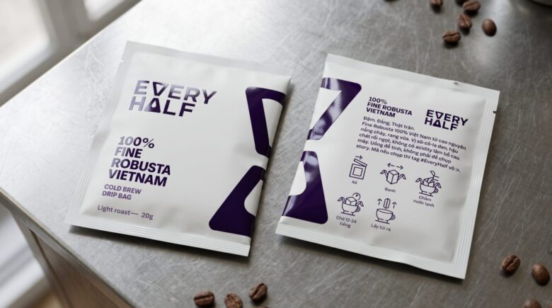
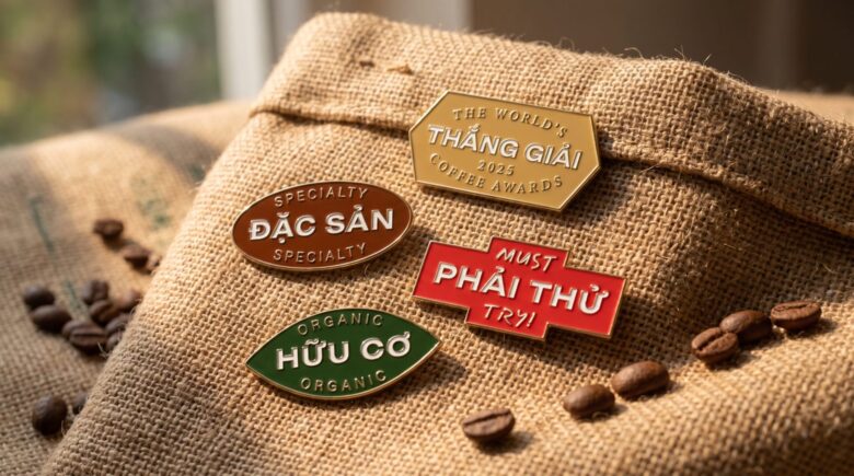
Three directions explored different approaches to the same problem. All three directions work within Every Half’s existing color system, treating the purple-to-dark-purple gradient as a roast-level indicator, from light to dark, literal and legible. A separate sticker/indicator system sits on top of all three directions. It keeps print costs flat as the range grows.
The first direction is the most direct (and practical): I rotates the wordmark 90°, run it full height down the pack face, and let the brand name do the work. No illustration, no supporting graphics, just Every Half, big and bold, as large as the format allows. On e-commerce thumbnails or on shelves where most specialty coffee packaging reads as noise, a name this size becomes its own signal.
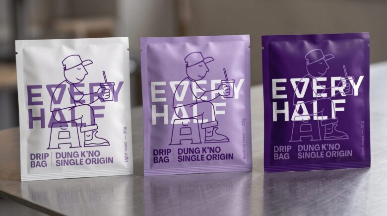
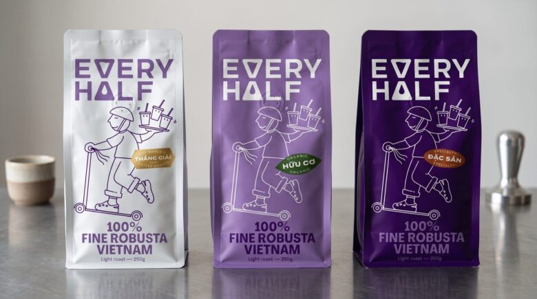
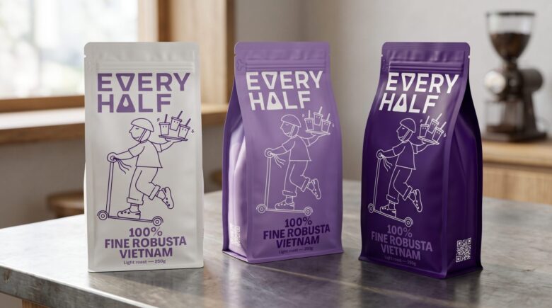
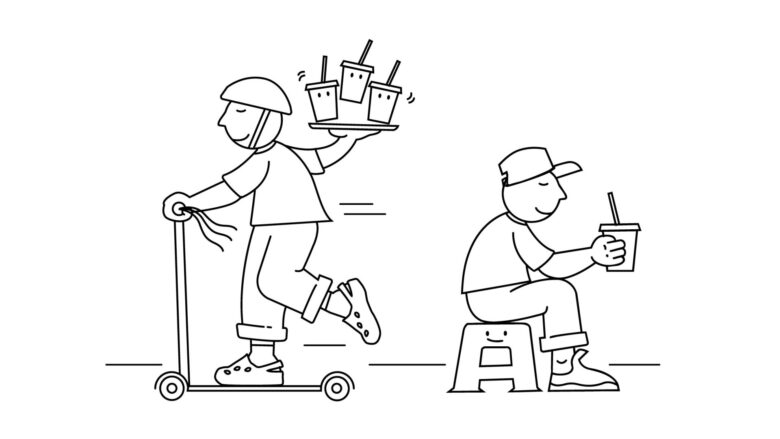
The second pulls from the street-level rituals that define Vietnamese coffee culture: delivery riders balancing trays through traffic, people drinking on low plastic stools on sidewalk. Drawn from observation rather than postcard iconography, the illustrations sit directly on pack as the primary visual, letting the moment carry brand personality across SKUs. I used the simplified variant, 2D flat, side view for this direction.
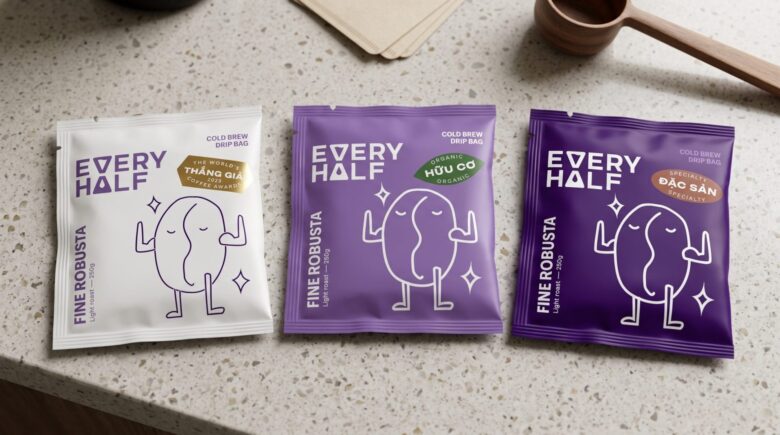
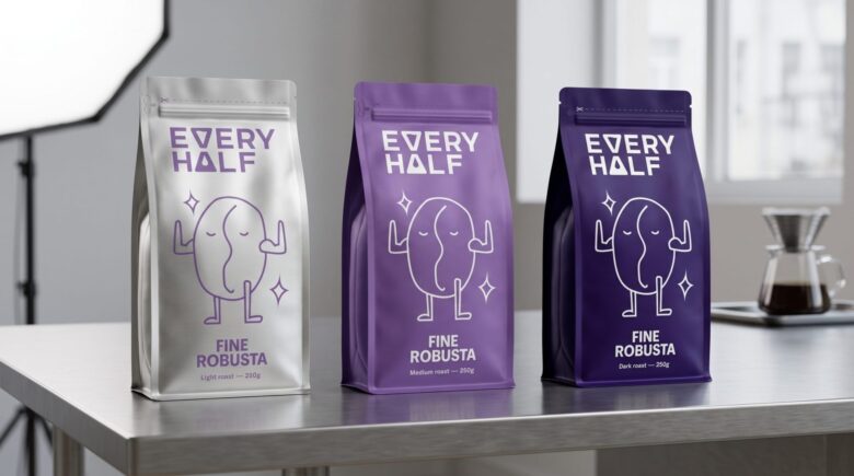
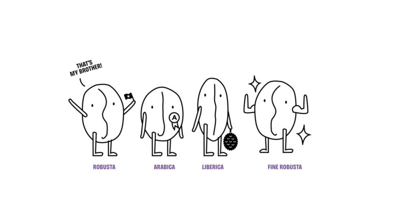
The third introduces a cast of coffee bean characters (Robusta, Fine Robusta, Arabica, Liberica – cà phê mít) each mapped to its origin . Built to extend naturally across future product expansion while maintaining system consistency.
* Packaging concept developed based on a commissioned brief for Every Half Coffee Roasters. The project did not move forward to production.
Designed by NYFsaigon
Add to collection