




Add to collection
Problem
Global warming is no longer a threat of the future — it is happening today. One of the underestimated factors contributing to this issue is food waste. According to the United Nations, food loss and waste account for approximately 8–10% of global greenhouse gas emissions, exceeding the emissions produced by the entire aviation industry. A significant share of this waste comes from fruits and vegetables that are discarded simply because they are not consumed in time.
Idea
To position frozen foods as a conscious everyday choice for reducing environmental impact through packaging design.
Solution
Nativo is a frozen fruit and vegetable brand that promotes a more responsible approach to food consumption. By extending shelf life and reducing food waste, frozen foods provide a simple way to lower the environmental impact of everyday eating.
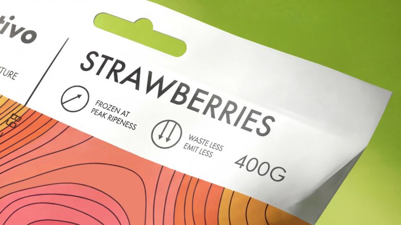
Instead of relying on vague eco-friendly claims and “bio” terminology, Nativo communicates through scientifically supported facts. Rapid-freezing technology preserves the nutritional value, taste, and freshness of vegetables while helping reduce unnecessary waste. Sustainability is not presented as a marketing statement, but as a measurable result of technology.
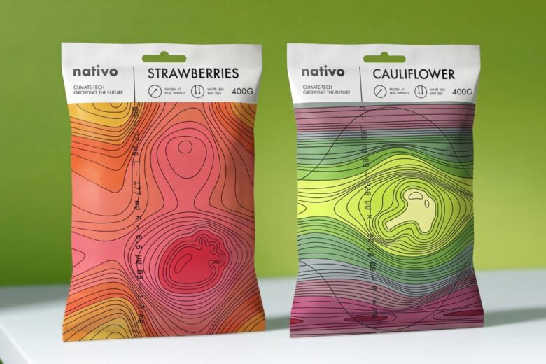
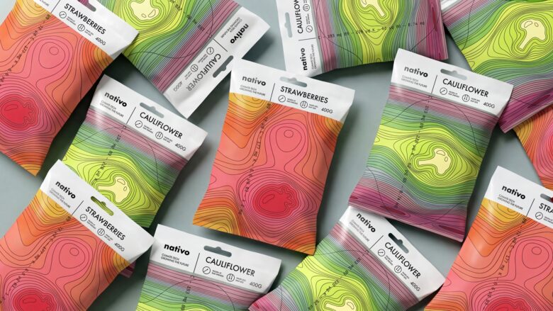
The visual identity is inspired by the climate maps of German geographer Karl Troll. Their graphic language is reinterpreted as a visual metaphor for natural processes and the preserved qualities of each frozen product.
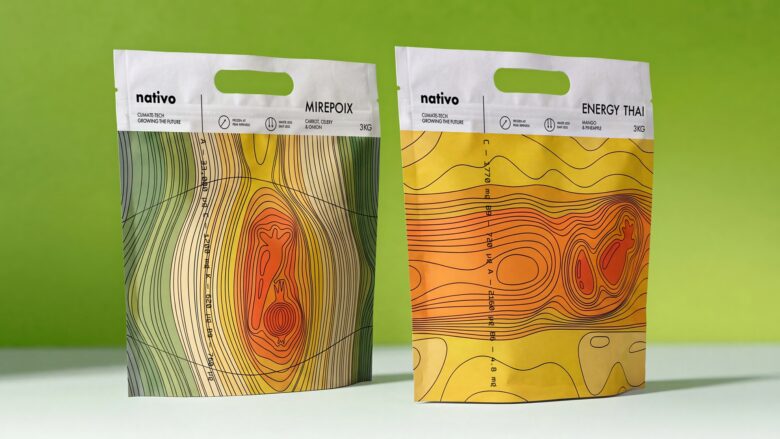
Each package places the product at the center of the composition, highlighting its freshness and nutritional value. A vertical information panel emphasizes key vitamins, while the typography references the aesthetics of the original climate maps, reinforcing the scientific foundation of the concept.
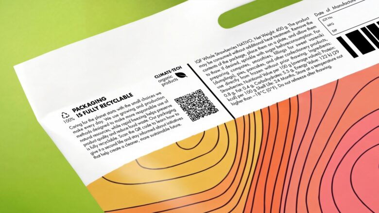
The back of the packaging features the brand story along with clear recycling instructions, encouraging responsible disposal.
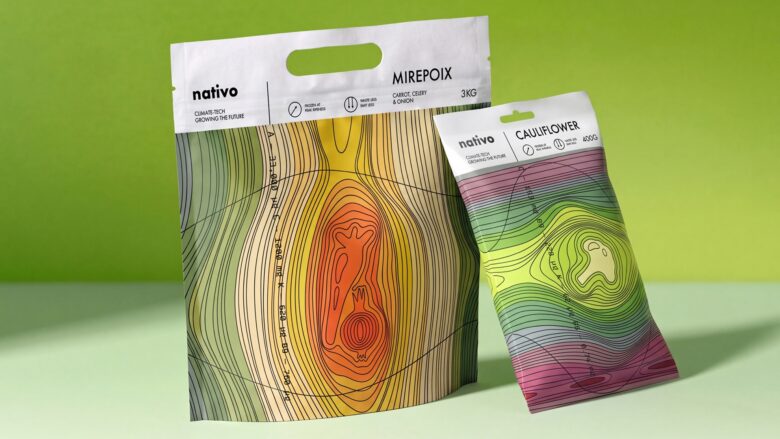
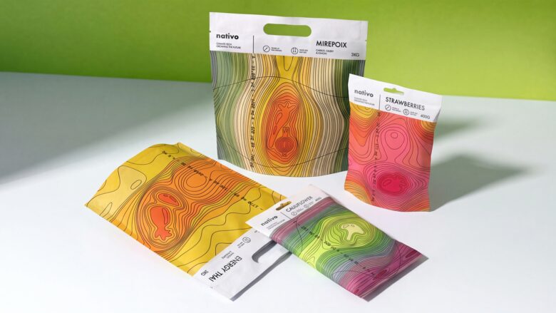
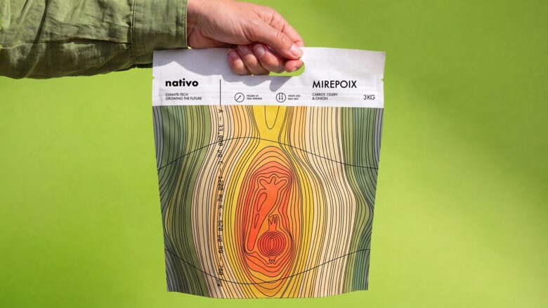
The packaging system includes two formats: compact bags for individual fruits and vegetables, and larger bags for mixes. In the larger format, the Euro Slot is transformed into a functional carrying handle, improving usability without adding extra material.
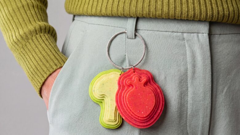
The concept of sustainable consumption extends beyond the packaging itself: branded merchandise made from recycled plastic reinforces the brand identity and creates a consistent experience.
Curator’s Insight
What makes this system work is the borrowed authority of its source material. Topographic climate maps carry an inherent visual credibility, they’re instruments of measurement, not decoration. By lifting that language directly onto the packaging surface, Nativo sidesteps the usual visual shorthand of “sustainable” branding (kraft paper, leaf icons, muted greens) and instead builds legitimacy through structural mimicry of scientific data visualization.
The contour lines aren’t just pattern. They function as a rendering technique for ripeness itself, with color temperature shifting from cool edges to a hot, saturated core where the product sits. This creates a kind of visual heat map logic: the eye reads concentration and intensity before it reads the product name, which is an unusual hierarchy for frozen food packaging, a category that typically leads with product photography or bold single-color blocking.
The vertical typographic strip running alongside the imagery, styled like map annotation text, does double duty. It reinforces the cartographic conceit while giving the nutritional data a reason to exist in that position rather than being relegated to a standard back-of-pack panel. It’s a small structural choice that keeps the scientific framing consistent across every touchpoint of the pack, not just the hero graphic.
Across the multi-SKU spread, the varying gradients per product (strawberry reds bleeding into cauliflower yellows) create enough differentiation for shelf navigation while keeping the system unmistakably unified. That balance is often where cross-category frozen lines fall apart.
Designed by Eva Chistyakova
School: HSE ART AND DESIGN SCHOOL 5


Add to collection