





Hoshi Matcha by majitoo
posted by retail design blog on 2026-08-20
Add to collection
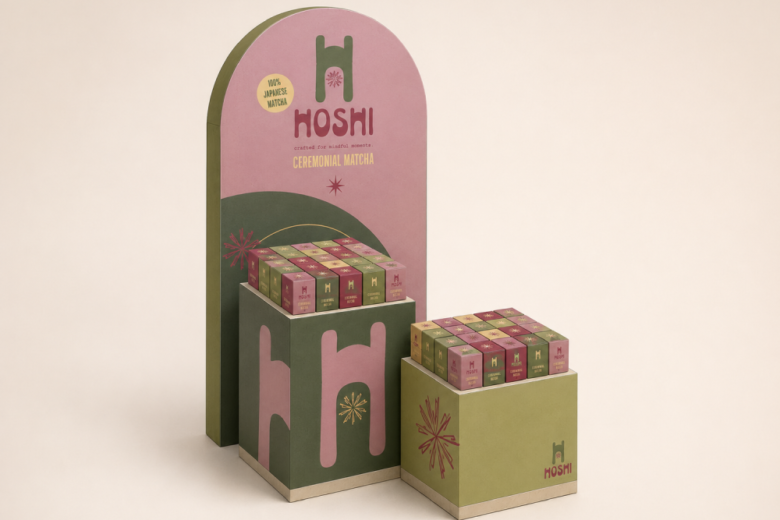
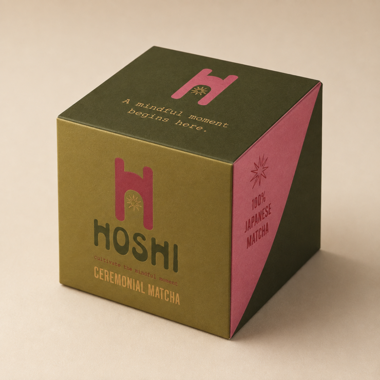
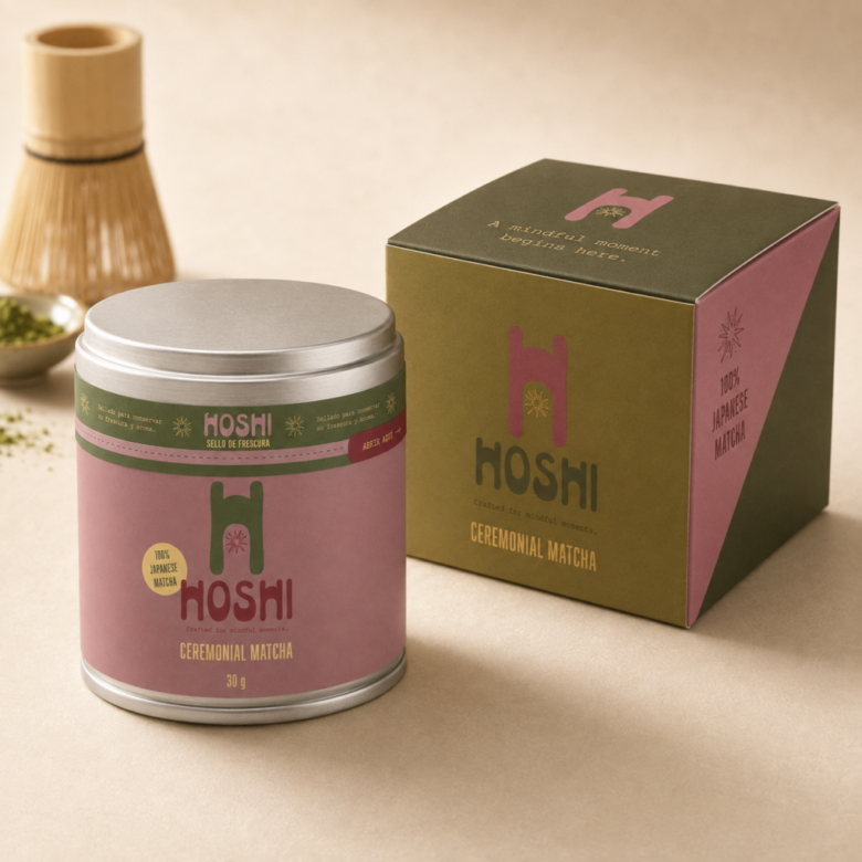
Hoshi is a university project that involved developing the visual identity and packaging for a ceremonial matcha brand from the ground up. The process included research, conceptual development, naming, logo design, colour palette, typography, packaging design, a tamper-evident seal, structural box design, a physical prototype and mockups.
The name Hoshi means “star” in Japanese and represents light, guidance and special moments. The concept presents the preparation of matcha as a small ritual of calm and well-being. The phrase “Crafted for mindful moments” reinforces this idea and defines the brand’s calm, approachable, youthful and contemporary personality.
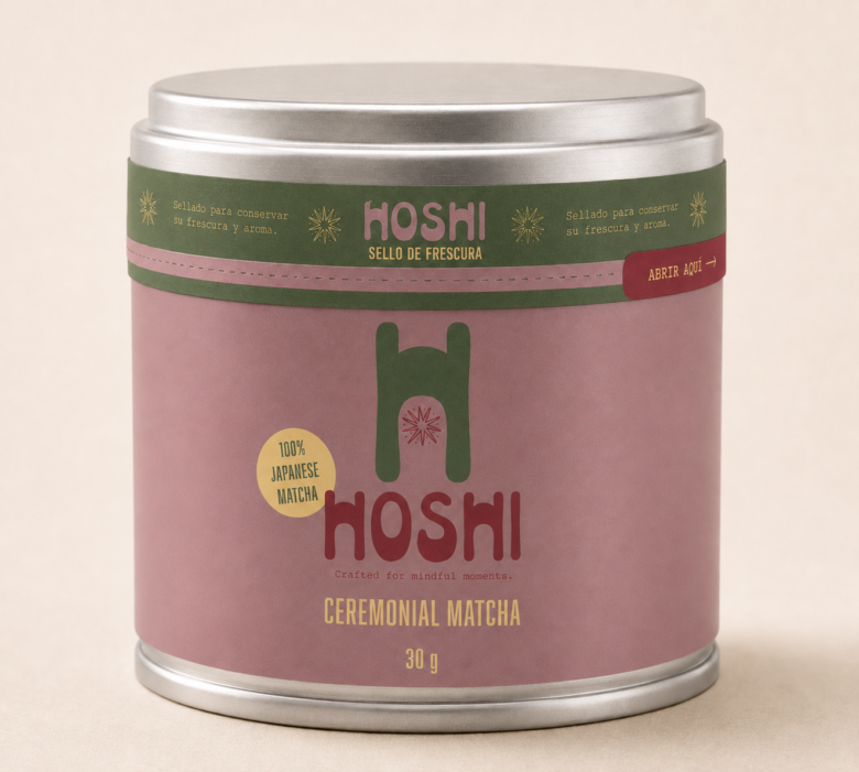
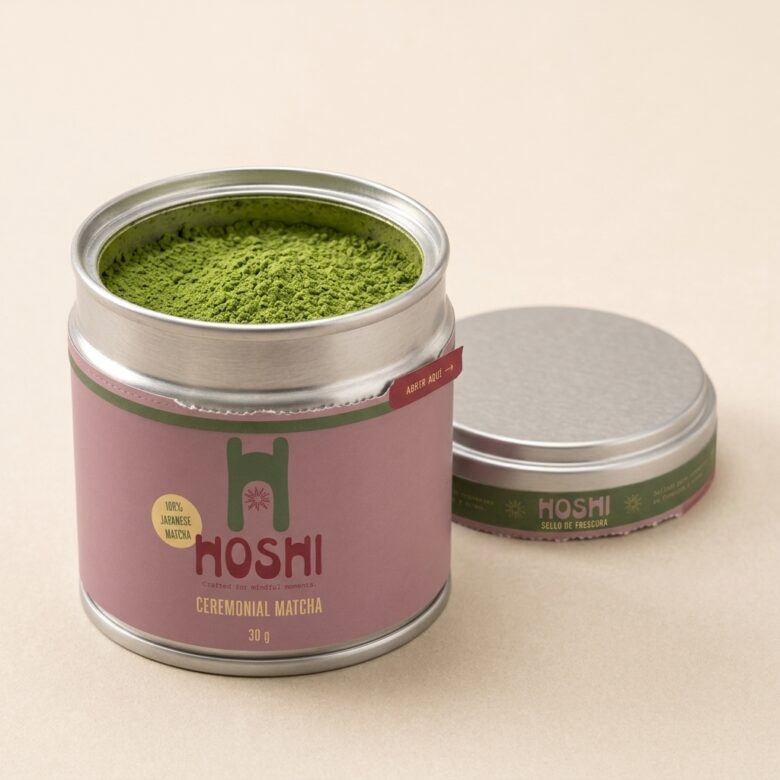
The visual identity combines olive green, dusty pink, raspberry red and creamy yellow. These colours connect the brand to nature and matcha while helping it stand apart from more traditional offerings. Organic forms and handcrafted typography add warmth and originality.
The project also included a metal tin with a label, a micro-perforated tamper-evident band and a box with a circular insert designed to protect the product and hold it securely in place. The result is a complete and cohesive visual system that brings together branding, packaging design and the unboxing experience.
Designed by majitoo
Add to collection