





AVOKIND by Prime
posted by retail design blog on 2026-09-24
Add to collection
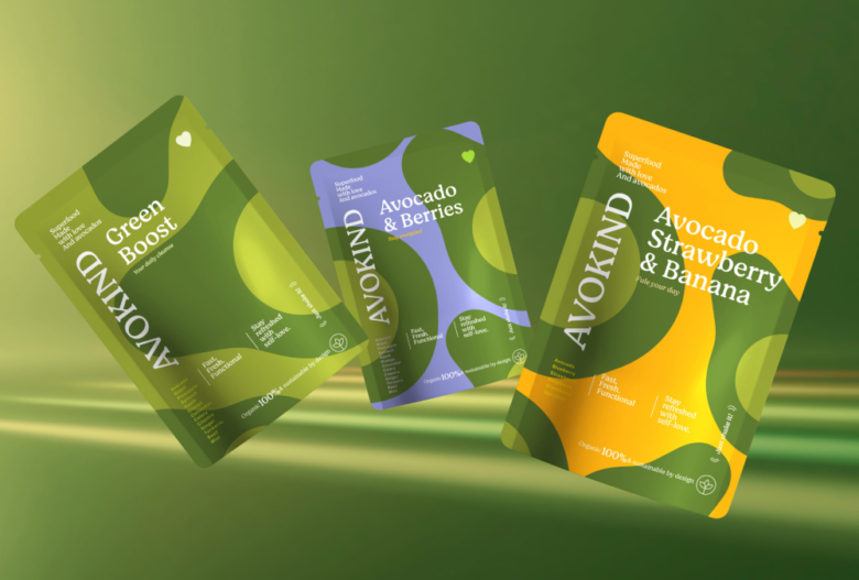
AVOKIND — Brand Identity & Packaging
We love creating brands. But what we love even more is giving them a personality that’s impossible to confuse with anyone else.
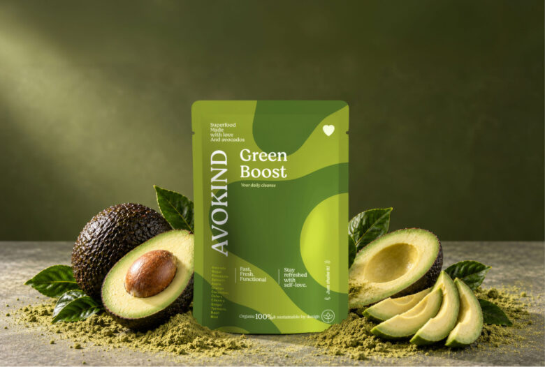
AVOKIND starts with the avocado and grows into a vibrant visual universe built around freshness, energy and self-love.
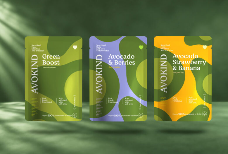
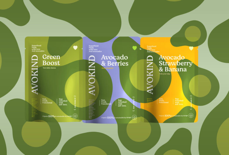
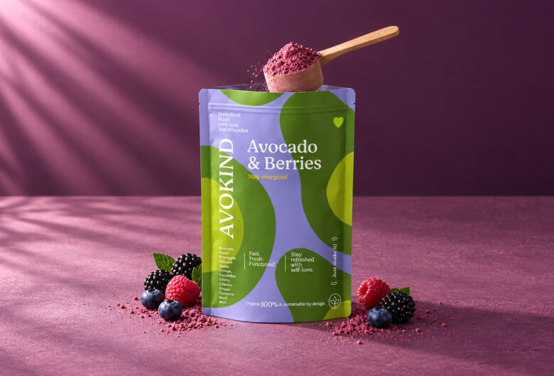
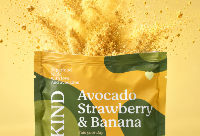
Inspired by the organic shapes of the fruit itself, the identity combines bold color, fluid forms and expressive typography to create a packaging system that feels fresh, playful and instantly recognizable. Each flavor develops its own personality through a distinctive color palette, while remaining unmistakably part of the AVOKIND family.
From the brand identity to the packaging, every element works together to turn a functional superfood product into something with character — designed not only to stand out on the shelf, but to be remembered.
Branding you notice. Packaging you crave. A brand you remember.
AVOKIND — Fast. Fresh. Functional
Designed by Prime
CCO: Charly Arias
Brand Leader: Julie Houtevelts
Art Director: Tony Agüero
ThePrime® — carias@theprimemx.com
2025© All Rights Reserved
Add to collection