




Roastery Studio by ahmedraoudgfx
posted by retail design blog on 2026-10-08
Add to collection
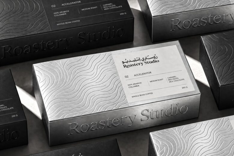
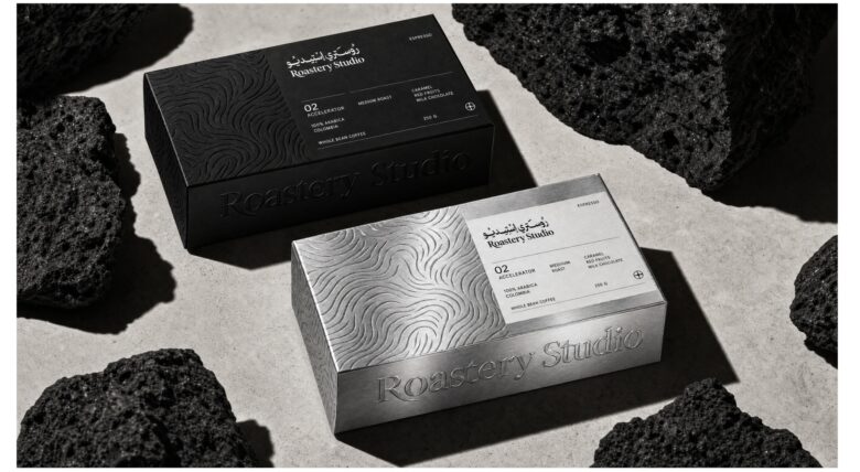
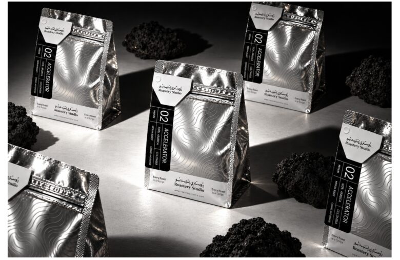
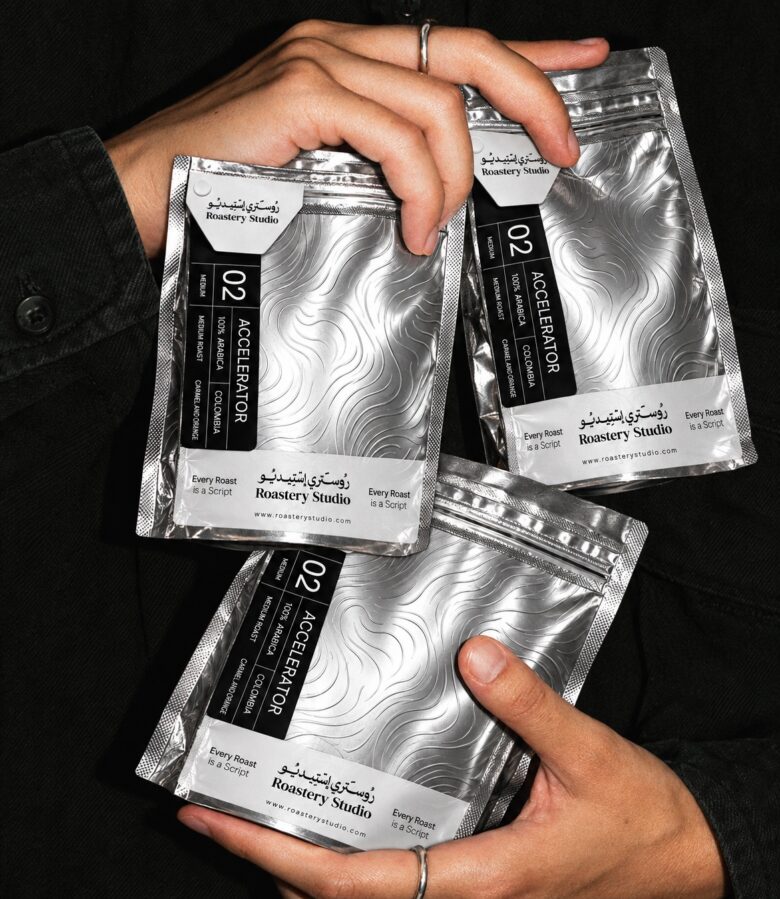
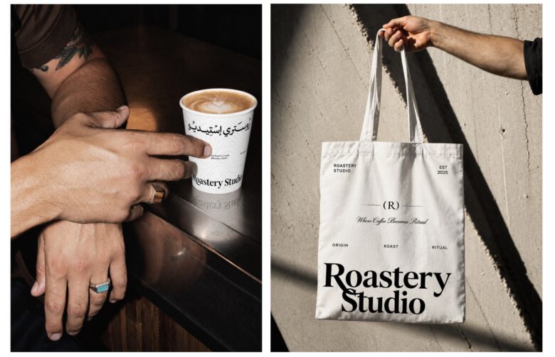
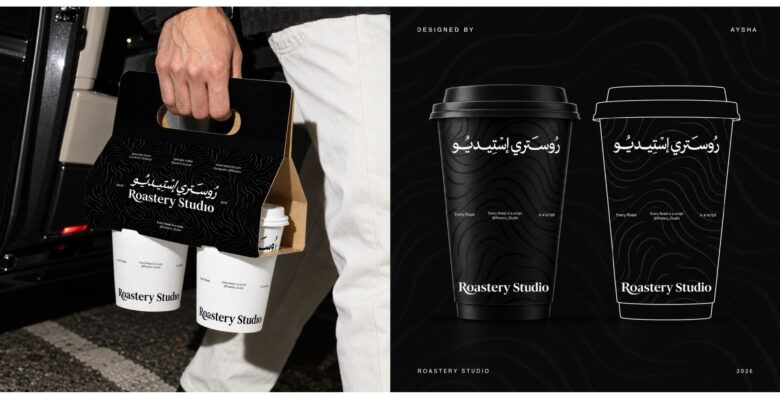
Roastery Studio’s packaging brings together metallic textures, bold colour, and Arabic and English typography to create a distinctive identity across coffee bags, takeaway cups, and boxes.
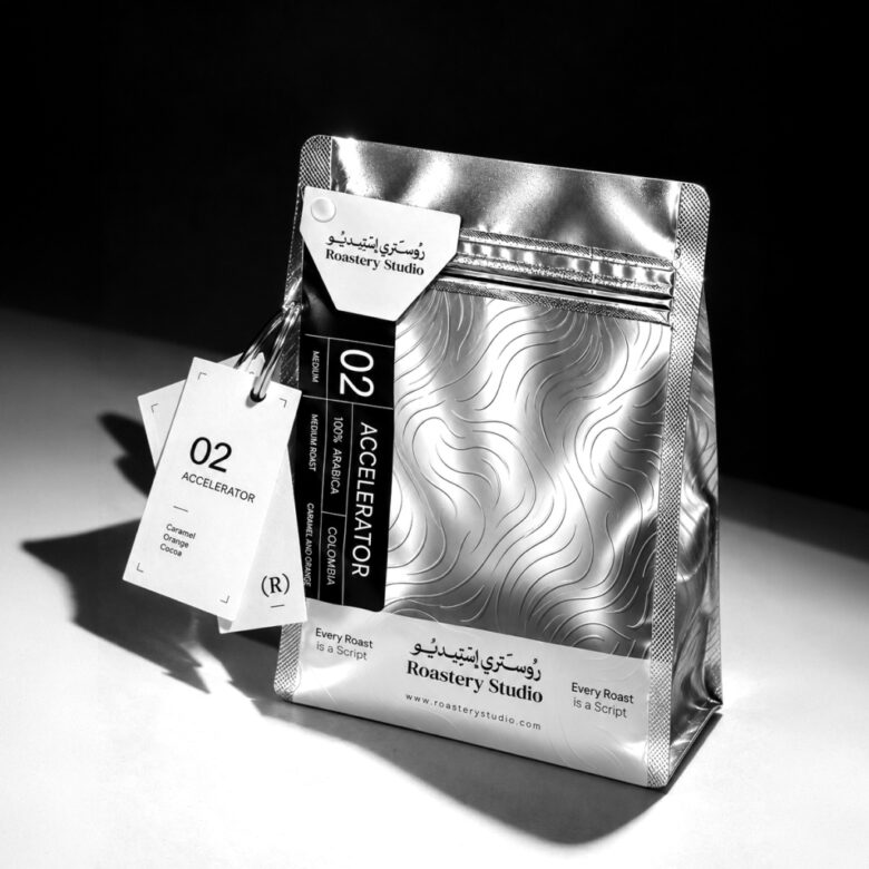
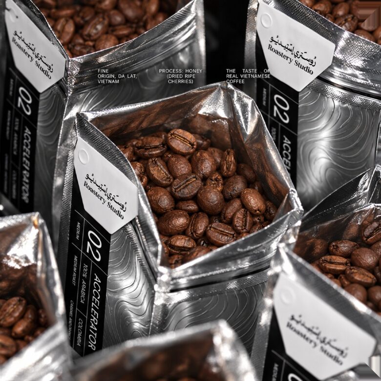
The silver coffee bag features an embossed wave that adds depth and texture to the metallic surface. A black front label provides a contrasting area for the brand identity, while a white side card introduces another layer to the composition. The design balances expressive material details with a clear graphic hierarchy.
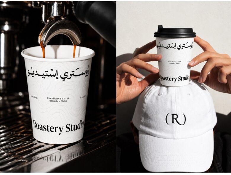
The red takeaway cup offers a bold counterpart to the silver packaging. Its white rim, subtle pattern, and Arabic and English brand signatures connect it to the wider identity while giving it a recognisable presence of its own. Across the packaging family, consistency comes from the relationship between typography, colour, and graphic placement rather than repeating an identical layout on every format.
The project explores how these elements adapt to different surfaces and proportions, from flexible bags to curved cups and boxes. Each application contributes to a cohesive brand experience while retaining its individual character.
The presentation follows a direct-flash visual direction, with crisp shadows, tight crops, and café settings that highlight the packaging’s textures and contrasts. Together, the graphic system and material choices give Roastery Studio a bold, tactile expression rooted in everyday coffee rituals.
Designed by ahmedraoudgfx
Add to collection