




Fullspan by Sirka Agency
posted by retail design blog on 2026-10-22
Add to collection
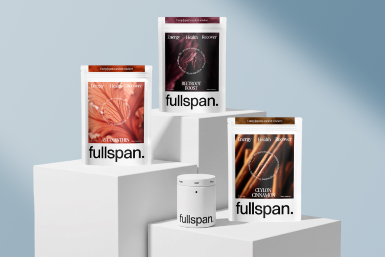
The project’s goal was to develop the positioning, visual identity, and packaging for an American DTC brand of single-ingredient supplements. The target audience is adults 40+ who want to keep their energy and health for the long run.
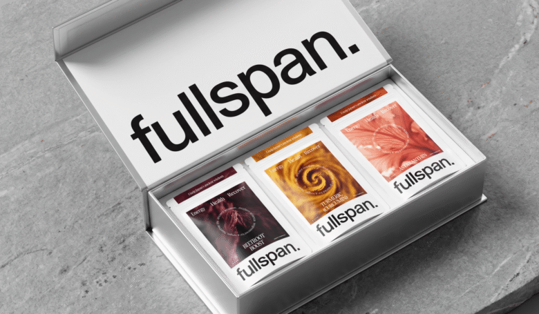
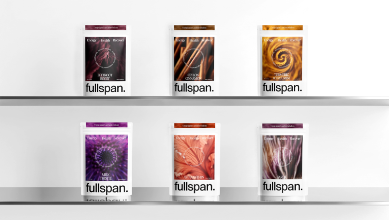
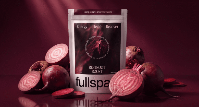
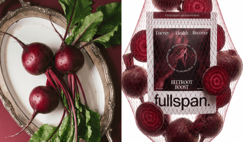
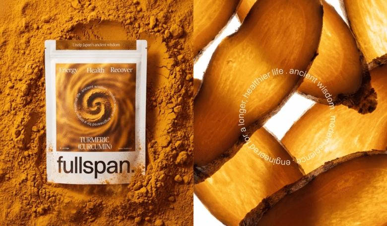
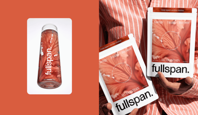
The design system moves away from the language of the pharmacy shelf, with its “miracle pills” and hidden formulas. The brand speaks the language of transparency: one ingredient, a known origin, a proven dose. Its in-house science team scouts the world for the purest, most effective active ingredients, and each of these priceless finds takes the hero spot on the front of the pack. Since every product is 100% a single ingredient, it earns a wide-format macro photograph of its own, abstracted into a texture and paired with a distinct color code.
Because the brand is built on naturalness, a refill system was a natural fit. The first order arrives in a reusable jar with a tracker: weekdays on the rotating lid turn taking supplements into a daily habit. After that, the jar is refilled from refill pouches that use significantly less material than new packaging.
Designed by Sirka Agency
Head of Marketing: Kirill Ivannik
Art Director, Designer: Yana Radchanko



Add to collection