

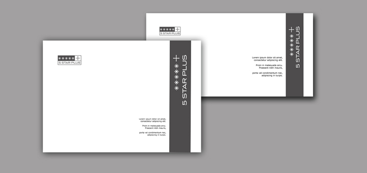
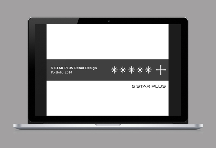
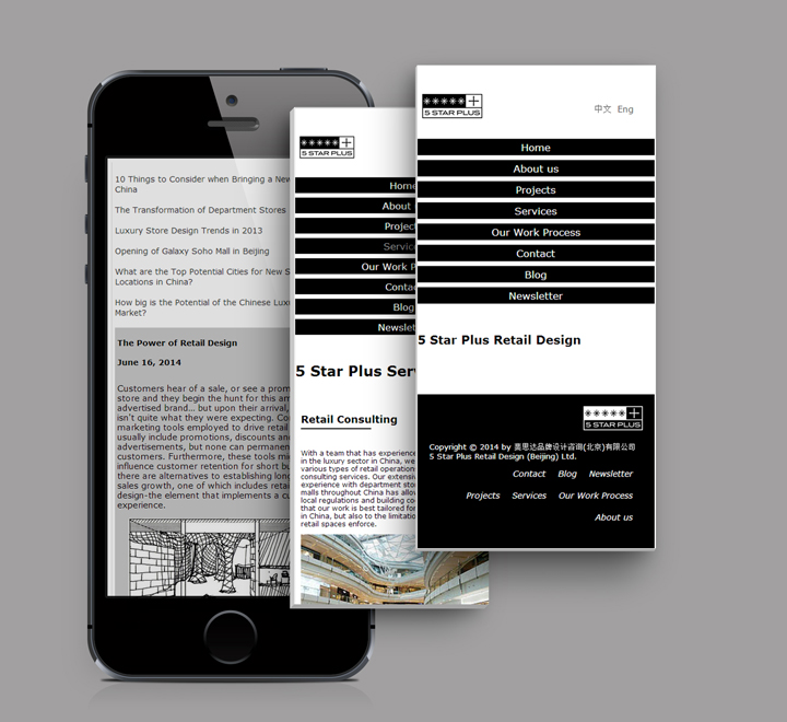
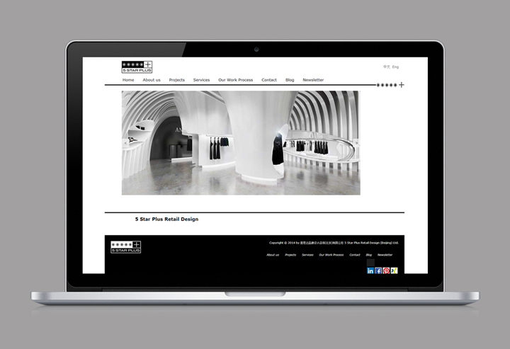
5 Star Plus Retail Design are China’s first one-stop service provider offering branded retail design, store design, consulting and project management services to international luxury and retail brands. A couple of months ago, the design agency decided that it was time for a new, more consistent visual identity. The team wanted one coherent design that would make a strong design statement. Within the scope of these redesign efforts were the update of the 5 Star Plus Retail Design logo, business cards, stationary including presentation and letter templates, as well as the email newsletter. The website had to be redesigned as well and become responsive, making an impression to clients and business partners.
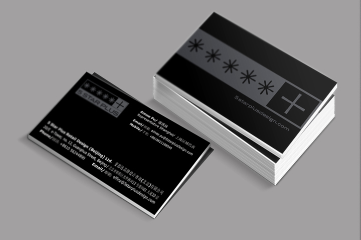
The visual identity design had to accurately represent the firm’s positioning; it had to look professional, sophisticated, inspiring, bold and creative. It was also important to the team that the new visual identity and especially website would indicate the creative services they are providing, ideally by featuring a number of sketches and design work. One of the major changes as compared to the old visual identity was the switch from a formerly black to a white background for increased readability and a more professional look. The addition of selected design elements, such as different applications of the logo, as well as some conceptual images, ensured a creative vibe of the website and documents. The result is a powerful visual identity that works with the contrast of black and white and leaves a lasting impression.



Add to collection

