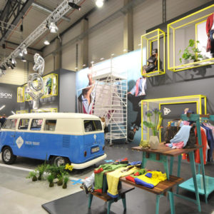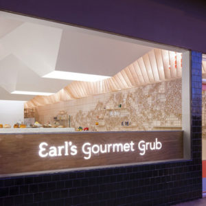


Having successfully opened a temporary store earlier this year, FRAME magazine decided to continue at another location designed by i29 interior architects. At the Felix Meritis European Centre for arts, culture and science, the monumental ‘Zuilenzaal’ was transformed into ‘FRAME store, Amsterdam‘, a mirrored universe that reflects and intensifies its grandeur.

Flexibility and being able to change the display identity completely was the main focus. Thus, the space offers a three-dimensional experience of the magazine – a creative and innovative world that surprises and invites exploration. Working within this context, the studio proposed a radical concept: two shops in one with the coexistence of contradictory atmospheres. Seen from the front, a museological installation of white panels and black frames floats throughout the exhibit. Hanging from the walls, floor, and ceiling, these components are meant to replicate a blank canvas, as the use of text and graphics provided by artists link back to FRAME’s origins.
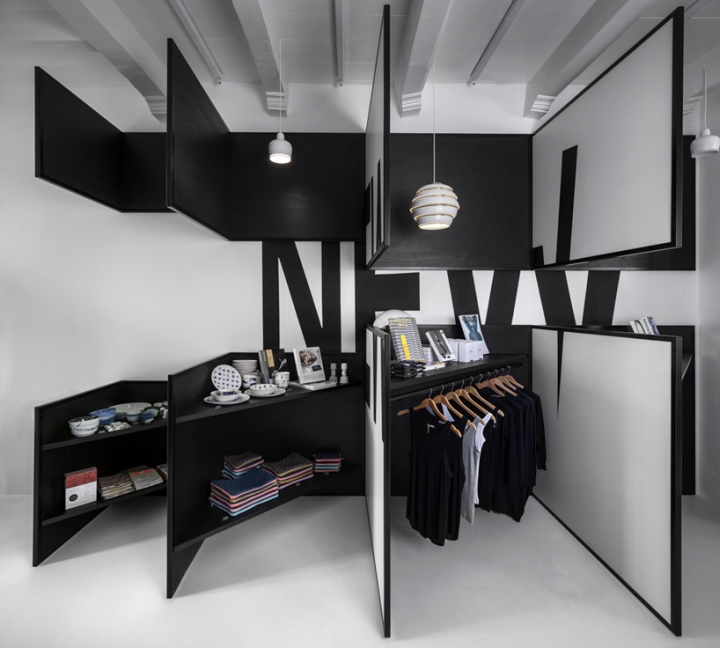
Looking from the back towards the entry offers a completely different environment. Triangular display boards in black stained wood show the actual products behind the front panels. In order to enlarge and amplify this contrast, all choices made are antithetical: black versus white, square vs triangular, and empty vs full. During the opening party, conceptual artist Niek Pulles presented a series of masks called ‘Future Tribes’.
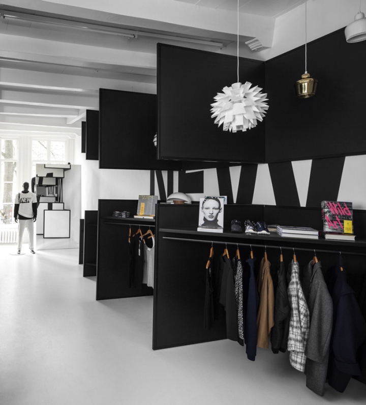
Detailed portraits of these artworks were embedded into the displays. Also, the an anamorphic element in the form of the word ‘new’ was displayed over several partitions playing with the multi-dimensionality. Both presentations clearly show the impact and possibilities of the approach combining 2D and 3D presentation in one store.
All images courtesy of i29 interior architects


Add to collection
