

This little wine bar is located in front of the oldest bridge in Paris, the Pont Neuf. It was designed with two major elements: the first one is a central wooden piece which is planned to work as a large table for customers; the second element is an equipped and practical bar counter, in line with the table. This solid wooden piece clearly fits in the room. It stands in the middle of this confined corridor and becomes the key element of the place. We lean on it: standing, seated, face to face, sideways… an orthogonal side with salient and rational angles, and a rounder side combining curves and counter curves. This ambivalence brings a massive and yet precious feeling to this table / counter, making customers at ease.
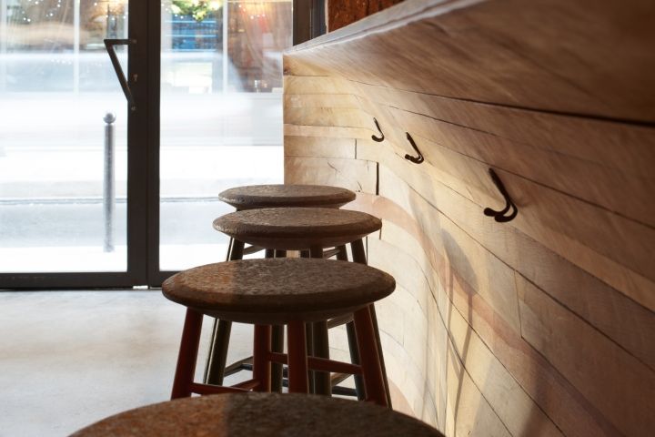
They gently touch the wooden curves, move freely around it, nest in the hollow of a curve… a real interaction occurs between the object and the customer. This item is close to six meter long. The architects and the carpenter designed it together, in a hand-crafted way. The basic principle is the piling up of wooden layers of different thickness, width and varieties according to available wood boards at the carpenter’s workshop during the study (oak, ipe, pine…). Once the layers were piled up and assembled, carving and sanding began. It needed to comply with the original drawing of the lines of the bar, in order to address the ergonomic obligations of the use of a counter: get the legs comfortable, seats height, etc.

A long reversed prism spreading out on the ceiling meets this massive anchored to the ground object, as long and wide as the table/counter. This inverted base becomes a large varnished crude steel and custom-made glass rack. A large wall for bottles exhibition spreads out on one of the side walls, all the way to the back of the room. This wall is in the same vein as the rest of the bar. It highlights the materials used in the place: stone, bricks or wood. This large wall panel is designed in a more decorative and graphic way. It was created with digital tools (CNC-controlled milling machines and laser cut technique).

It brings back the marquetry aesthetics with harmonious juxtaposition of triangles, with shading off tints created by the varieties of wooden veneers (mahogany, cherry and wenge woods). Some mirror triangles show in this colorful tones, bringing sparkles, reflection and light games. The upper level triangles are made of slate, to allow the writing of menus. Bottles are placed on black Valchromat adjustable shelves. In front of this decorative wall, we find two large «eat standing» elements made of extremely light folded steel sheets, reminding of simple origamis floating in the air.
Design: Atelier JMCA


Add to collection
