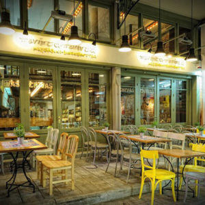
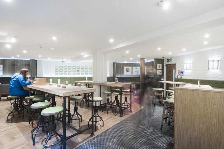

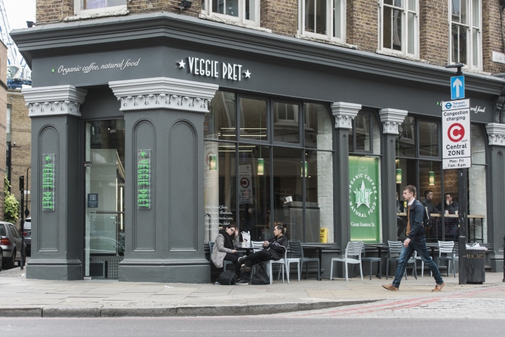
Spring has sprung and Pret A Manger has a new green store opening up on Great Eastern Street in East London. Your Studio worked with Pret’s creative team to create a new design palette for their veggie concept, building on design features from their concept in Victoria, London. The space is vibrant, spacious and the perfect environment to officially launch their vegetarian offer after testing the market last year. The building’s facade has been painted in classic tones of grey which pick out the architectural details and give a more sophisticated restaurant feel to the approach with more seating in the window space.
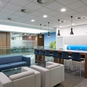
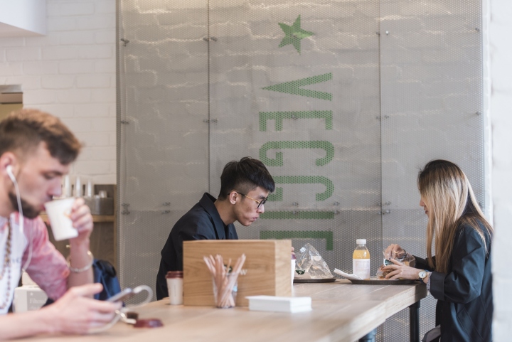
With a stronger street presence, the store has more kerb appeal to stand out on Great Eastern Street.The ground floor is bright and clean with layouts and flow optimised to serve more customers in a short amount of time as well as having comfortable seating in the perimeter for customers with more time. The downstairs floor has large sharing tables, green banquette seating, corner booths; this combination of seating throughout the space is new to Pret sites.
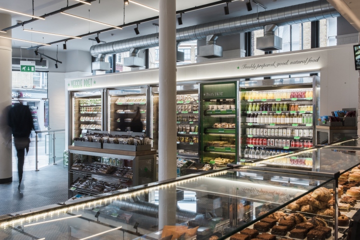
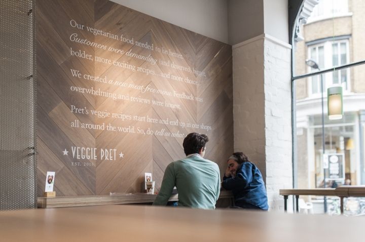
It’s a cosy nook to meet friends, eat tasty vegetarian food and drink turmeric lattes. Pret’s new graphic direction works seamlessly in the interior showing new materiality, such as white handwriting type applied to wood chevron panels. The new lighting concept allows the interiors to adapt to the outside weather, therefore can become brighter inside on a dark winter day. The lighting is integral to the store design as it respects and upholds Pret’s commitment to providing fresh coffee and natural food products which is at the heart of their offer.
Design: Your Studio


Add to collection
