
Power of Plant is a new brand from Austria focusing on development of 100% natural products through fair business practices and hand-made production as the alternative to mass industrial process. Starting with hemp oil and aromatic oil immortelle, they will eventually expand their offering to hemp protein powders, aromatic oils and cosmetics. Most similar products in the health food market rarely invest in quality branding and design, which eventually created an industry of poorly designed natural products, most of which look unprofessional, muddled with “alternative” brands thus suffering from low credibility with mainstream consumers.
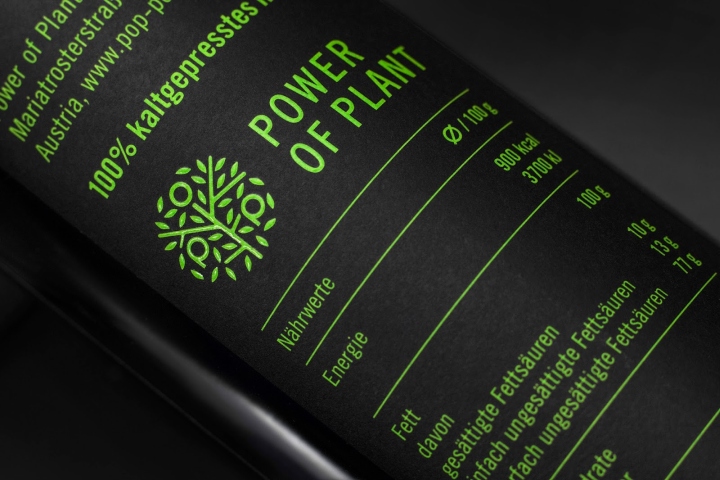
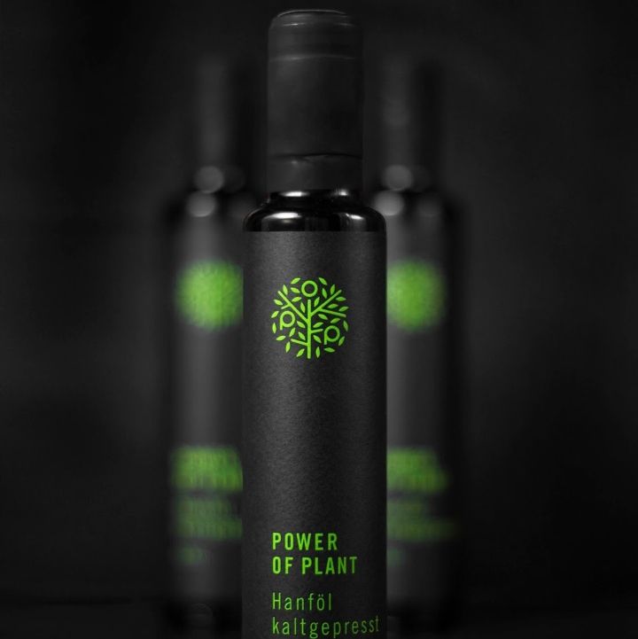
In our talks with the client it was decided to make a simple, minimal label which would position the brand within the mainstream, but keep it upscale and credible. It was designed to stand proud on the shelf right next to quality extra-virgin olive oils, for example. Using the branded house model, Power of Plant logo is the carrier of visual identity for all products making it simple and affordable to expand the future line of products.
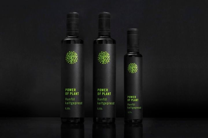
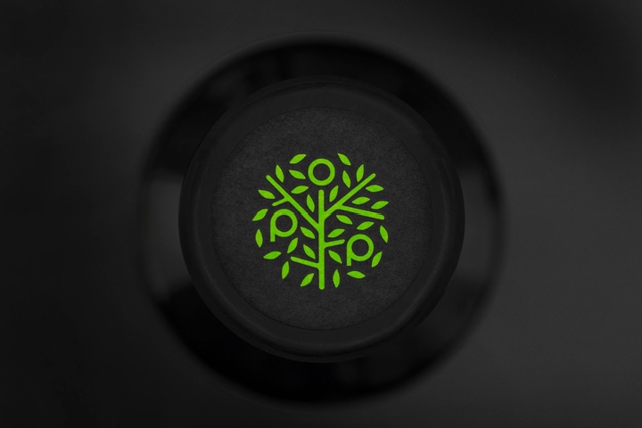
The logo is a powerful mark which represents the harmony of man and nature. Tree branches, resembling a human with their arms spread and geometric letters P.O.P., symbolizing fruits, are interwoven into a memorable, dynamic logo. Vivid green color is used to show energy/power, with future products having their own vivid color. Hemp Oil Label was printed in two colors on Tintoretto Gesso with Braille effect varnish to give texture subtle detail.
Design: Manasteriotti DS
Photographer: Ana Valjak
http://www.packagingoftheworld.com/2017/05/power-of-plant.html


Add to collection


