
healthy honey collection packaging by THE.ENDORPHIN.COMPANY
posted by retail design blog on 2017-01-26
Add to collection
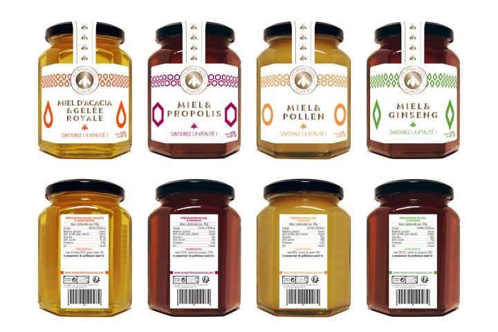

“Les Apiculteurs Associés” has been producing and selling honey since 1980, and is now one of the main honey brand in France. In 2014, they’ve reach the step of 2000 tons of packed honey, with more than 60 references. In november 2016, they’ve launched a new collection, “healthy honey”, made of 4 products (honey & Royal Jelly, honey & pollen, honey & Propolis, honey & Ginseng).
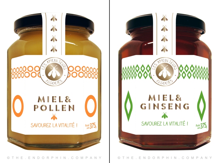
Our aim by working on this collection’s packaging, was to make a striking design, break the traditional codes of “Les Apiculteurs Associés” old collections, and overall, the other brands’ collections. By making a pared-down styled design, we wanted to bring up the modernity, the healthy and premium aspects of the new products.
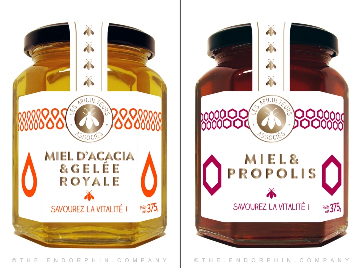
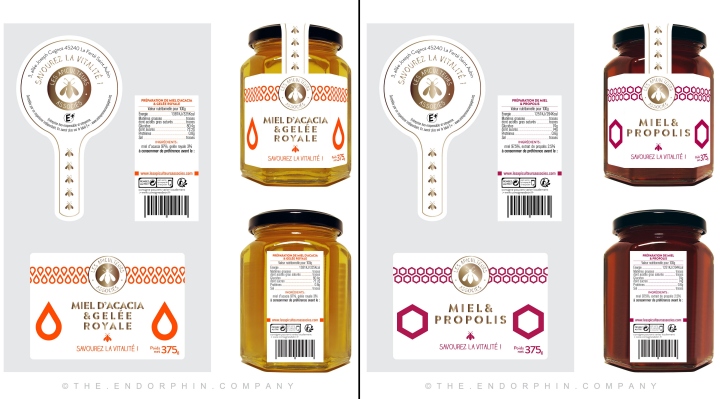
We decided to use a plain white label, in order to create a real contrast between the honey color through the pot, and the label.
We designed 4 symbols representing each product :
– a drop of Royal Jelly
– an honeycomb (which bees protect with Propolis)
– the round shape of a pollen grain
– a Ginseng leave
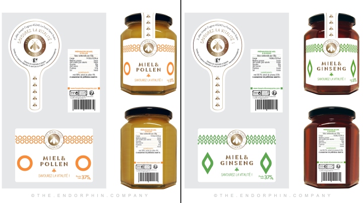
As the pots have hexagonal shapes, each symbols is placed in big size on its both sides, so it strikes the customer’s attention even though he doesn’t exactly face the pots. The symbols are also used on top of the label, making patterns to dynamise the design and contrast with the white background. The labels are a mix of white mat laminated paper and gold hot foil, which gives the pots a premium look.
Design: THE.ENDORPHIN.COMPANY


Add to collection