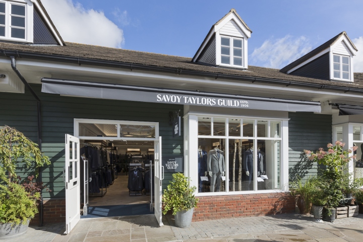


The opening of Savoy Taylors Guild’s latest Bicester Village location heralds an exciting new chapter in the firm’s long history. Launching in a new Bicester Village location, Savoy Taylors Guild unveil a bespoke retail update as part of their revitalised brand identity. HMKM’s concept redefines the firm’s customer as a discerning yet irreverent character who enjoys the best that life has to offer, and needs a sophisticated wardrobe to match.

This in turn inspired HMKM’s approach to both the store design and graphic language; classic, with a twist. When the first Savoy Taylors Guild store opened on the Strand in 1906, the press sang its praises; ‘No tailoring house in London has such beautiful premises.’ was the Telegraph’s review. Its grand plate-glass windows, beautifully crafted cabinets and intricate plaster mouldings created a luxurious yet modern interior that made it the most notable gentleman’s outfitter of its day, and set a new standard for the city’s blossoming retail scene.

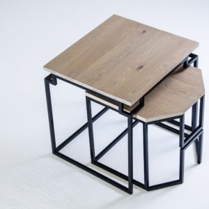
HMKM have drawn on key elements from that original interior, reinterpreting them to create an interior language that’s cut to fit the twenty-first century customer. Classic furniture shapes, from Savile Row cutting tables to gentlemen’s wardrobes, are abstracted and deconstructed to frame the store’s tailoring offer in a crisp, contemporary context.

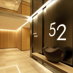
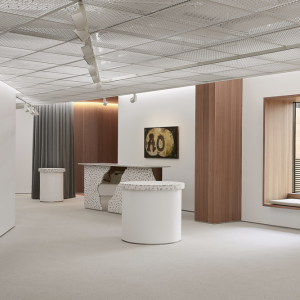
Blending polished burr elm, marbled tiles, sleek acrylic, rich leather and burnished nickel, these new pieces are set against a backdrop of basketweave parquet flooring, panelled walls and a suspended ceiling raft whose graphic lozenge pattern evokes the Strand store’s Tudor Revival ceiling. The fitting room lobby continues that witty interplay between past and present, with diamond-cut elm panelling and a dynamic carpet pattern sliced from rich tones of blue, bronze and earthy greens.

Inside each room, a wallpaper made from measuring-tapes gives another nod to the firm’s sartorial roots. In keeping with the interior vision, HMKM’s reworked brand identity playfully blends period features with contemporary lines. A new house pattern uses a criss-cross grid of stitch-like lines to evoke the intricate latticework of the firm’s Strand shopfront, whilst a reworked logo gives Edwardian blackletter typography a streamlined twist, stamped onto signage and packaging in a vivid shade of royal blue.
Design: HMKM
Photography: Duncan Smith


