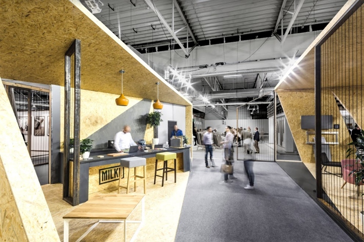

Following last year’s success of MILKE at Warsaw Home fair, the company was back again a year later, with a new pavilion designed by Poznań mode:lina™ studio. MILKE is a brand that surprises its clients by completing tasks which appear unattainable at first glance. Thanks to many years of experience, MILKE turns impossible into possible. The company’s development and business approach were recognised at last year’s 2016 Warsaw Home Expo, where the company won the “Discovery of the Year” award.
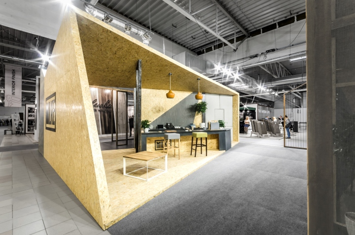
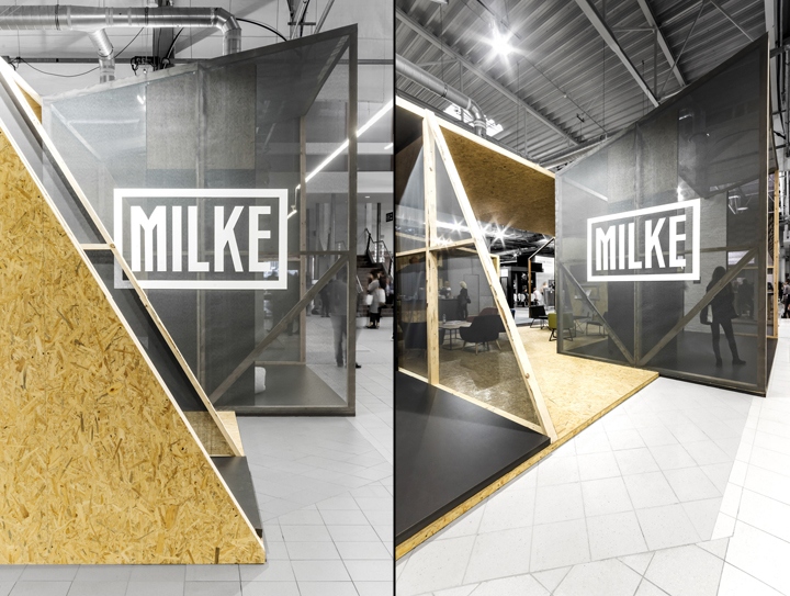
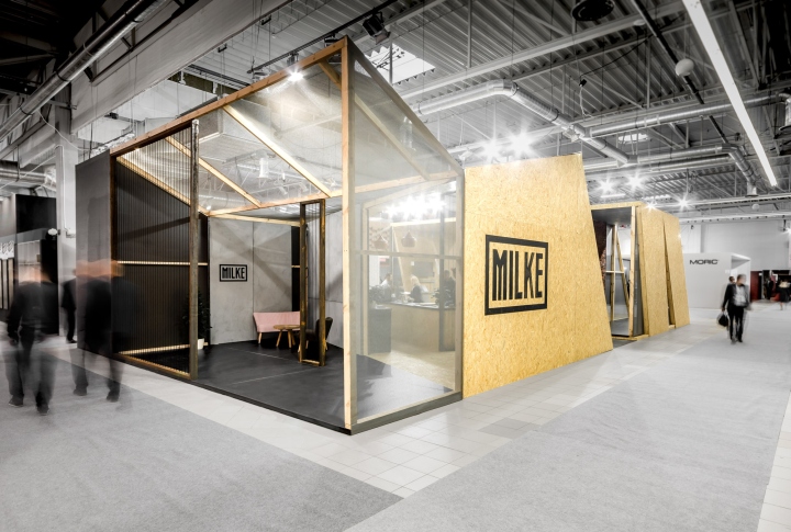
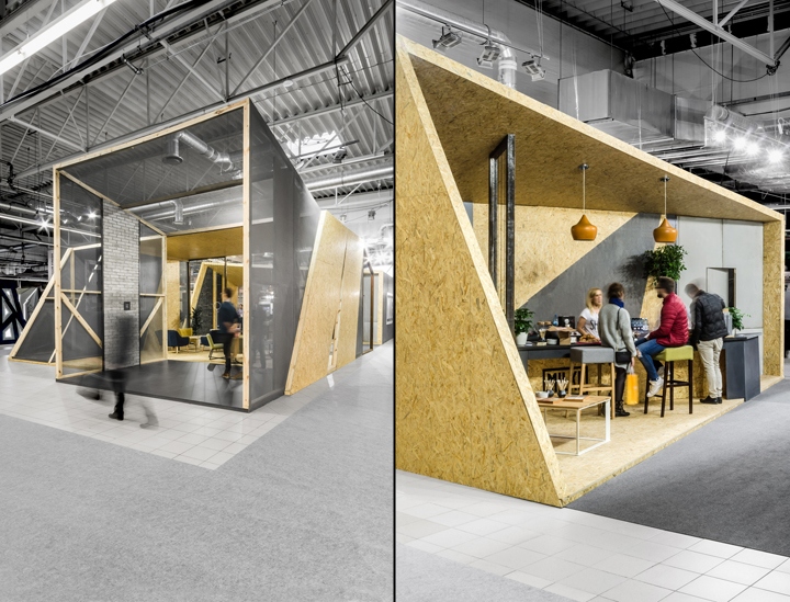
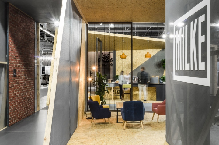
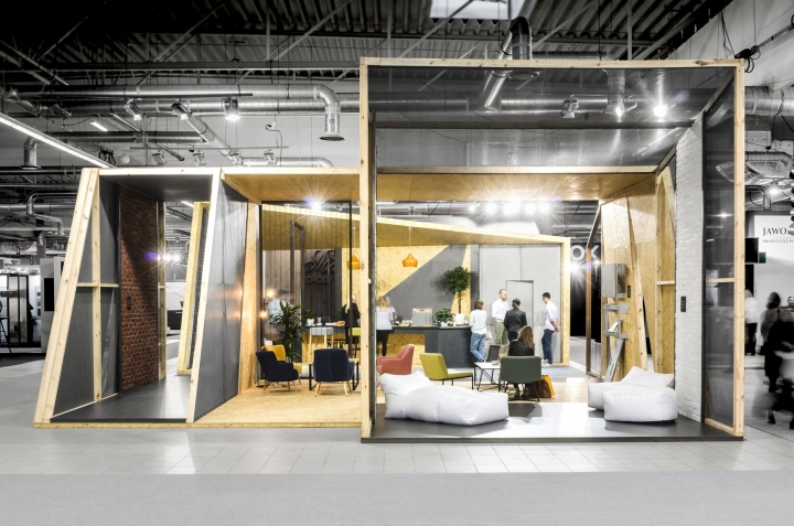
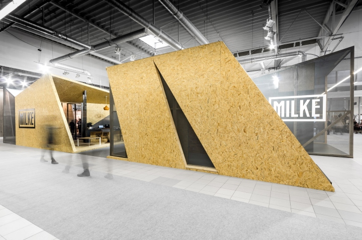
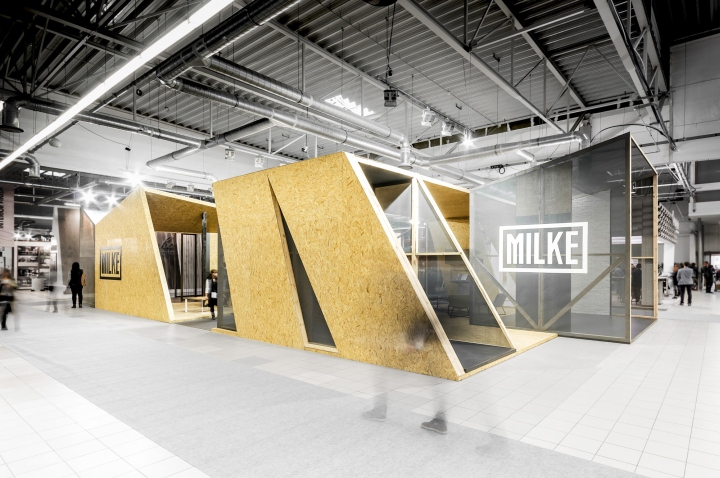
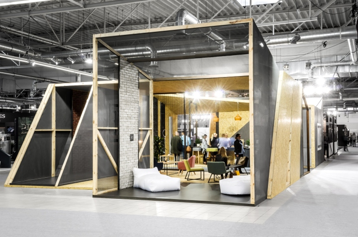
Their 2017 expo pavilion, designed by mode:lina™ studio designers, has a light transparent form, referring to MILKE’s distinct visual identity system and its main element – a logo with a characteristic frame. This is why, transparent net facade of the pavilion reveals its wooden construction frames. mode:lina™ architects faced the task of bringing together a need to create a fully welcoming andopen pavilion for expo visitors, but also to ensure privacy of business talks.
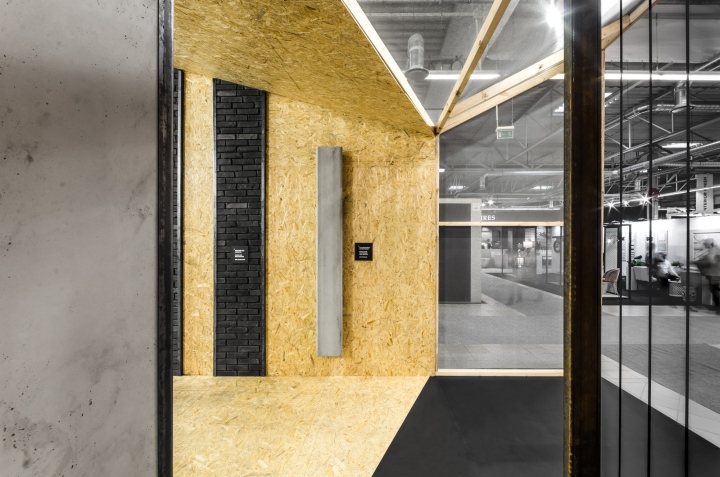
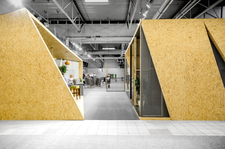
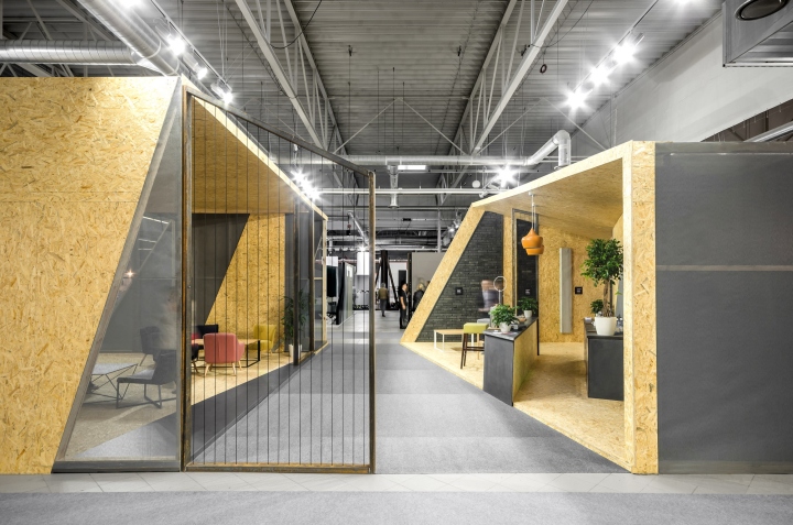
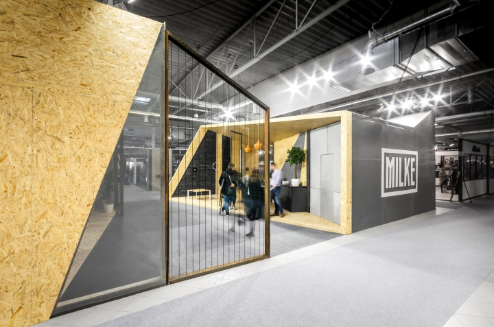
This was achieved byintroducing dynamic divisions to the pavilion, which allowed for ideal meeting areas to be created. Bydividing the whole structure into smaller sections, the designers introduced many entrances andpassageways, which helped to maintain the pavilion’s open character.
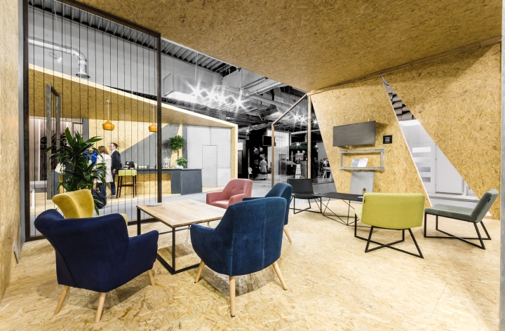
MILKE produces both interior and exterior wall cladding from architectural concrete using the GRCtechnology.mode:lina™ designers’ aim was to fully showcase the potential ofMILKE products,therefore the brand’s fagship characteristics were employed to put fnishing touches to the walls.Concrete wall covering gained black frames just as seen in the company’s logo, and was displayed inthe pavilion to match its form. For the pavilion to stand out on the expo map, its functional programme was complemented by acofee bar and chill out areas.
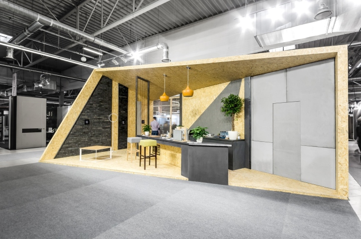
mode:lina™ architects faced the task of bringing together a need to create a fully welcoming and open pavilion for expo visitors, but also to ensure privacy of business talks. This was achieved by introducing dynamic divisions to the pavilion, which allowed for ideal meeting areas to be created. By dividing the whole structure into smaller sections, the designers introduced many entrances and passageways, which helped to maintain the pavilion’s open character.
Design: mode:lina
Photography: Patryk Lewiński


Add to collection
