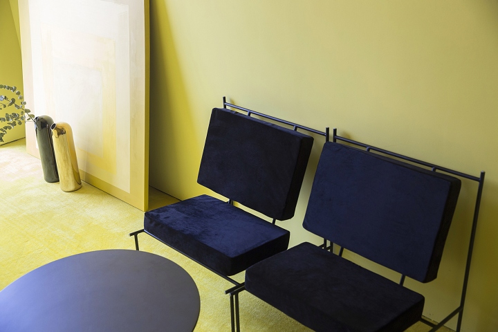

After twenty years of development, Centaline Property, having more than 11000 staff, is considered as the largest property agent in Shenzhen, China. Responding to the design brief for expressing new enterprise spirits, vitality, innovation and cooperation, Peng & Partners has made a revolutionary design for its new headquarters in Houhai beach area, Shenzhen. The whole project occupies four floors in the building. Three floors are for office, the other is conference center.

“Box” serves as the starting point during this office design process. By embedding, subtracting and extruding the boxes, the designer creates and lines up a sequence of positive and negative spaces throughout the whole office, which meet various functions, such as reception, meeting, private working area and etc. Having different and unusual spatial proportion and scale, these boxes convey varied emotions, public and private, narrow and wide, dark and bright.

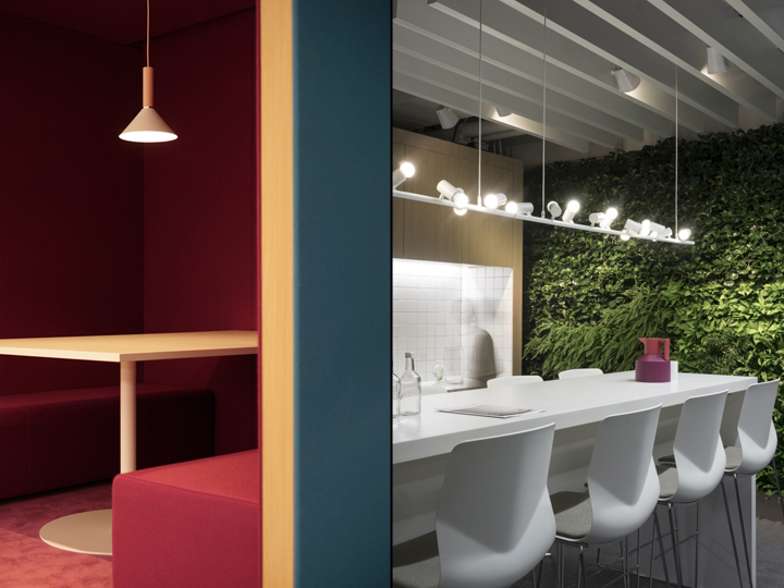
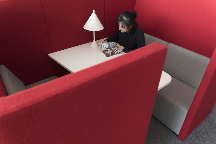
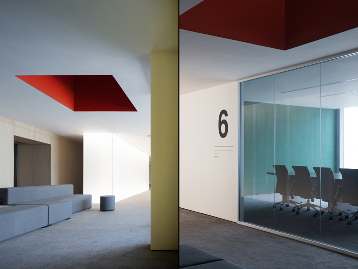
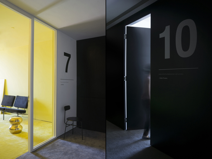
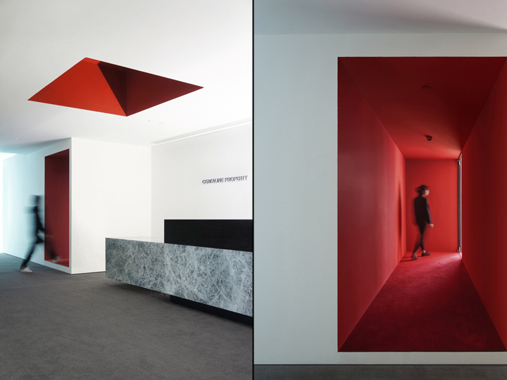
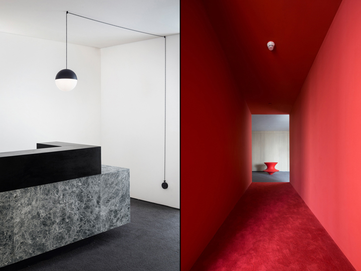
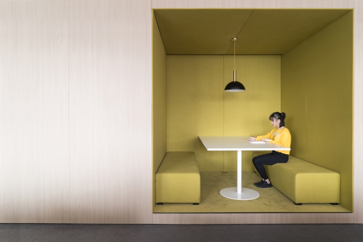
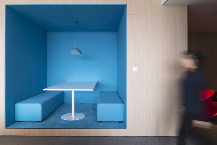
In the reception area on office floor, the red openings on wall and ceiling make the spatial composition and dimension so interesting and special. A chink of light at the end of the corridor evokes a sense of mystery. Inside the group meeting or private working box, floor, wall and ceiling are covered by same color carpet and sound-absorbing fabric, which helps people feel calm and stay focus inside and avoid mutual interference. According to their mood, people can also choose from boxes with a variety of colors.

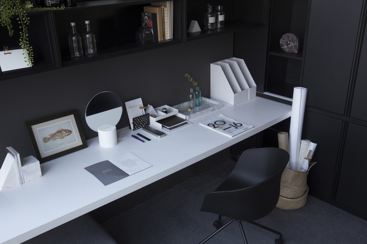
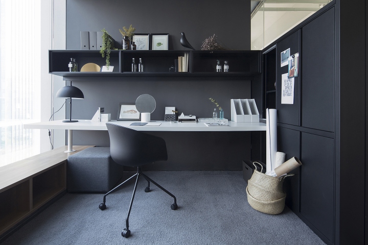
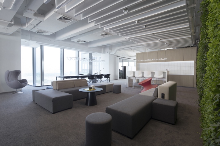
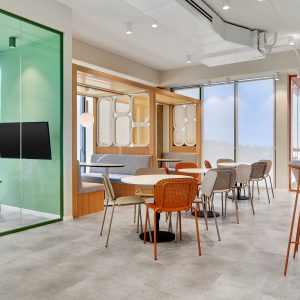
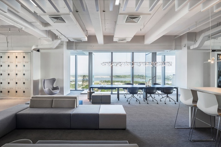
In order to ease the tension of traditional office, the large public leisure area includes vertical green wall, kitchen and bar, thus becomes a gathering place for communication, rest, and brainstorming. The modular sofas provide various ways of combination and usage, and allow staff to have barrier free and 360 degree communication. The plan layout of department manager room is so clever and innovative. All the functional elements are arrayed along the walls, storage, working, reading and communication are connected rationally. The small room of just 9 square meters provides a spacious and comfortable feeling.

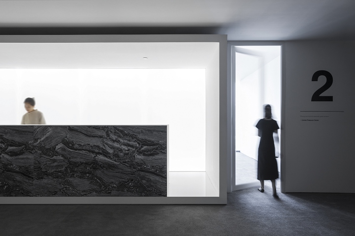
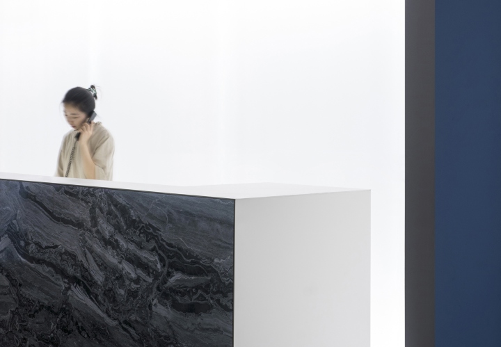
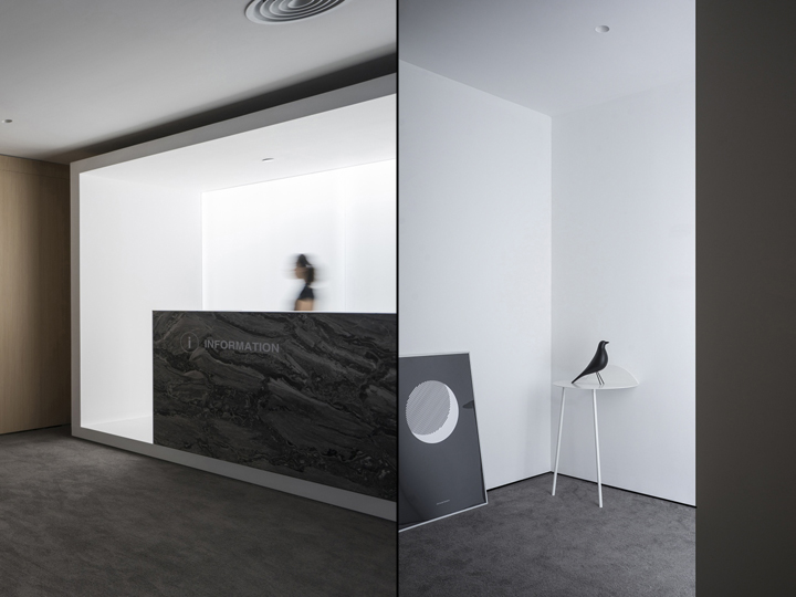
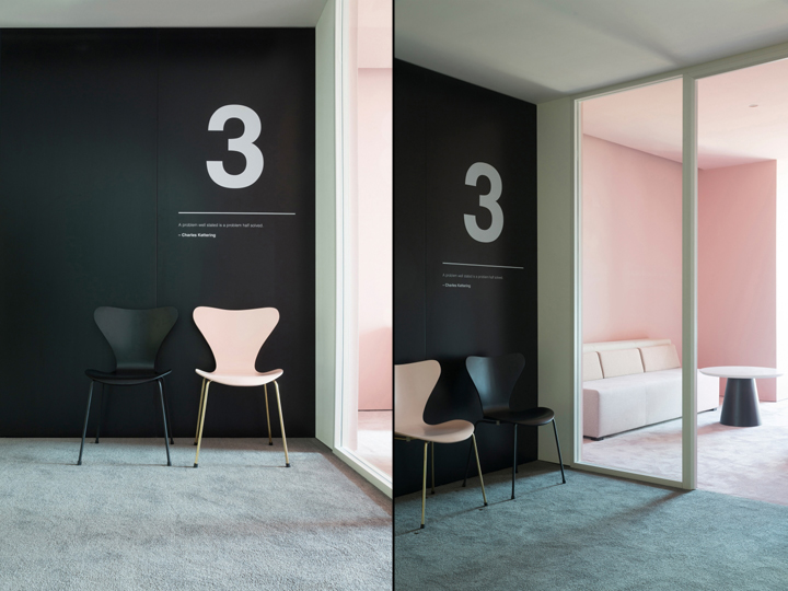
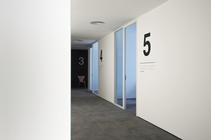
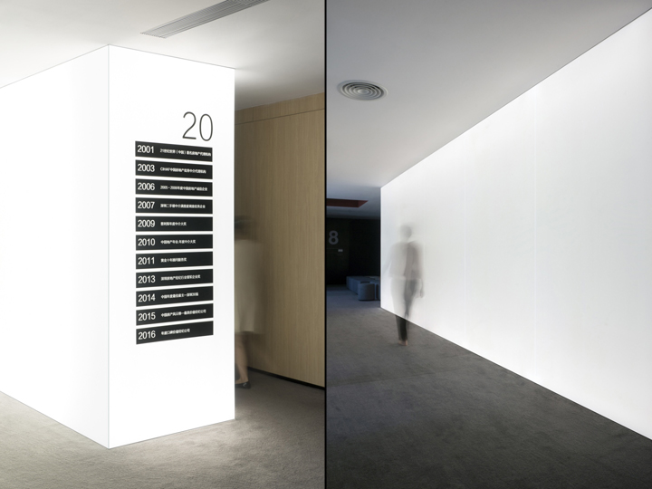
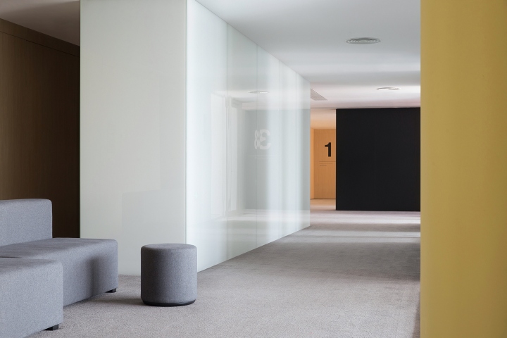
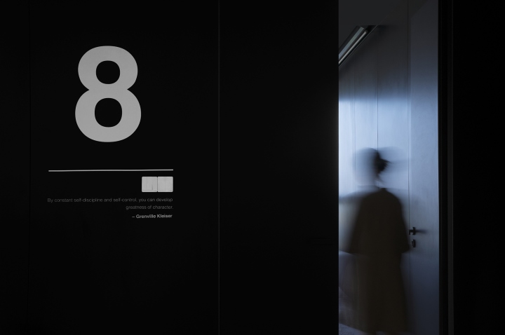
In the reception Area on Conference Floor, thanks to the soft light from the background luminous glass, the stage-like reception box makes even the ordinary behaviors feel like performance. The user experiences both inside and outside the box become so distinctive. The luminous glass box in corridor area serves as the main lighting source of the hub of conference floor, which avoids complex light and shadows and renders the space extremely clean, calm and graceful. In accordance with the space design language, the sign system design is super clean and minimalist. Even the switch panels are integrated with sign system into a coherent whole. The whole design process is trying to change the traditional working atmosphere and create a new and joyful work experience.

Plan Layout:
According to the conditions of the site as well as the company’s care towards the employees, the staff working areas are located next to the window to ensure that all departments have the most favorable nature lighting, ventilation condition and the best view of the landscape. The other functional elements, such as storage, meeting area, photocopying and telephone booth, are arranged along the building core tube.
Designed by Peng & Partners
Design Director: Wang Peng
Construction Drawing: Lu Xuetong
Photography by Zhao Hongfei, Wang Peng
