Opium pop-up store by Renesa Architecture Design Interiors
posted by retail design blog on 2020-04-06
Mumbai
Add to collection
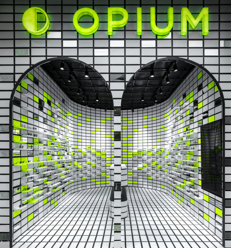
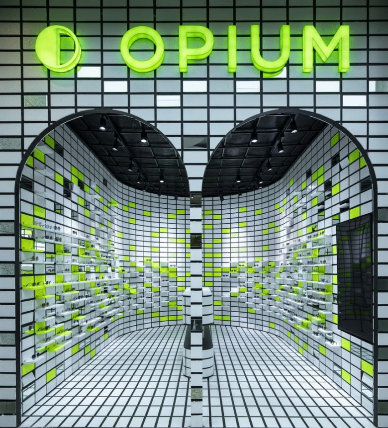
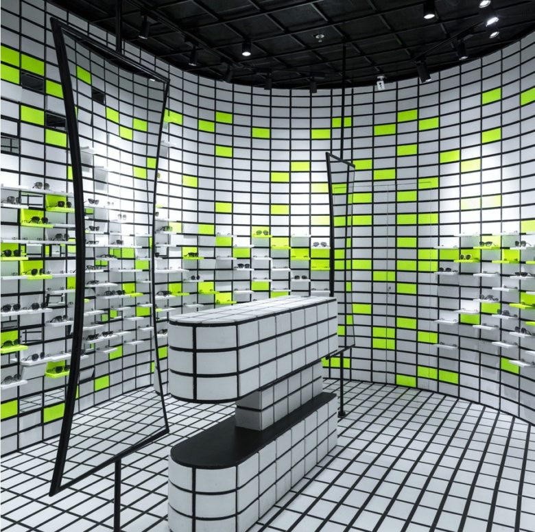
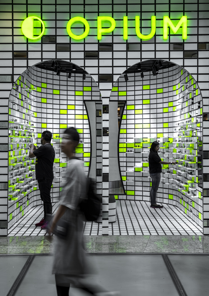
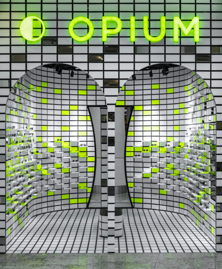
Welcome to the Chartreuse Vision! The new pop-up store designed by Renesa studio offers a clear spatial interpretation of the brand’s product identity at the Mumbai airport. Opium, a well-known premium lifestyle eyewear brand houses unique spatial elements set against a grid of time and space vividly illustrating Renesa’s bold design ideology.
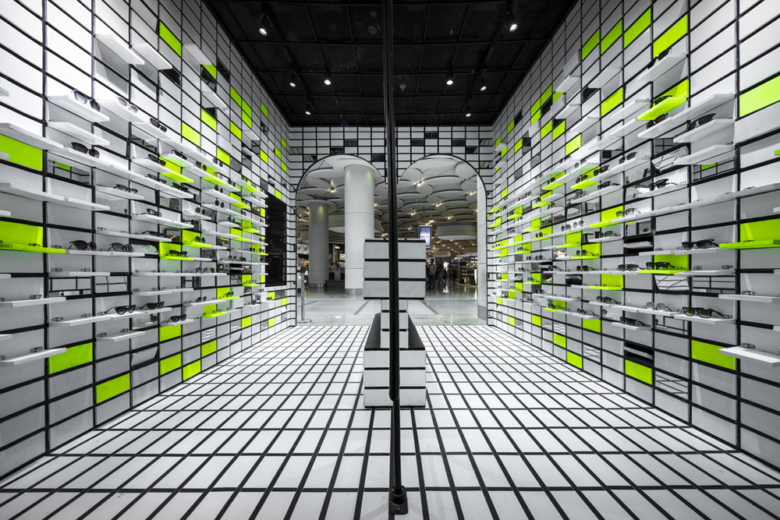
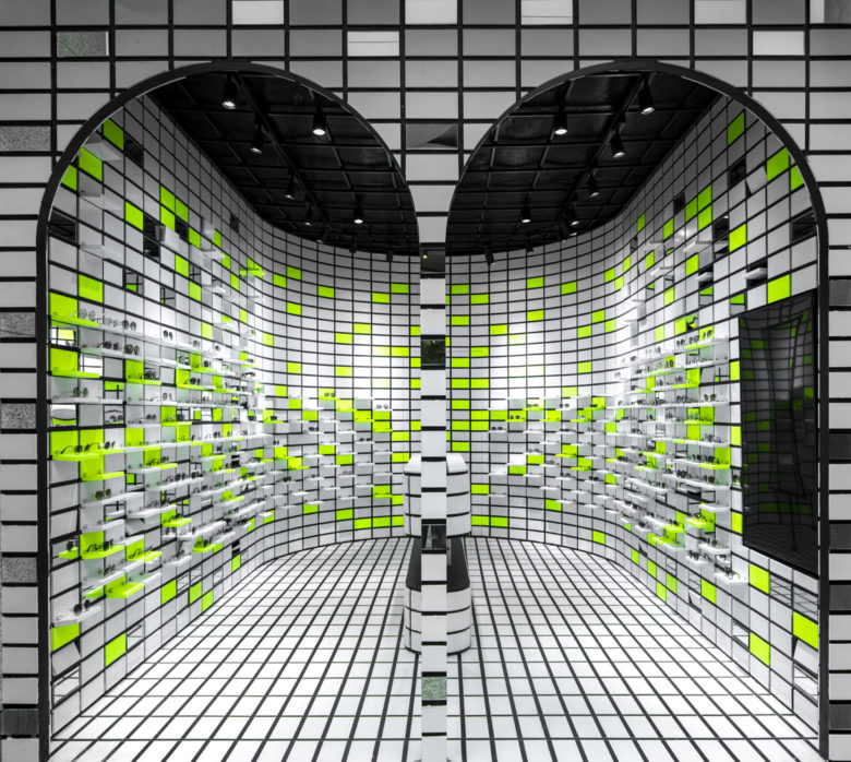
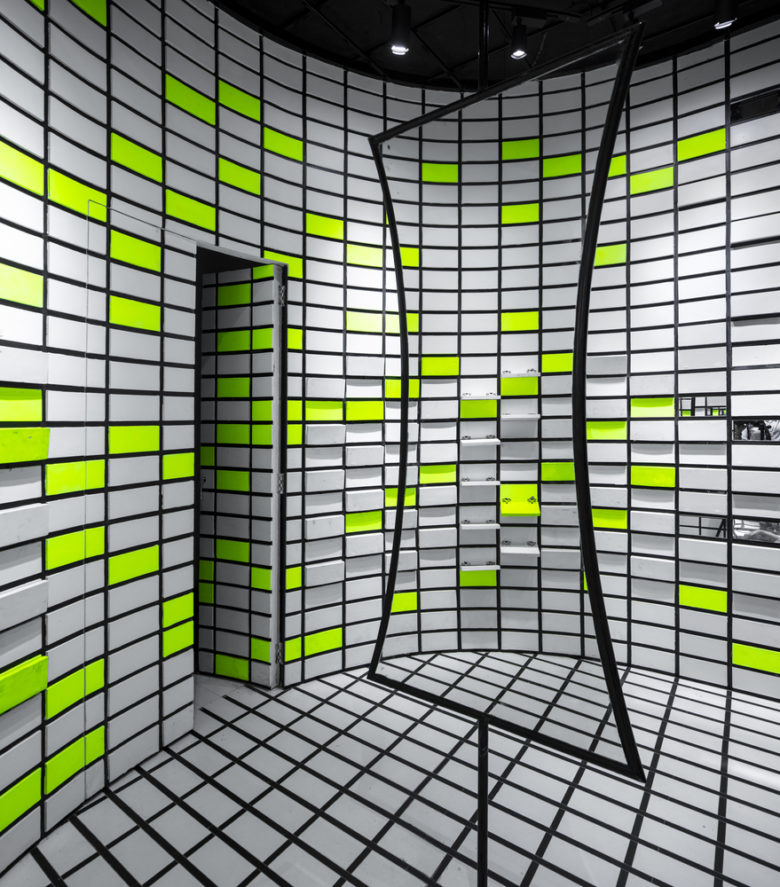
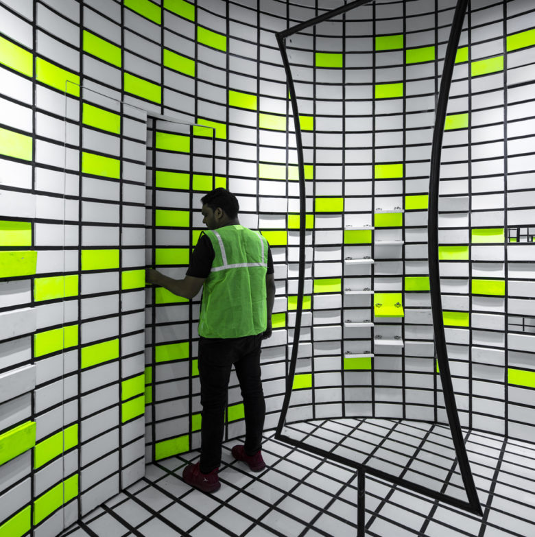
In a retail space stacking multiple products, the ‘ways of display’ determine an impression of the space to a great degree. Thus, the intervention sought to conceive a visually attractive space, articulating the functional moments. Starting with the arched entrance, framed by a stark neon sign of the brand, customers are guided through the one-way design that animates and illuminates the pop-up store. For a person passing by, the dialogue created between the design and store is that of an interactive component that invites the customers to delve into the store.
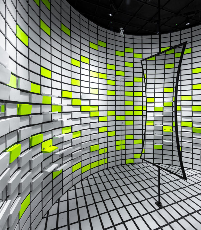
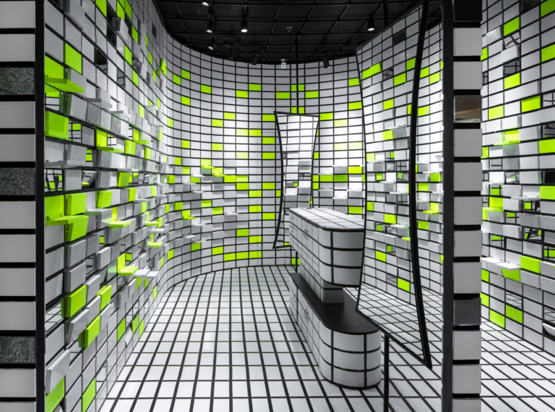
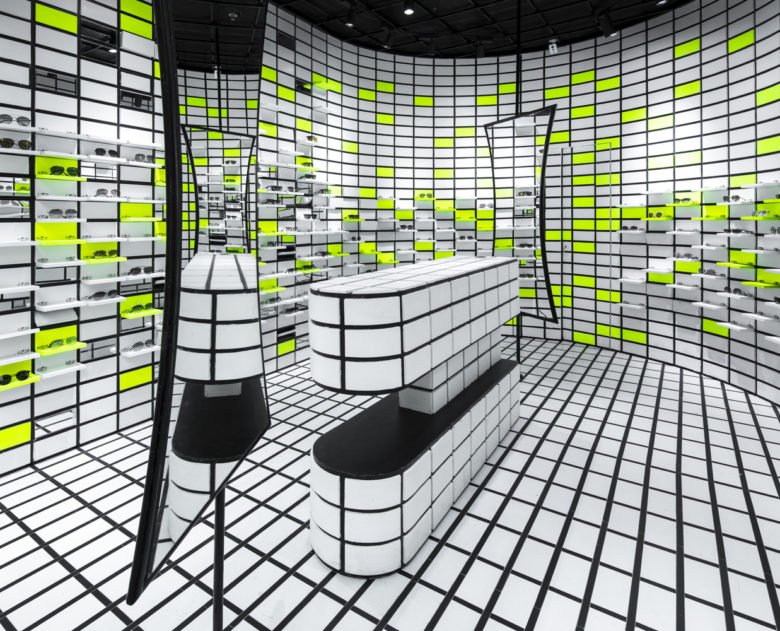
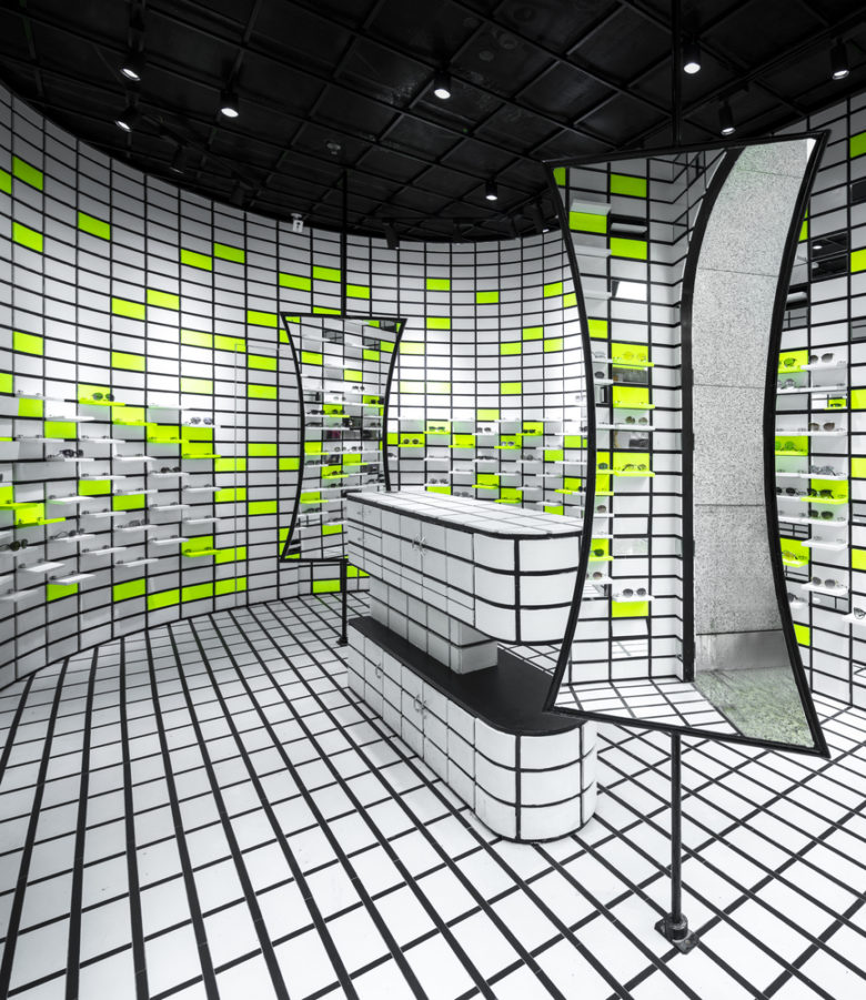
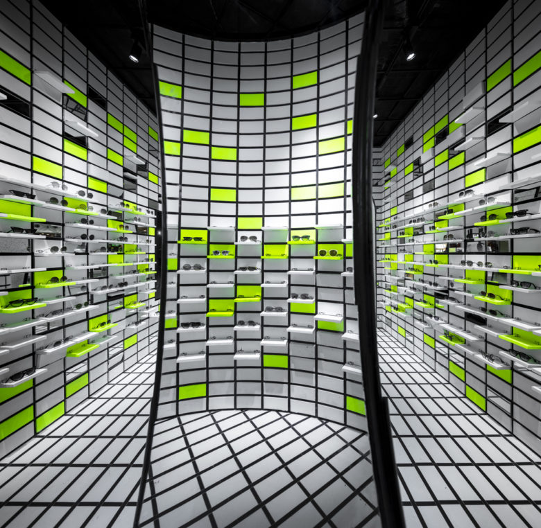
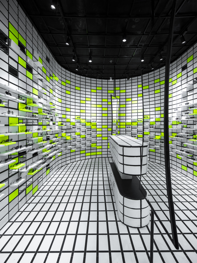
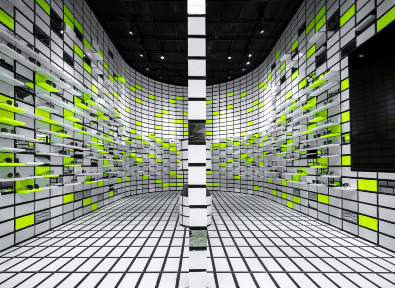
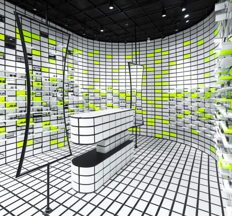
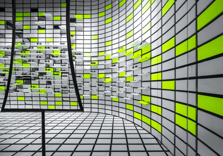
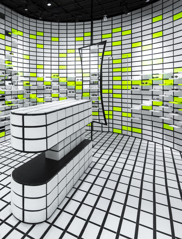
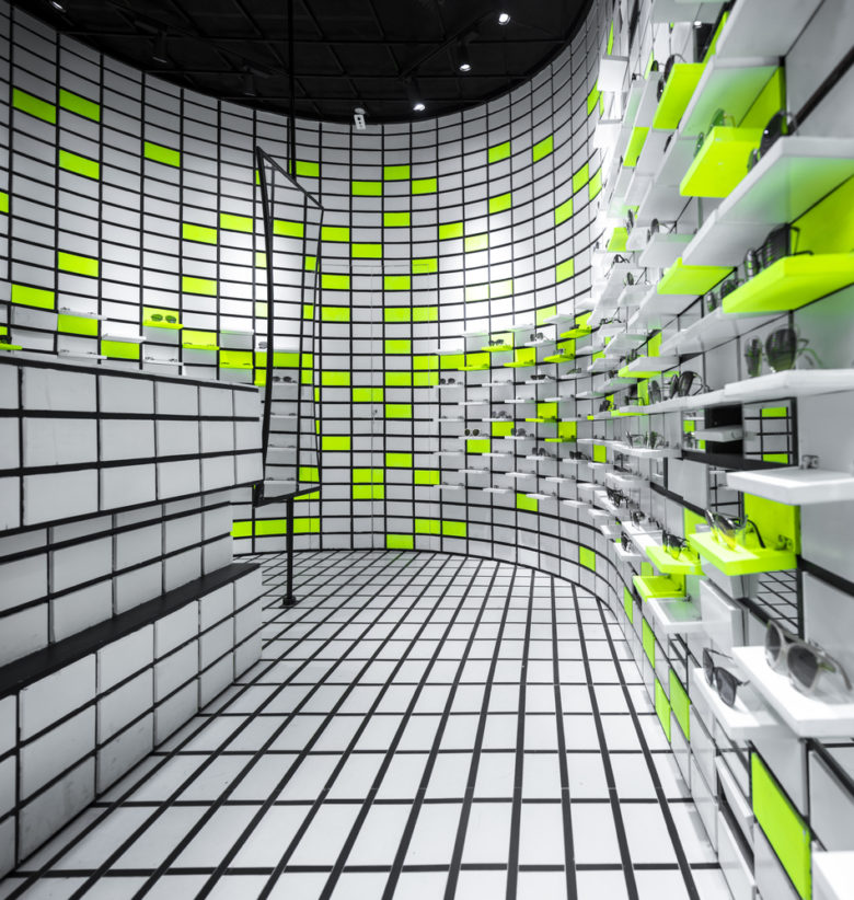
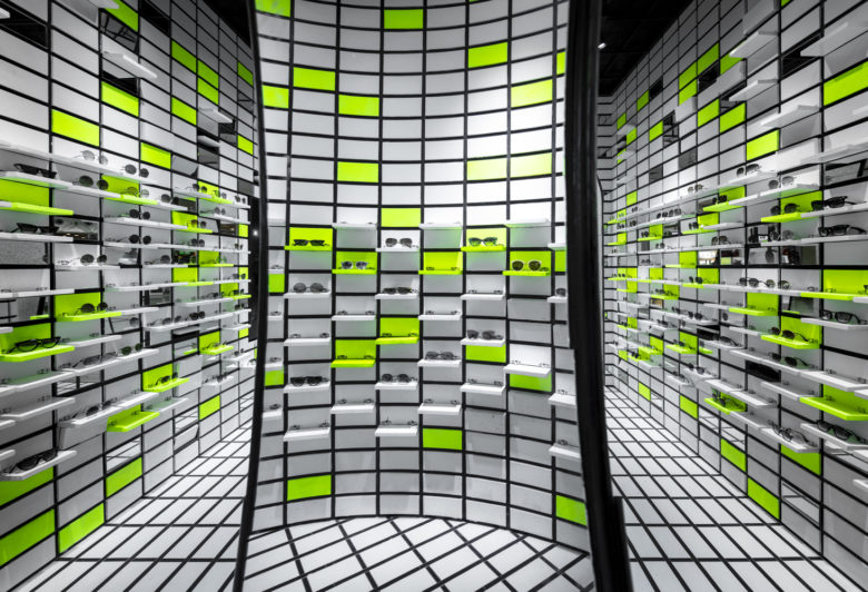
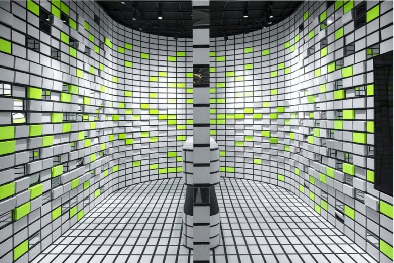
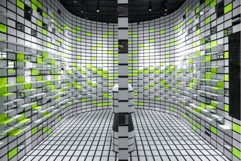
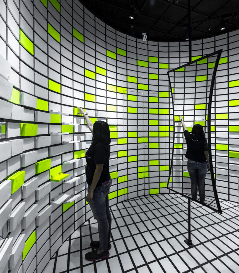
The design centers around a distinct and iconographic product presentation that allows different levels of interaction based on the client’s needs. Defined by its grid pattern, the shelving units delineate themselves through the flip-flop. Each pair of glasses sits on its own mini stage exaggerated through a neon green accent. These shelves give the monotonic space a richer way of extension, allowing the customers to speculate the space and products with interest.
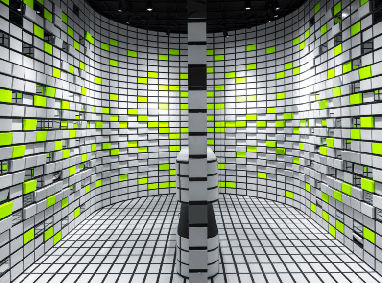
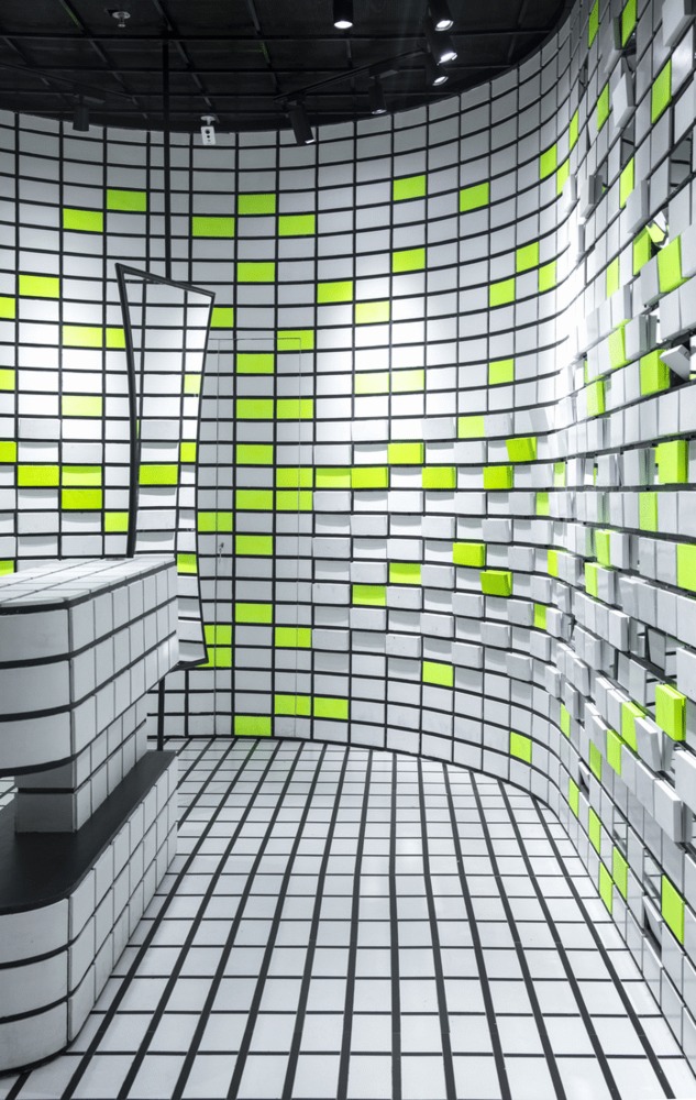
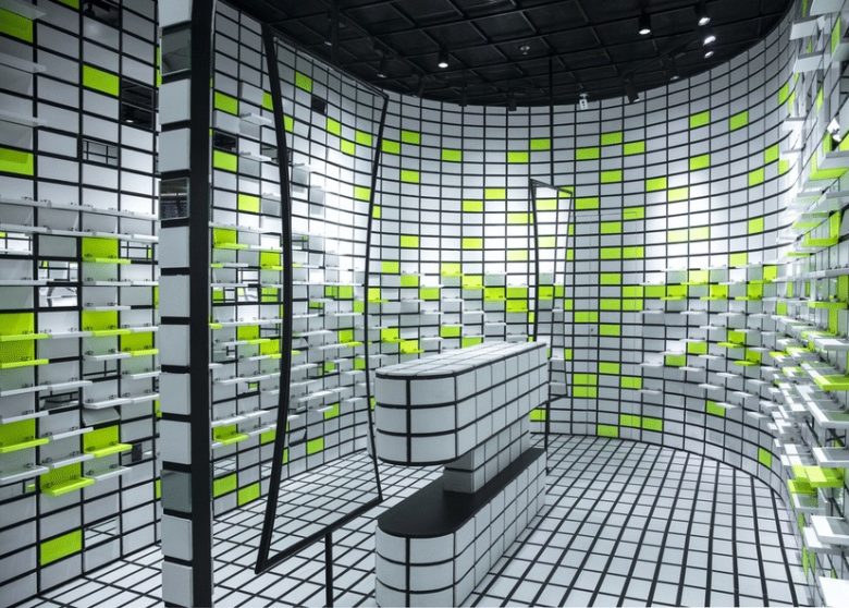
The process followed a grid of 8×4 inch tile that extends to the walls, flooring and furniture. The idea was to create a captivating store that conceptually references what eyewear does; tint or enhance the image.To incorporate this notion, the modules were repeated arbitrarily throughout the space to create complexity.These modules while curving in to the store were broken by neon green, mirror and collapsible shelves to create the illusion of recesses or volumes looming out from the walls. Thereby, articulating the language of design not only through repetition but also through recourse to everyday store typologies.
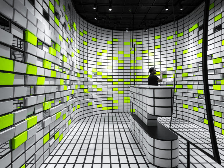
The curved line to which the design adapts and configures develops seamlessly continuing on to the cashier desk unit. The desk conforms to the homogeneity of the design centralizing and distributing the circulation of the store space by being located in the middle. Flanked on either sides by mirrors, a semblance of movement is created that emphasizes each display in a symmetric perspective. The project is not merely about designing an optical store, it is to create an ambiance in which public space and private space are deconstructed and placed in the same field to maintain a strong visual character. The result is an eccentric experience through a simple vision of color blocking.
Architects: Renesa Architecture Design Interiors
Architect In Charge: Sanjay Arora, Sanchit Arora
Design Team: Renesa Architecture Design Interiors
Interior Designer In Charge: Vandana Arora
Photographs: Niveditaa Gupta


Add to collection