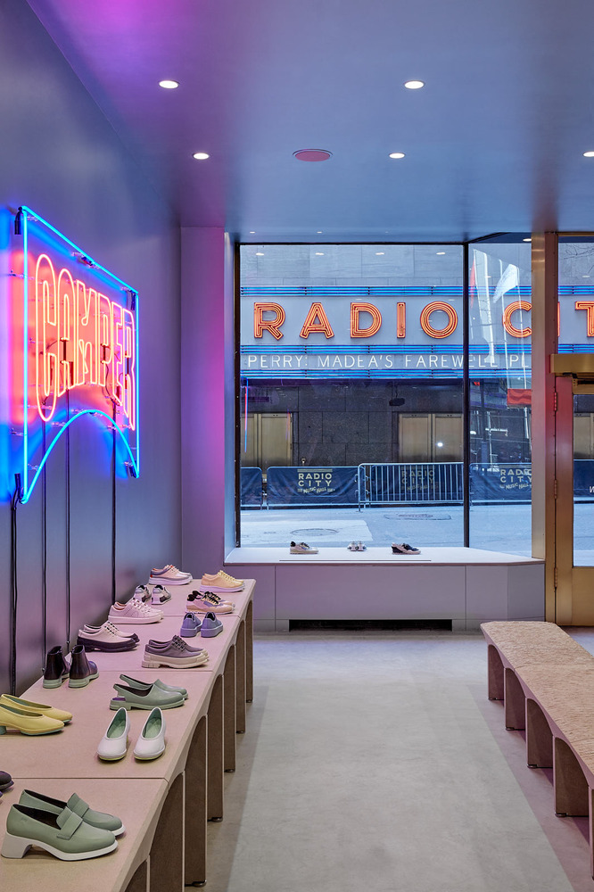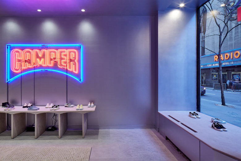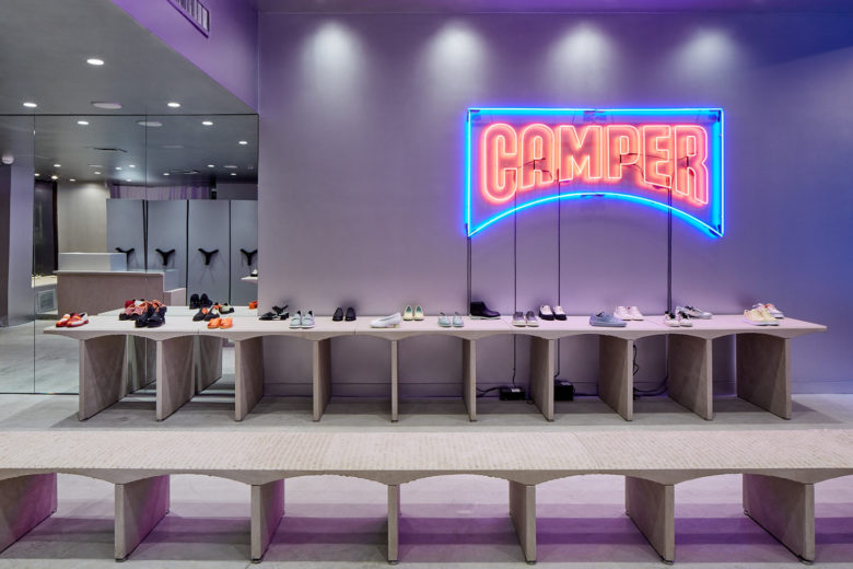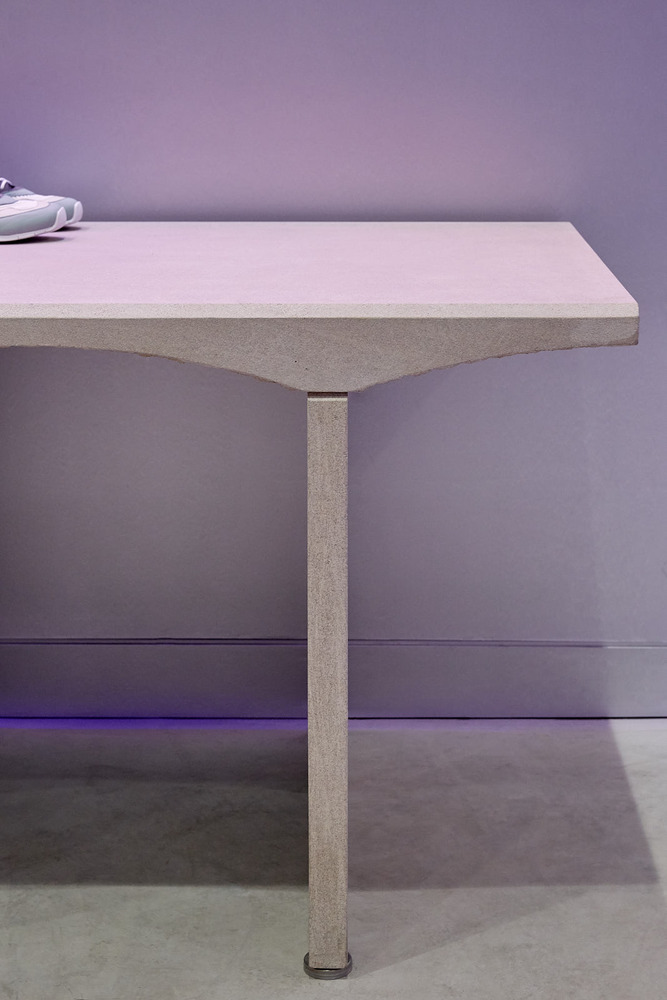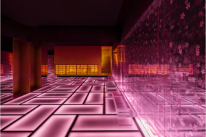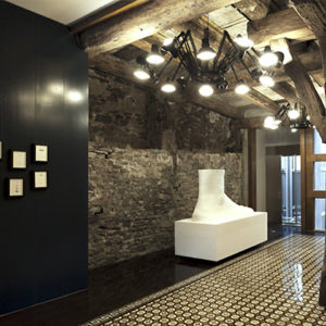

For the new Rockefeller Center location, just across the street from Radio City Music Hall, Olivares takes inspiration from the store’s historic surroundings and uses natural Indiana limestone to pay tribute to one of New York City’s most cultural landmarks. On a nod to the iconic signs of Radio City Music Hall, designed by Edward Durell Stone and Donald Deskey, the store’s interior is painted with an aluminum-based paint and features a large neon Camper logo.
In his design for Rockefeller Center, architect Raymond M.Hood implemented the first escalator used in a retail environment. In homage to this mechanical spirit, the Camper Store uses space-efficient, mobile archive shelving to eliminate the stock room and provide a more transparent environment for shop assistants and customers.
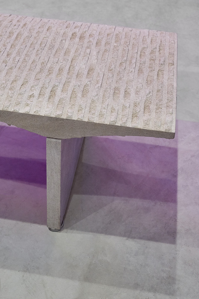
The displays, benches, and service desk of the store are made from Indiana limestone, the same material used on the building’s facade. While Hood’s façade is composed of flat tiles, the store’s furnishings are three-dimensional objects and are carved from solid limestone blocks using state-of-the-art robotics saw miling at QuaraStone Company. From within the shop, visitors have one of the best views of Radio City Music Hall, except now the view has been co-opted and reads ‘CamperRadioCity.
Architects: CAMPER, Jonathan Olivares
Lead Architect: Jonathan Olivares
