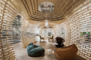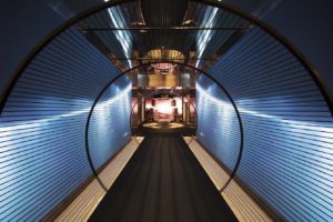
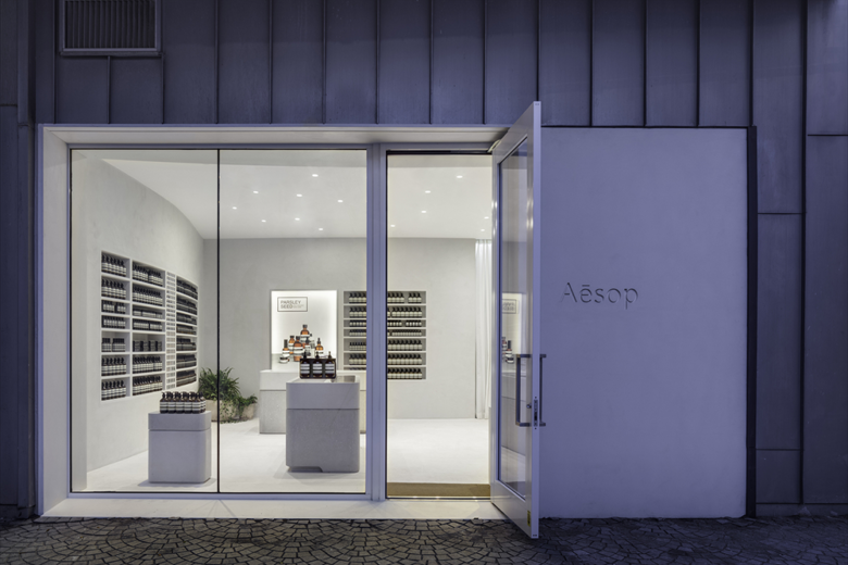
The intention of the project was to explore a link between Miami’s mid-century modern architecture with the tradition of the Brazilian modern architecture. In the same creative way that the European modern architecture was interpreted in North America, there was an interpretation and recreation of this movement in South America. This connection is reinforced by Miami’s climatic and geographic characteristics – a sunny place and close to the tropical area. We established these bonds through the choice of pure geometric shapes, specially the cylinder and the circle, that are recurrent in both local and Brazilian modern architecture history, and also through the use of a light color palette, close to the white, another feature common to both traditions. Some important initial references were the Miami Beach Post Office, the work pieces from the Brazilian sculptor Sergio Camargo, the luminosity of American pools from David Hockney or even contemporaneous projects, sensitive to these recurrences, such as the Faena District from OMA, recently inaugurated in the city.
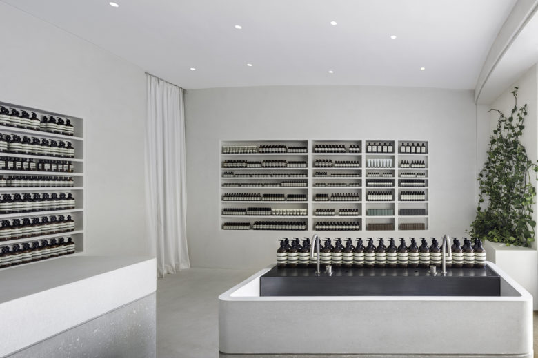
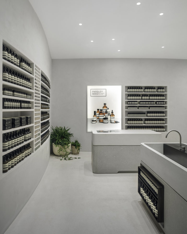
Stem from these images, we decided to create a space that would not have right angles, constructed only by curve plans – cylinder segments – as if the environment was a resulting emptiness of the connection between these pre-existing volumes.
The site – Miami Design District – is a relatively new commercial enterprise formed by a set of design stores. Miami city has a strong connection with the Latin American universe, both Spanish and Portuguese speakers, due to the great amount of Brazilian tourists that visit it. That is why it makes sense to us the attempt to connect both cultural worlds through the space and the architecture.
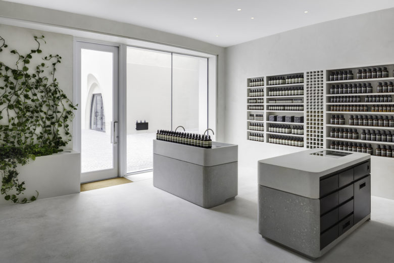
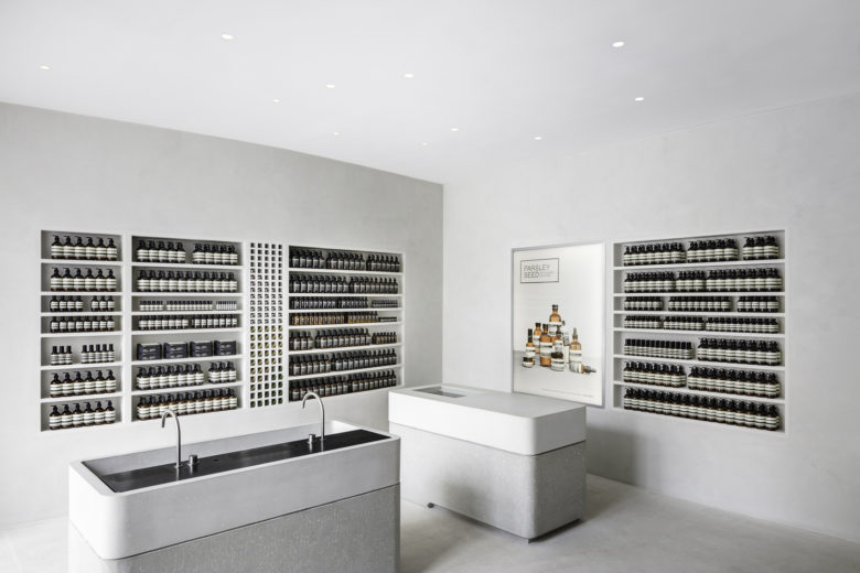
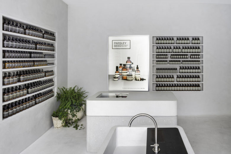
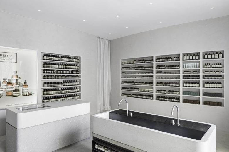
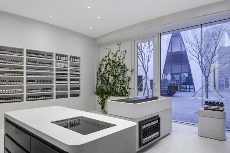
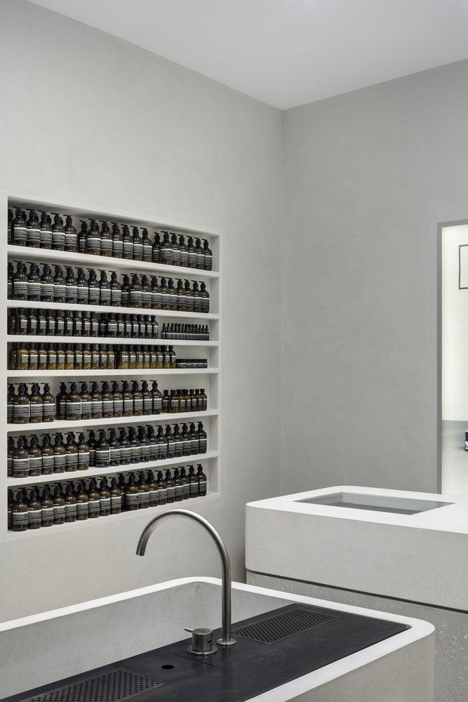
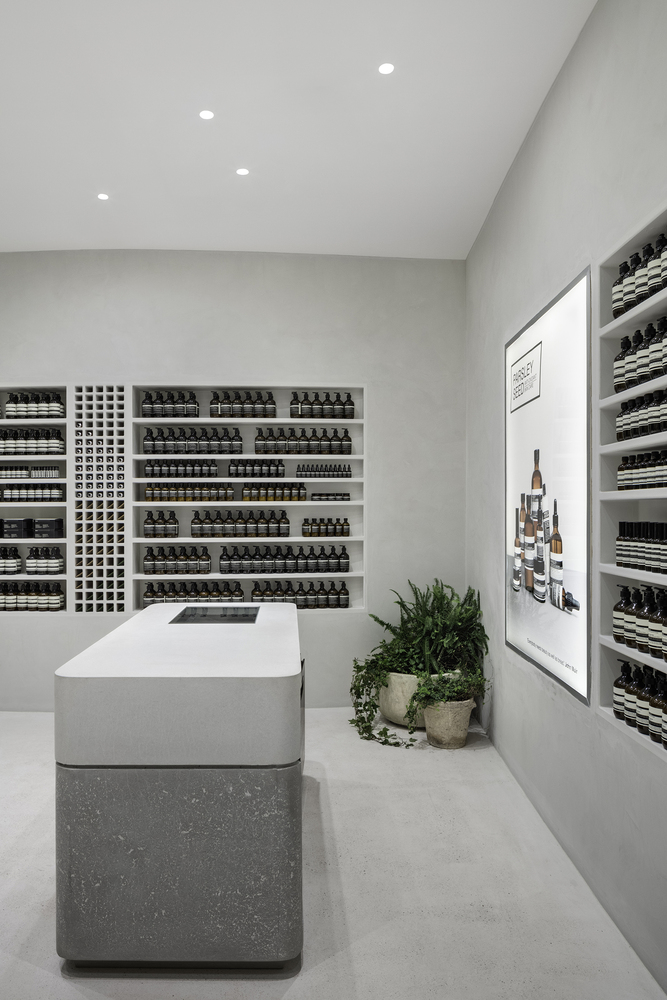
The project has a reduced palette of materials, in similar color tones. The materials are from a natural origin but industrially processed. Although they kept the irregularity and proper roughness, there are marks from the process of the industry. Concrete, polished plaster, terrazzo flooring, in warm tones from the gray to the white. The intention is to keep the formal purity of the simple geometries with their smooth surfaces, but with imperfections, roughness and porosity, as if the environment was formed by great stones, very simple but with variations and nuances of texture and color. A controlled recreated nature.
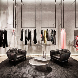
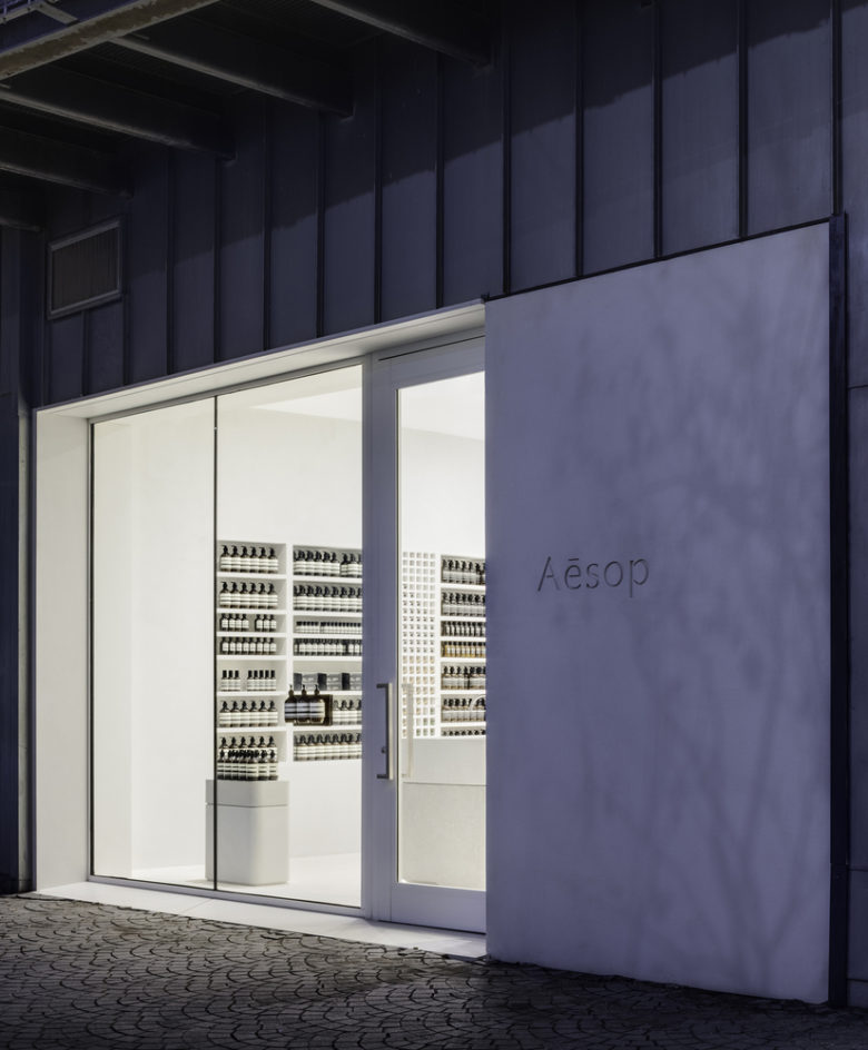
We avoid using elements that could refer to a home environment, like furniture. We eliminated the maximum number of objects. The products are exposed in recesses in walls and not in shelves; the countertop and the sales counter are from the same material of the floor, as if they were natural outcrops and not independent objects. The illumination is also based in light points in recesses in the gypsum, without exposed equipment. The vegetation arises from holes on the façade, without pots or supports separated from the architecture.
The only exception is the armchair designed by Lina Bo Bardi, Italian architect that worked in Brazil in the second half of the last century. Her career is an example of this successful mediation between the European modernism and its tropical reinterpretation, incorporating the roughness and the rudeness of the artisanal production processes and, at the same time, being connected to the industrial production. Besides being appropriated to the historical and conceptual context, which are references to the project, the chosen armchair is an upholstered semi sphere over a lightweight metallic structure, reinforcing the formal repertoire of the other elements that compose the space and avoid right angles.
Designed by Metro Arquitetos Associados
Via
Add to collection
