Opportunity And Imagination
The project is located at Haiya Mage Mall in Bao’an, Shenzhen.
As such a drawer concept retail is built within such large business volumes, the comparison between the beverage store and the mall, somehow forms a relatively unitary parasitic and contrasting relationship.
“We hope to break through the traditional mode of retail chains and create an experimental beverage store.” said our client, which deeply moved us as we first met. Regarding the project, the space includes an approximately 90㎡ indoor area and an approximately 100㎡ outdoor area, it was extremely challenged especially for the outdoor implementation, however, it is the challenge this space brought that inspires and sparks our imagination, which allows us to set sights on a bigger perspective, to see the indoor and the outdoor space as a whole, instead of as separate areas.
Run Into Naturalism Romance
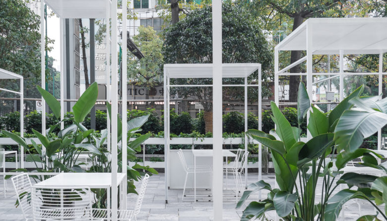
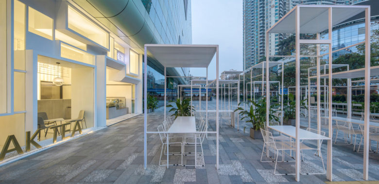
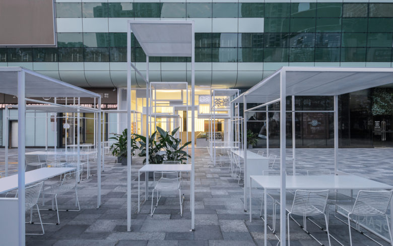
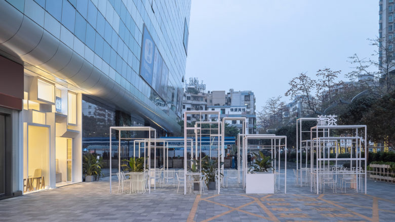
We want to create a landscape space that blends the indoor with the outdoor area. The inside space will work as a support for the function of the shop, while the outside space will serve as a public stage, providing both landscape and exhibition function. We try to find a rhythm of slow and peace in such a fast-paced city.
Turn Restricted Condition Into Positive Thinking
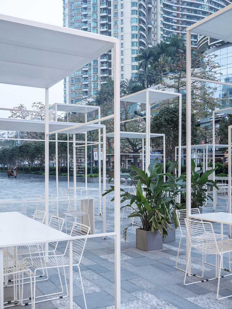
Before our renovation, the original site was placed with potted plants and flags which was designed to separate the pedestrian and vehicles. Unfortunately, such public space does not appeal the pedestrian to stop for a while, this is a typical street section in China, safe but lack of vitality. Our design process was full of complications, from the stage version proposal approved by our client to the revised urban furniture version proposal requested by the fire department, under the restrictions of standard, usage, budget, timeline and various factors, we continued thinking and exploring our way out.
Exhibit Spatial Experience For User
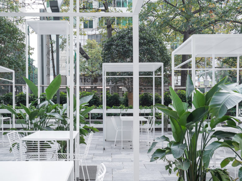
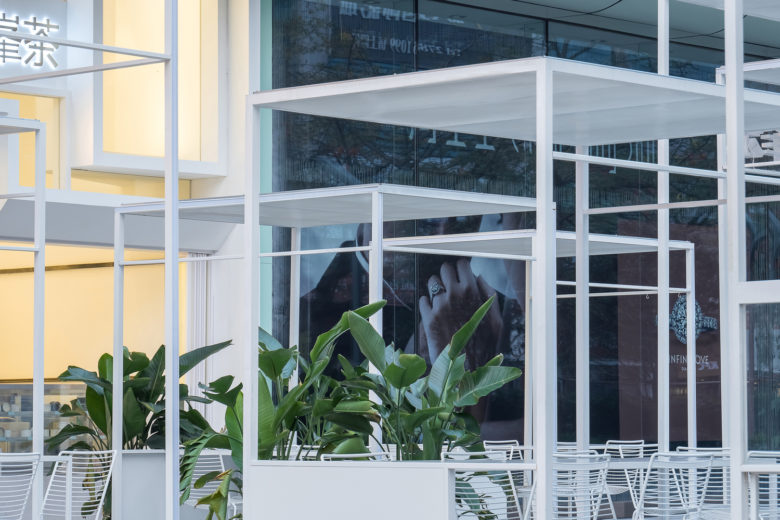
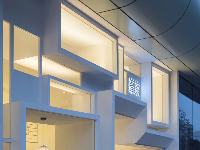
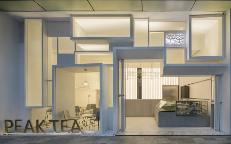
We hope that the design of this group of furniture can be served as the supporting background to different activities and functions such as culinary experience, art exhibition, city jungle and etc. In order to have people experience the subtle changes between the space and themselves, the configuration is simply arranged by several rectangle structures but in different scales. The overlapping lines of the structures enframe a series of scenery, having the users themselves become the main character in the scenery, we hope to create and visualize the spatial experience for them.
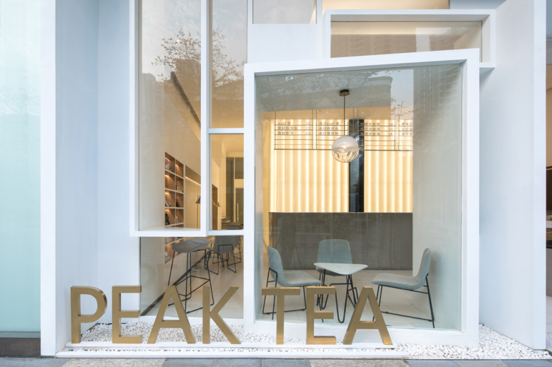
Seeing and Being Seen as a means of façade
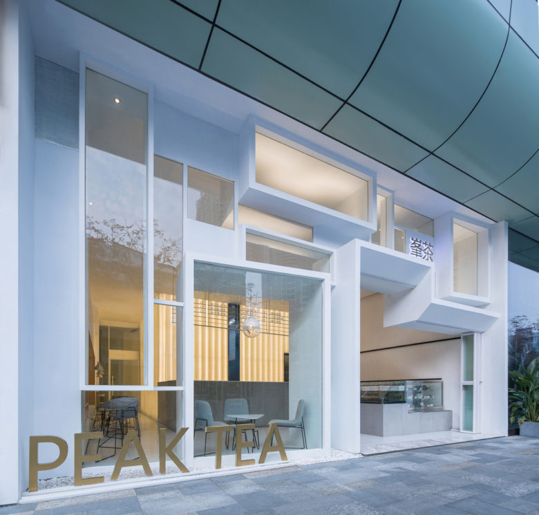
The inspiration of the façade design comes from Edward Hopper’s masterpiece Nighthawks. The realistic painting depicts an all-night diner where three customers, all lost in their own thoughts, are close yet distance from each other. The depiction of the characters is so accurate and vivid that arouses us a philosophic thought on human isolation, we therefore hope to bring the sense of alienation back to an appropriate scale through such a store. A large plate of glass is a symbol of technological revolution, on the contrary, we want to achieve an experience of seeing and being seen through the fragmented façade.
Concise Feeling From Inward Stretched Facade
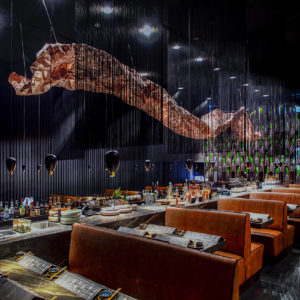
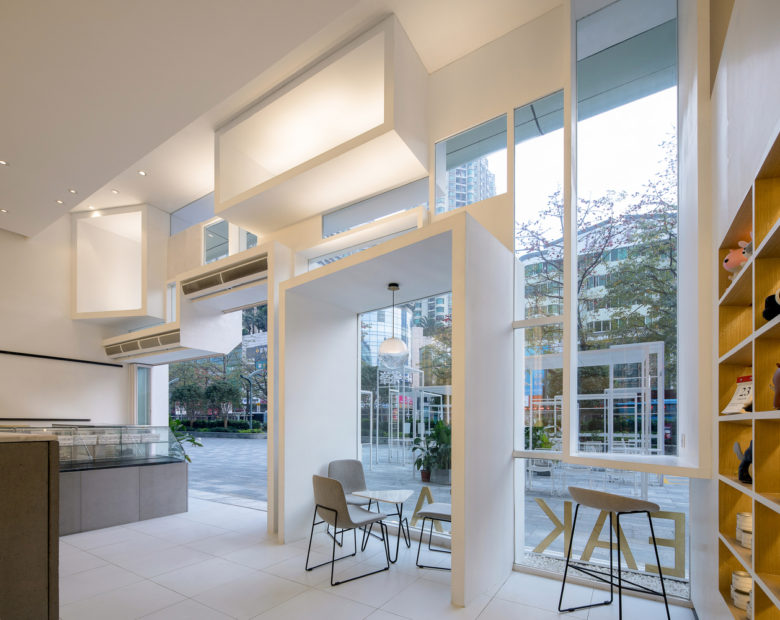
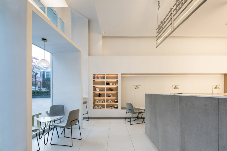
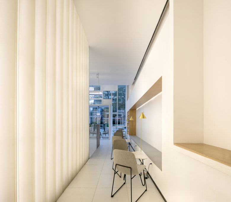
The interior design is the process of simplified and purified the façade. Apart from utility function, all the details are created to serve the purpose of making people feel comfortable. As the base color in the space, white is used for constructing the spatial structure, wood veneer is used for decorating the seat area and the color gray, somehow appropriately adorns the front desk and seat area that has the service function.
Architects: Onexn Architects
Photographs: Chao Zhang
Lead Architects: Bo Zhang, Jingjing Wang
Design Team: Bingxiang An, Ming Zeng, Ziying Cai
Add to collection
