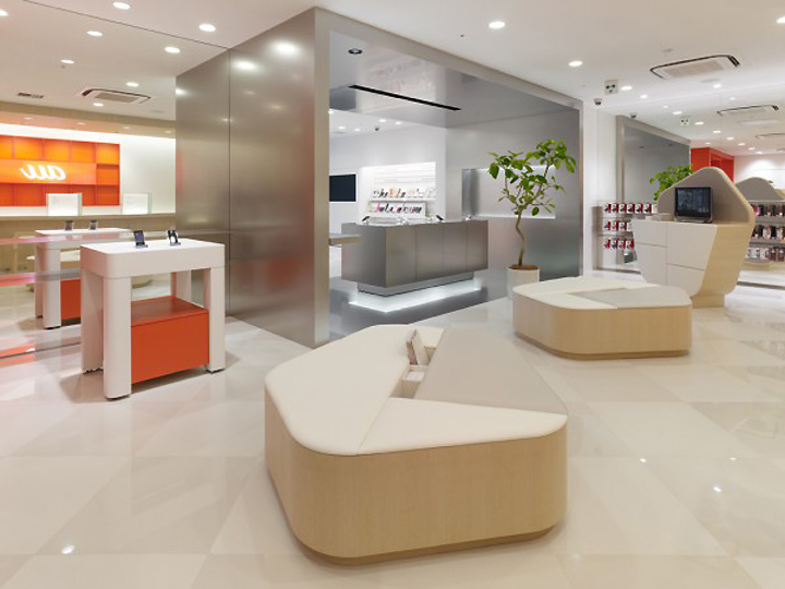
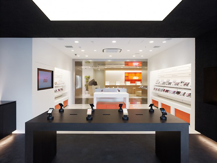

Situated near the JR Yurakucho station in the conveniently located Yurakucho-Ginza area, we were tasked with providing a new image for the interior design of the au Shop that would depart from existing mobile phone shops. In order to become an integrated communications shop providing fixed line and WiFi equipment, in addition to mobile phones, we suggested a space showcasing a variety of products in a presentation that would be easy to understand even to first-time customers.

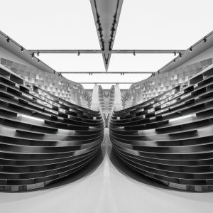
We proposed a configuration where the consecutive spaces seem to change by using a layered layout that makes the most out of the peculiar L-shaped plane extending to the back of the project area found on the first floor of a building nested between Harumi Street and the rail tracks. While based on the white neutral space associated with the image of existing shops, the finishing of each product area is made unique by the usage of cemented excelsior board painted black, vibration finish stainless steel and wood.

However, the effect does not depend on layered zoning POP and relies on the easy classification of products as well as on framing to emphasize each area. The reception and waiting area at the end of the tunnel extending from the entrance is furnished with sofas, ticket dispensers and a water server. The curved profile of the furniture gives a softer impression, contrasting with the straight lines that make up the space. The interior space can be seen through the facade, framed by a multi-layered tunnel that subtly bridges the boundary between the shop and the street.
Designed by Torafu Architects


