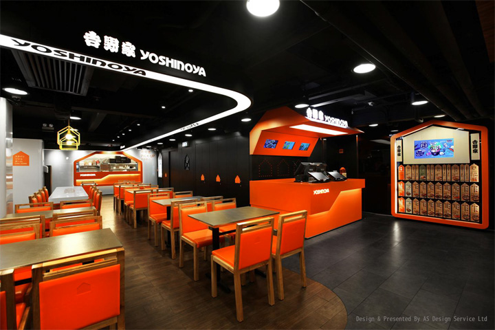

“We want customers to understand (the image) at the first glance, being simple and direct would make more sense.” Positioned at a rapidly growing market, fast food corporations often targeted at the younger generations. Designers deliberately used the most direct and simple interpretation to demonstrate the image as innovative, apparent, and young.
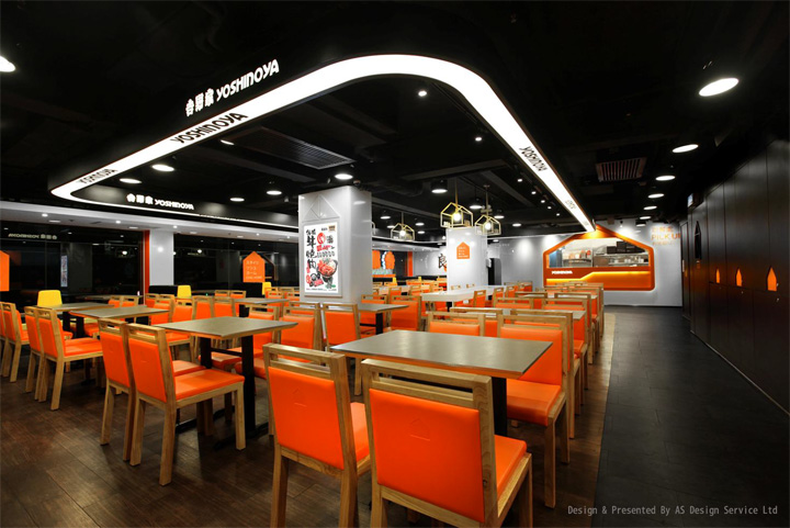
Designers Four Lau & Sam Sum used “Home” as the core design element to build a “Chic Home”, presenting the brand image as young, energetic, and warm. The shape of “House” created a marker that makes the customers easily associated with the new image “Home”. Yellow pillar structure, orange geometric triangle patterns, and levels of distinctive colors have become the new image elements of Yoshinoya fast food chain.
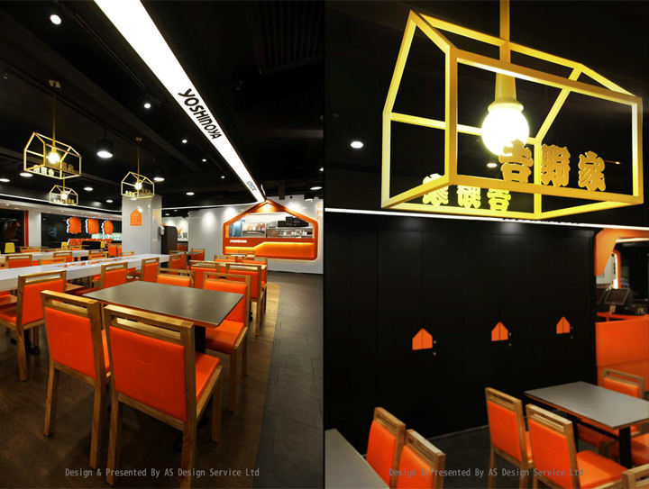
High malleability and varied house—shaped design could link different areas and makes the spaces more stereoscopic. The design of geometric triangles on the wall creates a diversity of design styles, was inspired by Japanese origami. It makes the “Home” vivacious and creates a relaxing and lively environment for dining.
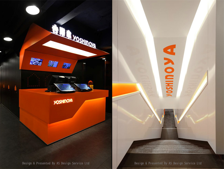
The idea “Chic Home” does not only make the enterprise to flow with the trend and also to create the “Feel At Home” to the stores. The enterprise provides not only high quality food and services, but all productions are of “Quality With Conscience”, including the restaurant environment. It also brings out a people-oriented attitude and a steady sustainable development
to the industry.
Design & Presented By AS Design Service Ltd


Add to collection
