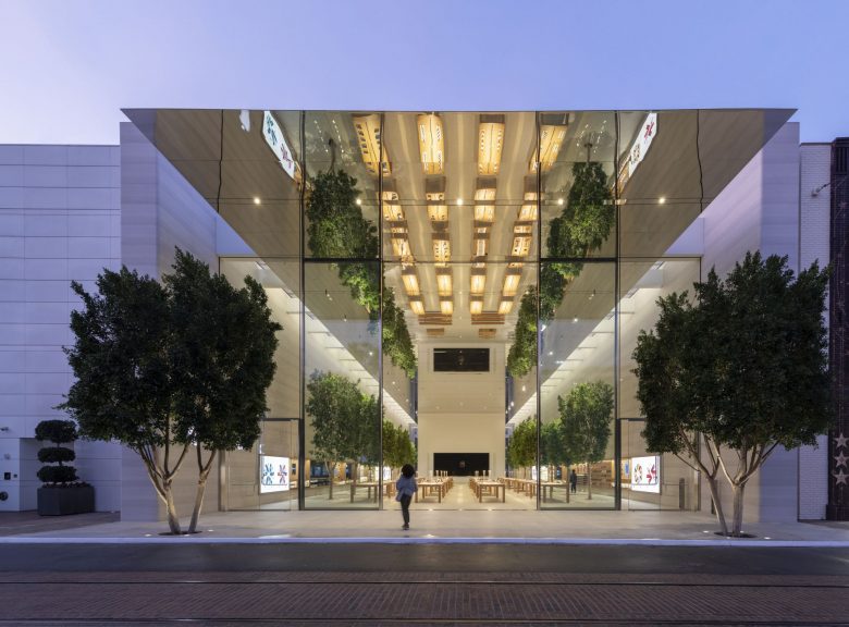
Apple’s location at popular open-air shopping and entertainment complex The Grove has been redesigned to ‘capture the city’s vitality’.
Key features
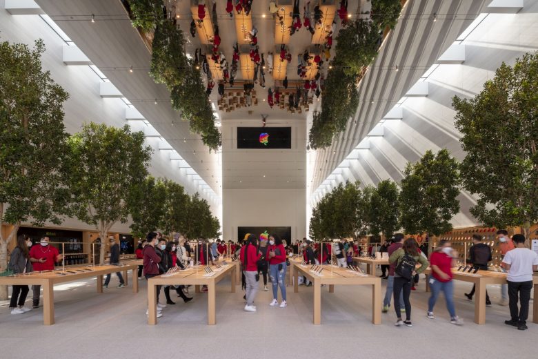
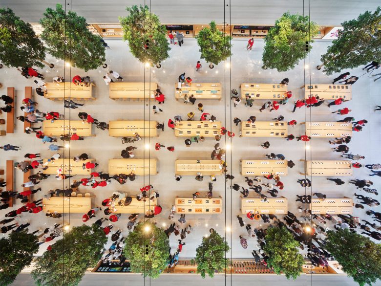
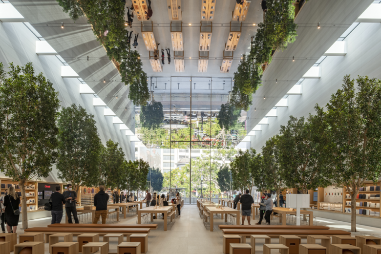
The renovated store doubles the size of its predecessor, an expansion targeted at strengthening Apple’s position as a community hub. The tech brand and Foster + Partners wanted to get as hyperlocal as possible with the design, taking references from Los Angeles’ motion-picture industry, its subtropical climate and greenery and creative, lively spirit. ‘[The space] brings together the special light, the trees, the spirit of the film and entertainment industry and the art of illusion, all within the soaring volume of the store, amplified by the mirrored ceiling,’ explains Stefan Behling, head of studio at Foster + Partners. This ‘dematerialized’ ceiling is accompanied by 1.5-m-long skylights that pour LA sunshine into the open interior, the walls of which are surfaced in smooth Castagna stone.
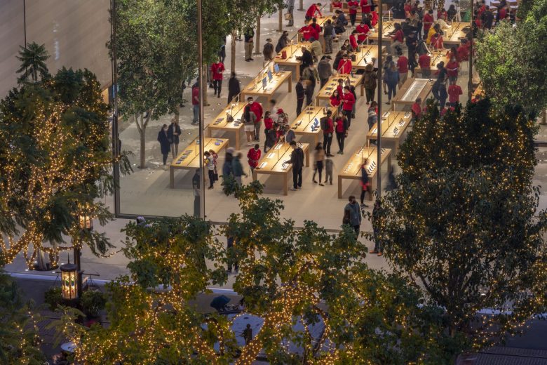
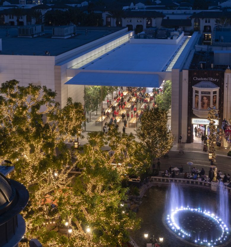
To truly connect the Apple outpost with its surroundings, the firm conceived a fully glazed façade with two large sliding doors. It’s a design that visually blurs the boundaries of exterior and interior while additionally providing for natural ventilation almost year-round. 16 ficus trees weave from outside the building, into the store, and back out, a ‘biophilic link’ that invites the indoor-outdoor use characteristic of most Apple flagships.
Frame’s take
In June, we published an article on the opening of an Apple in a downtown Los Angeles location, a renovated historic theatre similarly designed to involve the community. Apple at The Grove reflects the brand and Foster + Partner’s sensitive approach to hyperlocal design, showing that there is more than one way to reach out to its city’s people. Site-wise, the newest LA store is very different than its downtown neighbour, but the design concepts are consistent in their ethos and direction. It’s an adherence to fundamental qualities – openness, brightness and user-oriented – that makes Apple stores so recognizable, welcoming and functional no matter the context. And it’s becoming increasingly clear that, for Apple, biophilia is a huge part of making that work.
Designed by Foster + Partners
