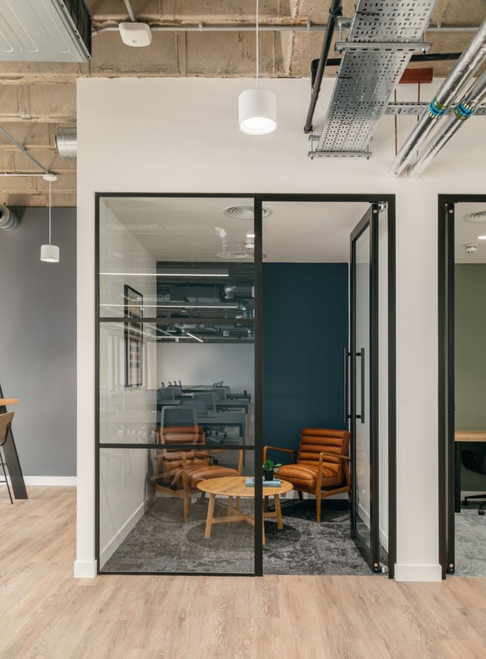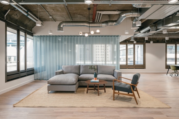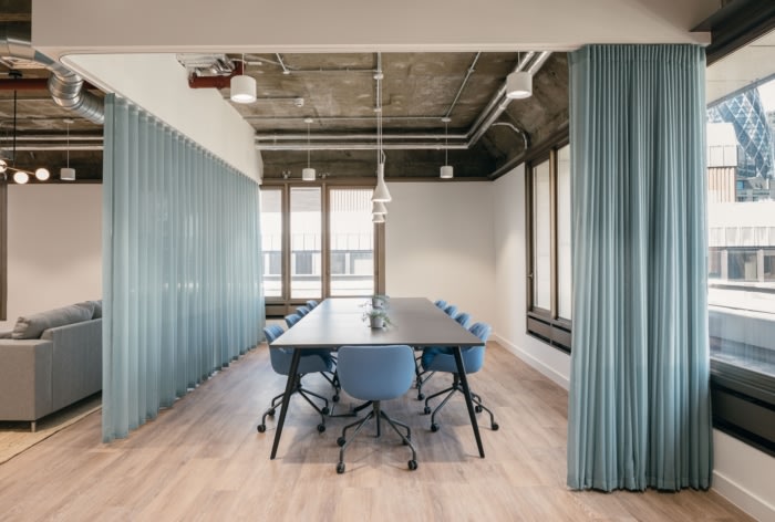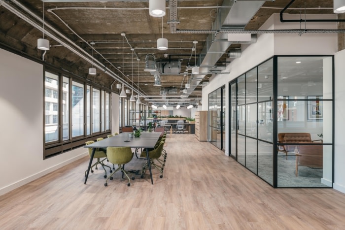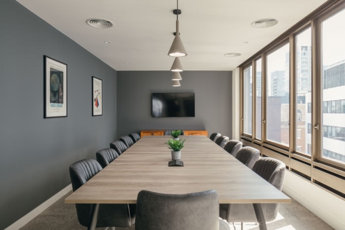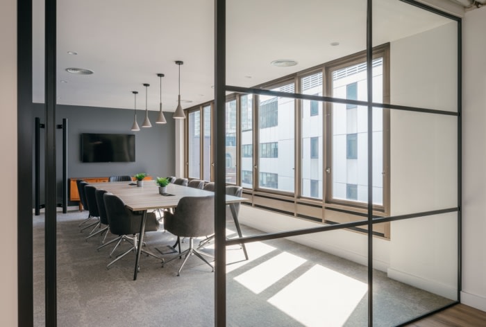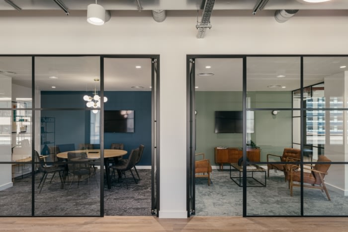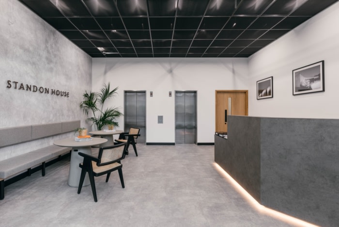
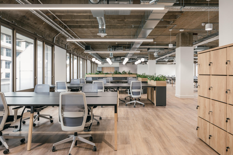
WHITEPAPER designed a neutral space with ample natural light for the Standon House Office Building in London, England. Standon House was a hidden opportunity to create an inspiring workplace within a Brutalist building. The landlord was looking to do a full Cat A and Cat B refurbishment of two floors, as well as the Reception and disused basement.
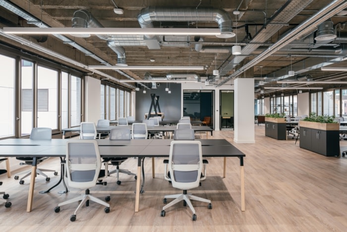
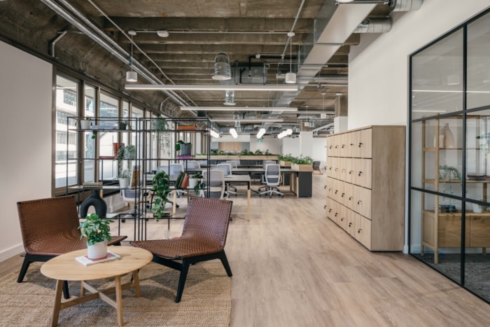
During the project, the building’s original features came to light. A series of concrete ribs were uncovered beneath the suspended ceiling, as well as the raw brickwork that many office tenants favour today.
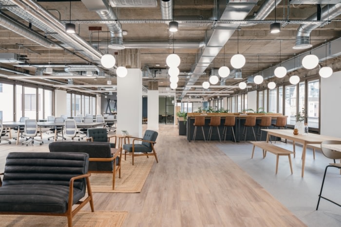
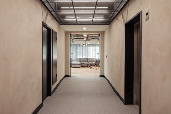
The overall design scheme was influenced by the Brutalist architecture, translated through subtle form and geometry in the style palette. Black metal grid ceilings and feature lighting add a layer of texture and guide people down the walkways.
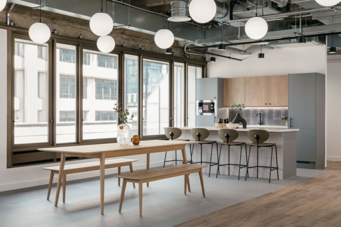
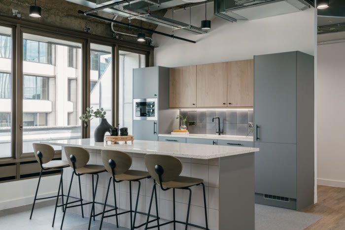
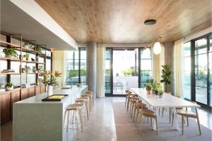
The scale of the work required the design team to work to a high level of detail to ensure the mechanical and electric elements worked with the design intention. For example, the globe lighting used in the main desk and kitchen areas was installed on a grid alongside other services which had to be carefully mapped.
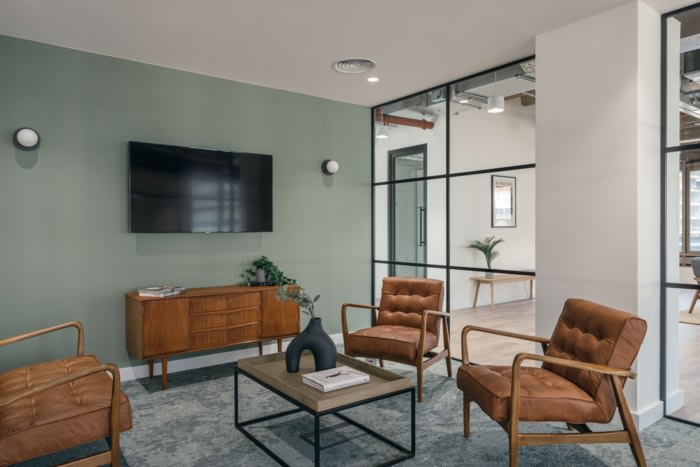
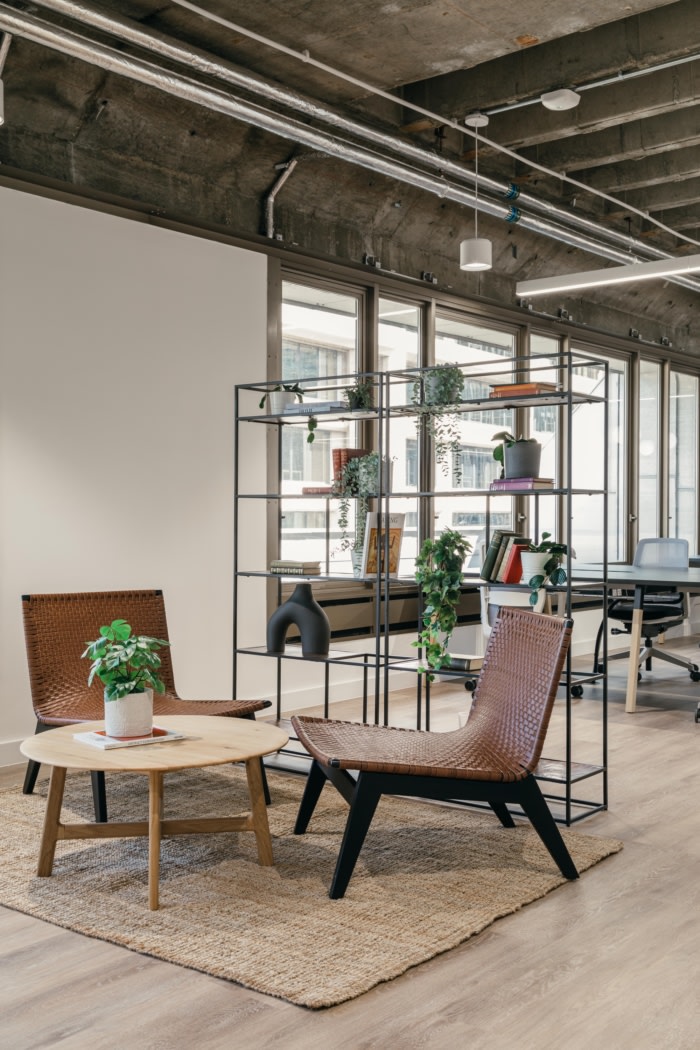
The design was created without a specific tenant in mind, which tasked the design team with installing soft furnishings that have a wide appeal. Residential style furniture and dressing softened the industrial nature of the building and created an inviting home-like environment. A selection of art and vintage books gives the space a character to help prospective tenants imagine occupying the space.
In the basement, showers and changing facilities were installed to replace the disused storage space. Punchy terracotta-painted doors and olive tiles add fun to the space, to complement the calmer tones used in the work area.
Overall, the project transformed 20,000 sq ft of space over four floors, including the basement, and took 12 weeks to complete.
Design: WHITEPAPER
Furniture: Hunter’s
Photography: Chris Wharton
