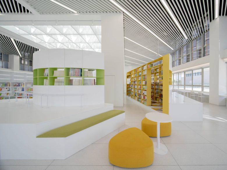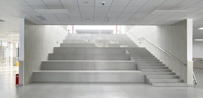
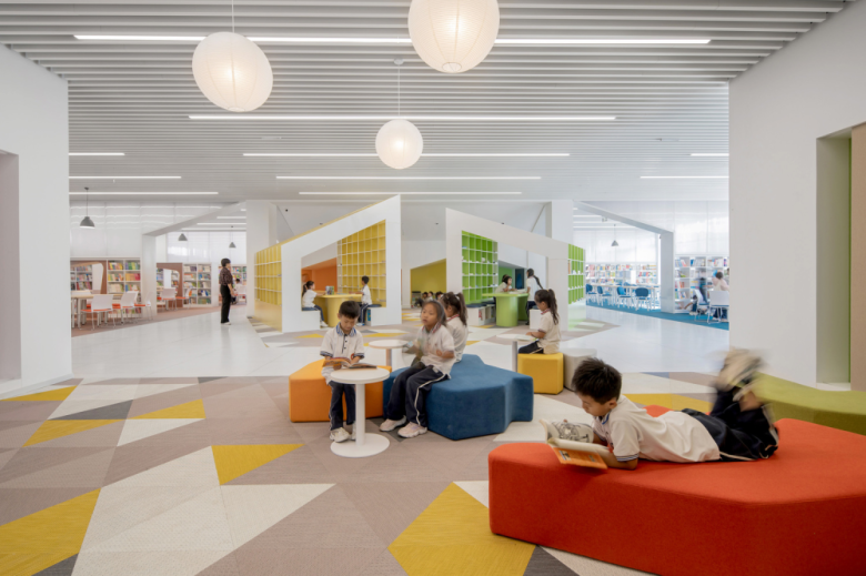
Shanghai Conservatory of Music Experimental School Hebi Branch is a newly-built nine-year public school. The library, centered on the campus’ main axis, serves as the spiritual visage of the school. When URBANUS received the invitation to design the library’s interior in June 2022, their designers were relatively unfamiliar with Hebi, as it was designated as a fifth-tier city. However, after seeing the prosperous state of urban development there, the designers felted motivated and hopeful to make an exciting library. In a way, it is the place where design strength is required the most that can shed the brightest light onto its strength. Nowadays, social media has shed light on the proliferation of internet-famous library and bookstores in first and second-tiers cities. However, a library in a fifth-tier city must not conform to such useless luxury; rather, it is a pragmatic necessity. Since children in such remote places has limited exposure to the world, a good reading space may nurture a love for reading, thereby developing a lifelong habit for learning. After all, it was William S. Maugham who said, “to acquire the habit of reading is to construct for yourself a refuge from almost all the miseries of life.” In short, the more under-resourced an area is, the more meaningful a primary school library can be. The original building has three floors – square in plan – with a large staircase leading to the second-floor, which has a central skylight and a mezzanine. The starting point for design is to upgrade the existing conditions with minimal cost.
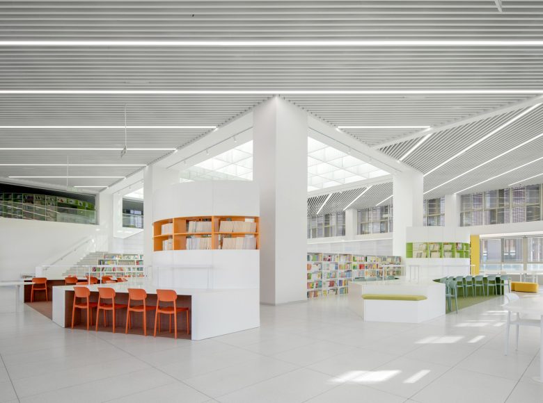
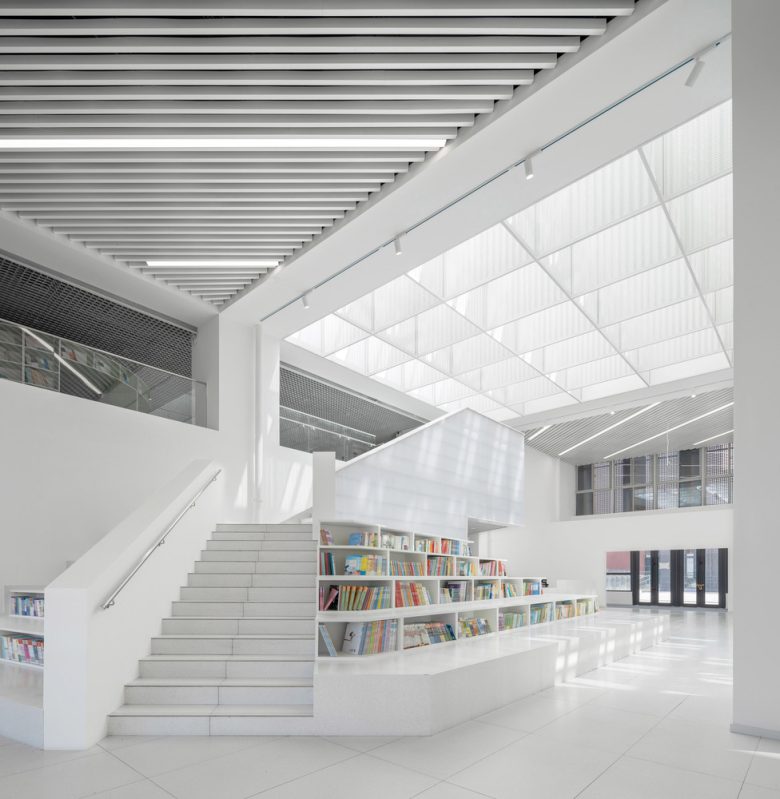
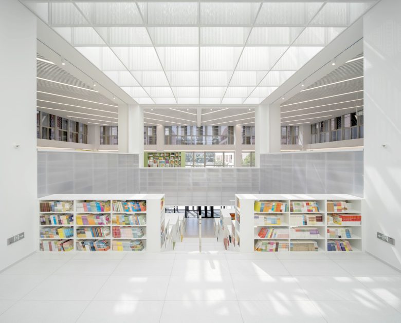
Problem 1: The skylight above the atrium lacks careful consideration for sun shading, ventilation, and smoke exhaust – resulting in areas with excessive heat and direct sunlight not suitable for reading. Solution: “Softening the light, soothing the wind.” The skylight is to be motorized with new clerestory windows to allow natural ventilation and reduce the need for air-conditioning, thereby assuring indoor comfort level through active energy-saving strategy. Below the skylight, perforated aluminum panels are suspended as a “light filter” to diffuse direct light into a gentler one for assuring the space underneath is suitable for reading.
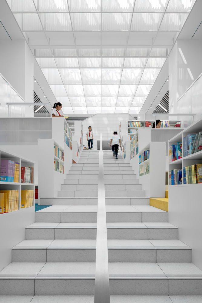
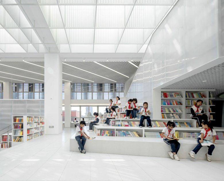
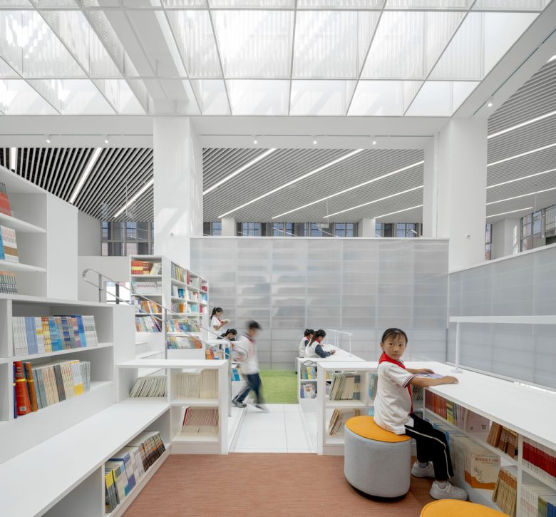
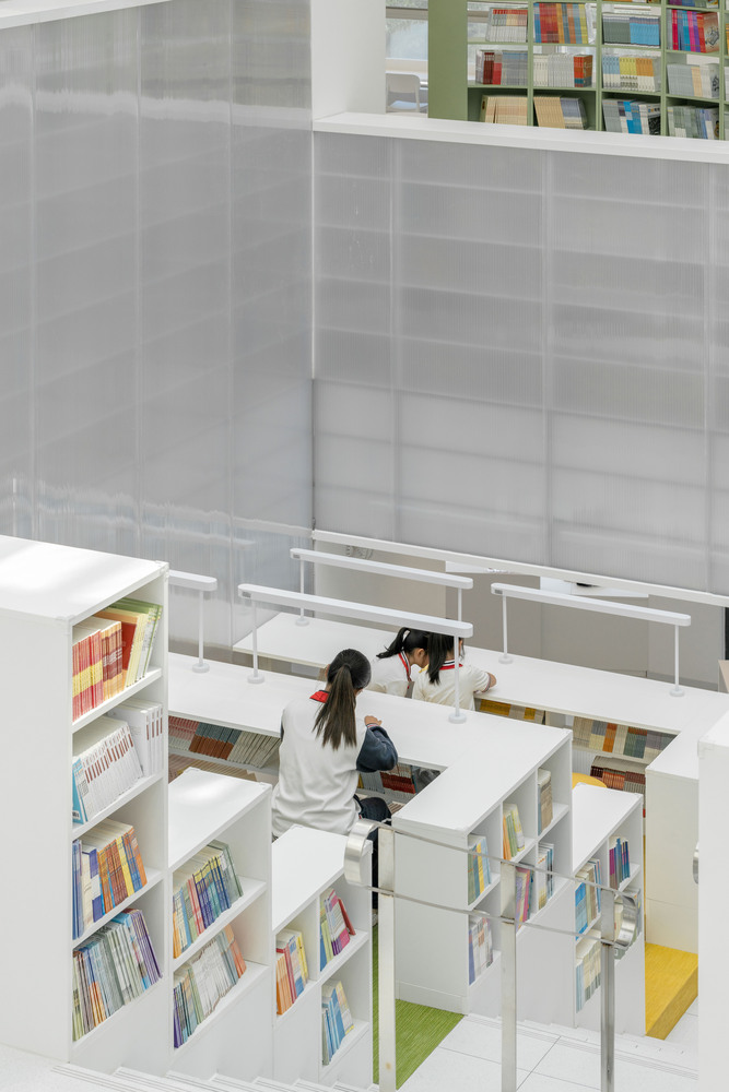
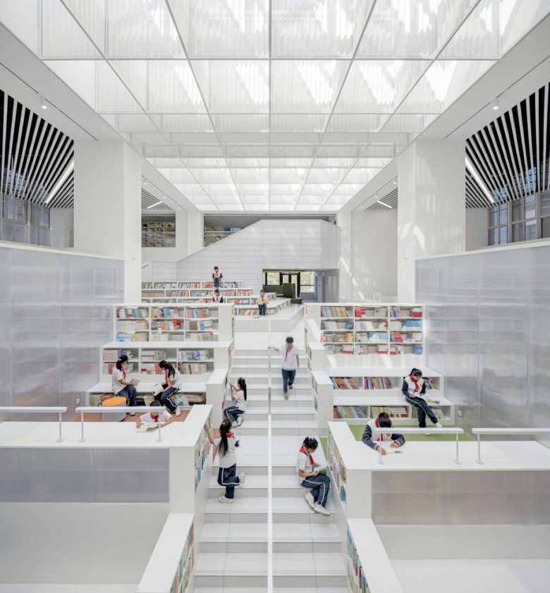
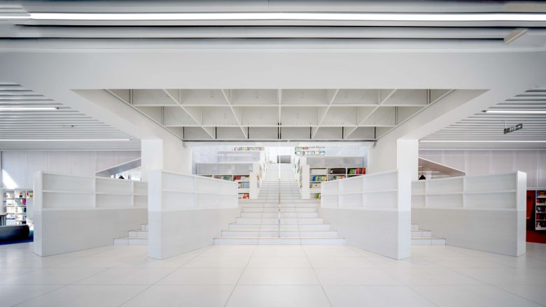
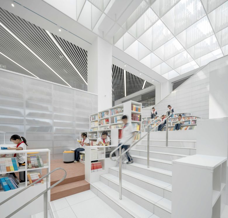
Problem 2: The original staircase is more akin to a bookstore’s event space, which is not appropriate for a quiet library. Solution: Building a “book mountain” – a cascade of learning. With the “book mountain”, the original large staircase is divided into several reading areas at different levels, which are bounded by a central stair. Functionally, this is a mixing space for vertical communication between elementary and middle-schoolers.
Problem 3: The third-floor of the original building was essentially a mezzanine overlooking the second-floor’s atrium; it had no direct connection with it. Solution: “Stepping up a level”. The third-floor is a teachers’ retreat – a reading lounge glancing over the lower levels. Below, the “book mountain” extends into the second-floor, linked via a zigzag staircase embedded in the bookshelves – completing a continuous spatial narrative throughout all three levels.
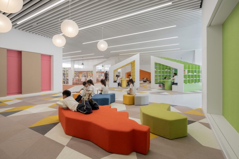
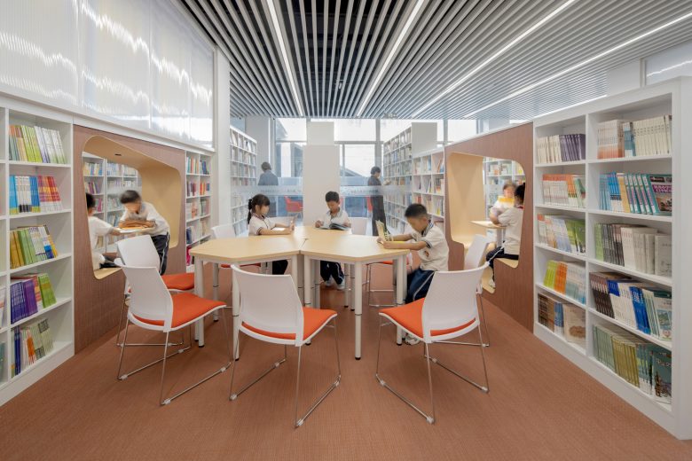
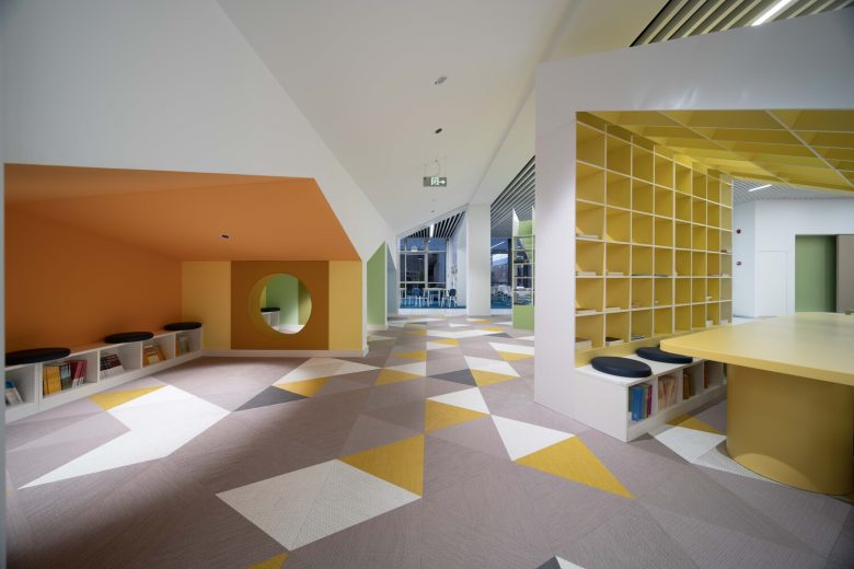
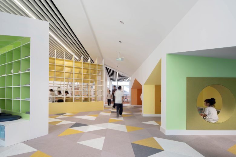
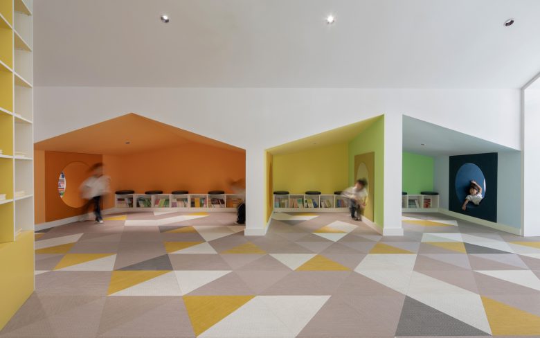
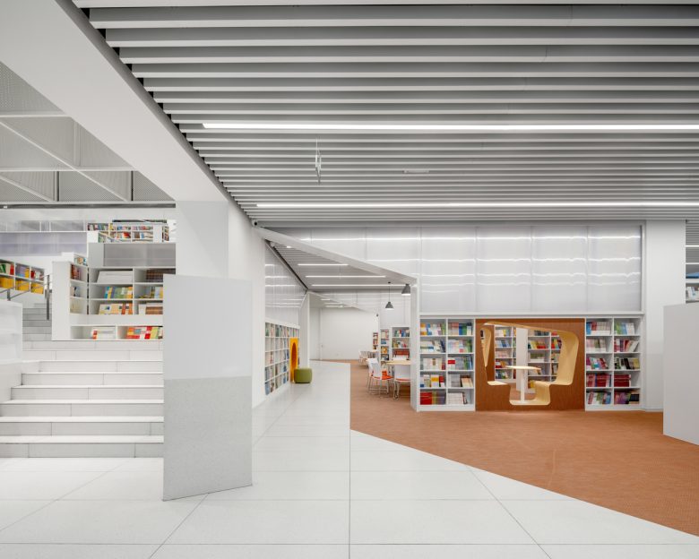
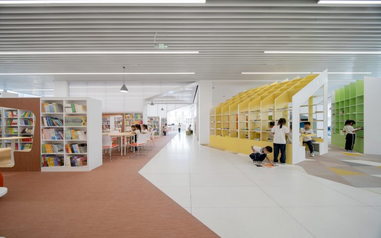
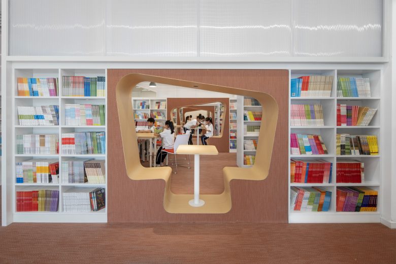
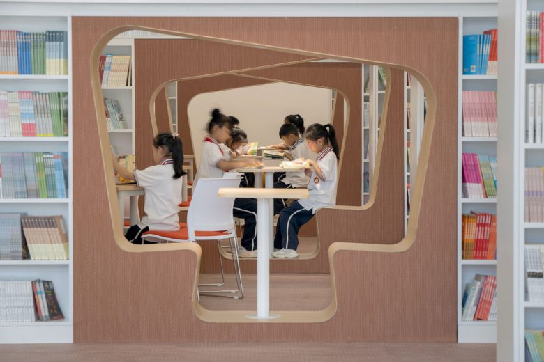
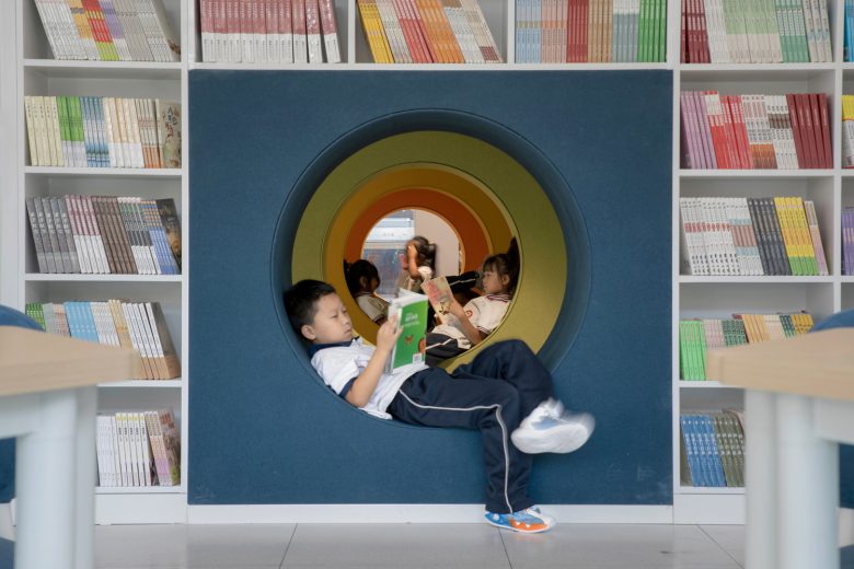
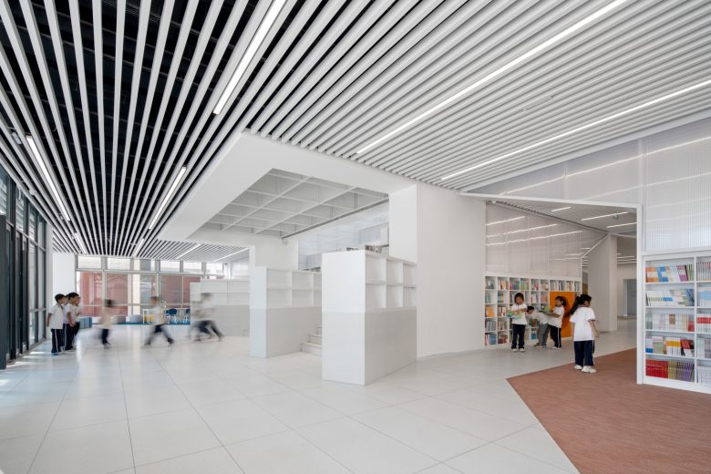
In the updated plan, the first-floor is designated as an elementary school reading area; it also includes a closed-shelf section accessible by teachers; the second-floor is designated as the reading space for middle-school students. First-floor elementary area. To expand the sense of space, glass partitions were used between the teacher’s closed-shelf section and the elementary’s open-shelf reading area. The transparency also allows teachers to supervise the students, thereby lowering managerial needs. Considering how elementary students have a hard time concentrating and may require supervision, the large space on this floor is subdivided into smaller independent areas via bookshelves. Each area can accommodate exactly one teaching group for reading sessions. In addition, the bookshelves are punctured with inhabitable “caves”, which not only assures visual porosity between the areas, but also provides a more introverted setting for the kids. As for the space underneath the large staircase, two different spaces are used to simultaneously form a series of “cave dwellings” and “reading huts”. These types of spatial games helps to create an exciting reading atmosphere.
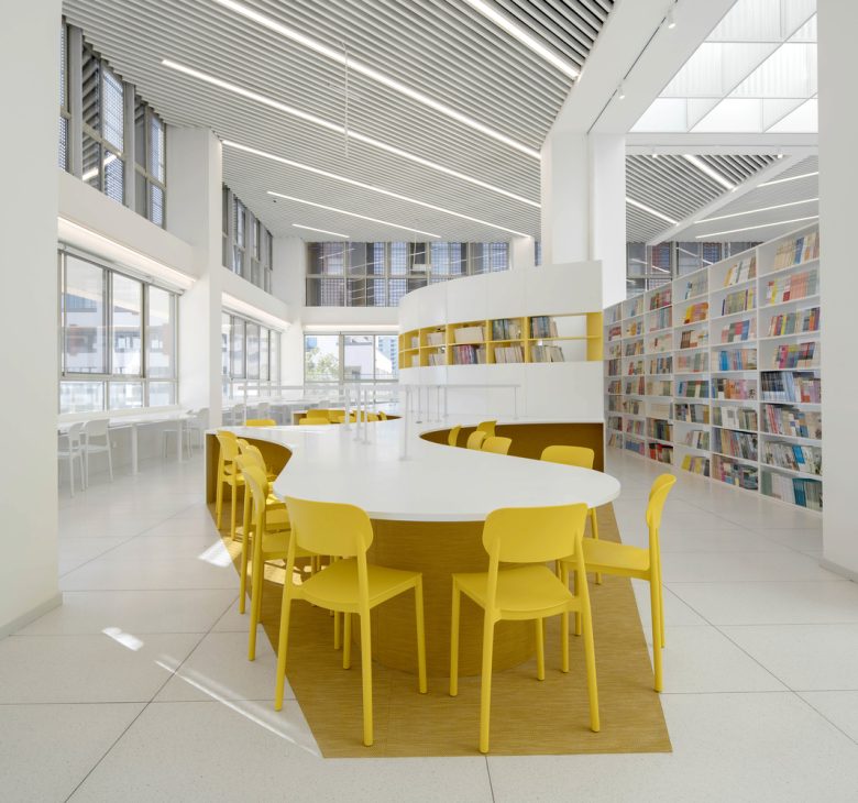
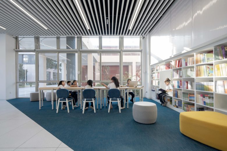
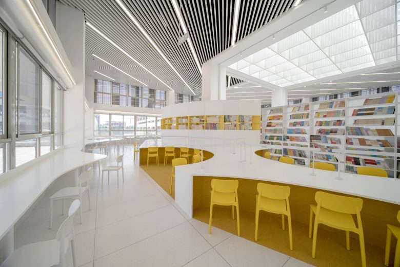
Second-floor middle-school area: Reading Islands. As a lofty reading space, the second-floor provides a variety of areas according to the needs of middle-school students. Along the curtain wall, a continuously-changing table serves as the individual study area. Here, there is an abundance of natural light and an open field of view – a fitting area for students to concentrate and think autonomously. Along the inner perimeter, three independent “islands” surrounds the atrium. With the size to accommodate one whole class, each “island” has one thematic color, a large shared desk, and a bookshelf hut for secluded reading. The big desk also allows a group of friends to openly share their books and thoughts.
Third-floor teachers’ lounge: “a spiritual highland”. The third-floor serves as a “refueling station” for teachers. The bookshelves here reject any materials related to teaching, but instead fill it with readings that helps a teachers’ self-improvement. Altogether, this is a retreat for socializing, as well as spiritual rehabilitation.
Materials. To make the space look brighter and cleaner, the walls and ceilings are finished in pure white, but additional texture is needed. Therefore, polycarbonate panels were deployed along the perimeters of the “book mountain”; its translucency dimly veils the colorful books behind the shelves. The suspended “light filter” was original designed with polycarbonate panels in mind, but it only held a fire rating of Class B1; the skylight of building material required Class A. As a result, it was replaced with perforated aluminum panels, which yielded a similar lighting effect. PVC-woven vinyl carpet of different colors and mosaics were used on the floor to define different spaces, as well as to enhance sound absorption. Together with highly saturated colors of furniture and bookshelves, they bring vitality and variety into the space.
Color Selection. The library needs to be clean and simple, full of vitality and positive energy. Therefore, the space called for large backdrop of white with accents of saturated primary colors. White was chosen for the large spaces to emphasize the quiet attribute of the library; feature include the white “light filter”, white translucent polycarbonate panels, and matted white terrazzo-textured ceramic tiles. Highlighted above the white are the bright colors on the floor, furniture, and bookshelves. Using color psychology as the basis, the carpet in elementary section used darker blue and brown-red so children of this age are not distracted while reading. The middle-school section on the second-floor has better lighting; by comparison, colors there appear brighter than the first-floor one, and as a result the space appears even more lively and active. Furniture Design. In order to continue the permeability and fluidity of interior space, the areas are only divided by bookshelves and desks. To achieve continuity with the ground, PVC woven vinyl carpets were also used as a finishing materials on parts of the bookshelves and desks.
Conclusion. With a quality even rarely found in first or second-tier city public schools, the budget for this library is not high. It takes place in a so-called fifth-tier city, and the benefits far outweigh the investment. Here it is even more necessary to use the power of a physical reading space to open up the children’s minds and to arouse their interest in reading, as they do not have the opportunities to enjoy an eye-catching reading space available for the children in first-tier cities. The intention of this design is to transform their love for a library into a love for reading – allowing students the means to build a portable “refuge” for reading that extends into their lives.
Architects: URBANUS
Lead Architects: Hui WANG
Design Team: Yutong Wang, Yongmei Yao, Yu Chen, Shuyan Zhang, Yenpang Chou, Jingyu Wang, Yiyang Wen, Zhongyu Jiang, Xiaoye Li, Ting Zhang | Mengting Yang, Chen Lin, Jinghan He, Yao Yutong (Intern)
Photographs: UK Studio
