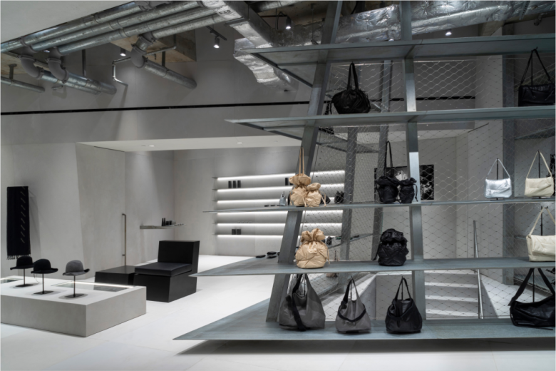
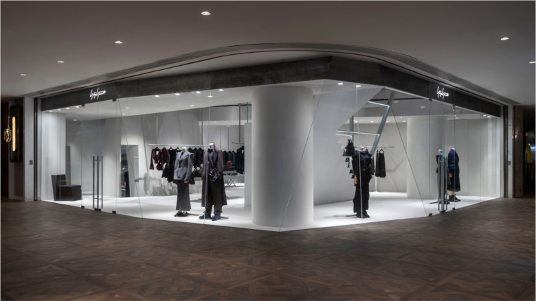
Japanese fashion brand Yohji Yamamoto‘s store at K11 Musea in Hong Kong first opened five years ago. Just a few days ago, the store relocated to a new two-storey unit within the popular shopping centre. Once again designed by Tokyo-based architecture and design practice OSO, the concept of the store takes cues from the city’s many skyscrapers, or more precisely, the complex concrete and steel layering that can be found below these buildings, underground, such as car parks, mechanical rooms and foundation structures. As such, the interior design of the new Yohji Yamamoto store translates this monumentality into larger-than-normal beams which accentuate the differences in height and emphasises the vertical axis.
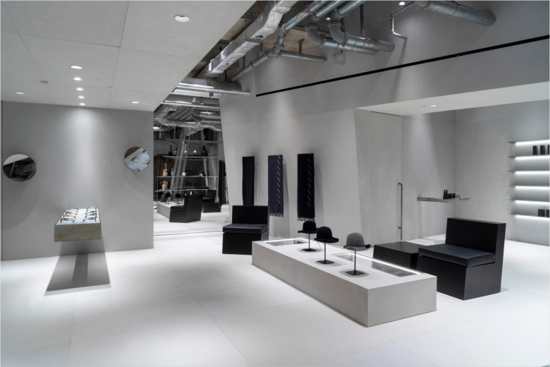
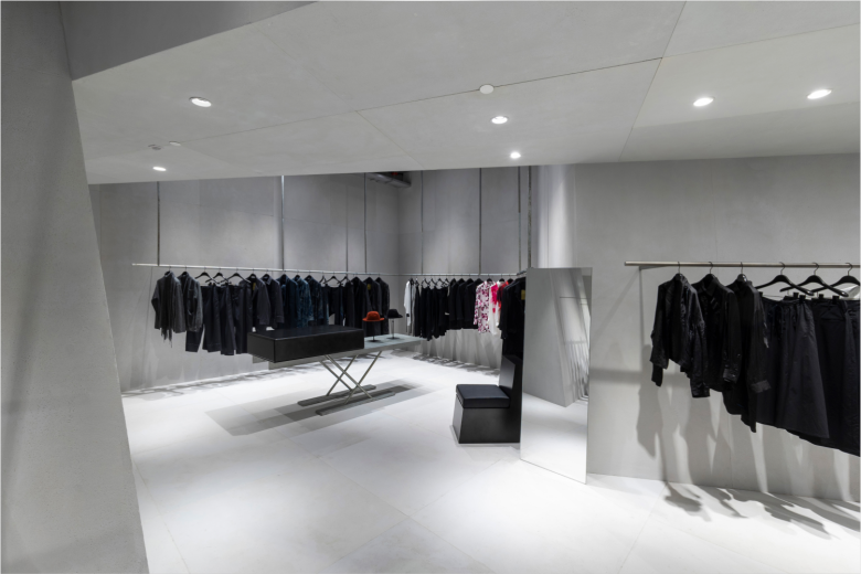
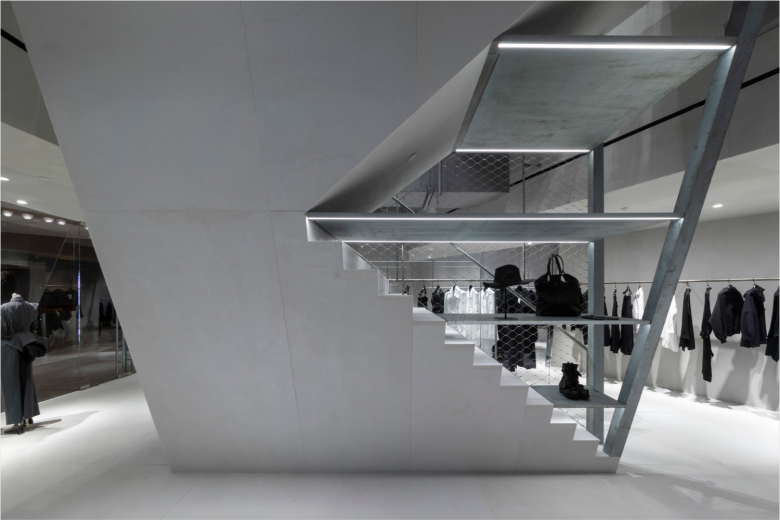
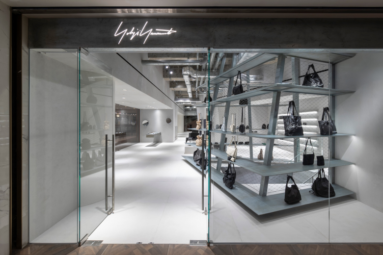
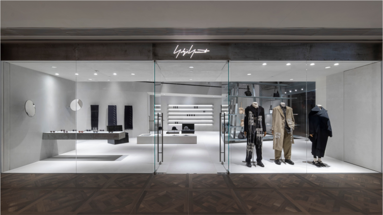
In areas without ceilings, the existing concrete structure, ventilation ducts and utility pipes are all exposed. Materials such as cement panels, galvanised steel and wire mesh emphasise the structural character of the space. Upon entering the store on the second floor, shoppers find a understated and sparsely furnished space in which a tiered metal display, which flanks a stairwell, takes centre stage. The walls are slightly angled, creating a sense of asymmetry and tension. So, upstairs. bags, eyewear, accessories, and other items are presented, while the lower floor sees the latest Yohji Yamamoto and Yohji Yamamoto POUR HOMME collections displayed on sleek wall-mounted and suspended metal racks. © superfuture
Add to collection
