


Add to collection
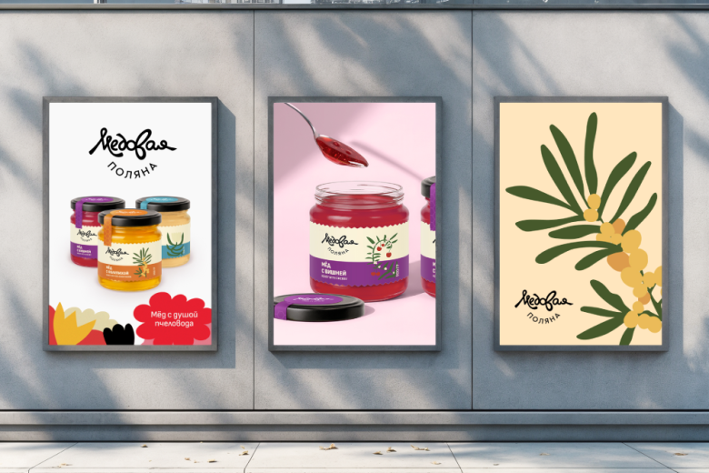
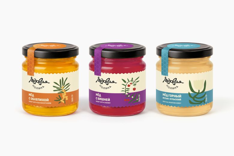
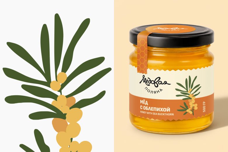
A fresh design for a traditionally conservative product. Honey is a classic, conservative category. Store shelves are packed with jars featuring gold foil, bears and honeycombs. Our task was to break away from predictable visuals and attract a younger audience that values aesthetics and natural products.
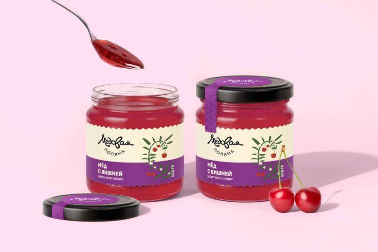
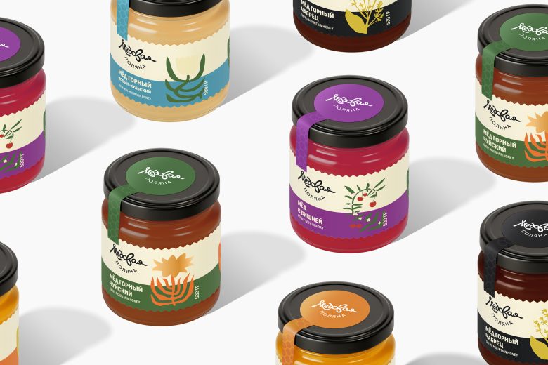
We developed a brand identity concept inspired by modern book illustration, with handcrafted, organic shapes. The packaging features bold botanical graphics (sea buckthorn branch, flower, berry) so the flavor can be recognized instantly. A signature seal-sticker running from the lid down the jar not only protects the product, but also adds a touch of “apothecary-like” precision and quality.
The result: a modern yet warm brand image that conveys care, craftsmanship, and high product quality.
Designed by Berik Yergaliyev


Add to collection