Add to collection
Curator’s Insight – The Well Coffeehouse
There’s something quietly rebellious happening on the shelves of Nashville’s specialty coffee scene, and it has everything to do with a color choice that most coffee brands would never dare make.
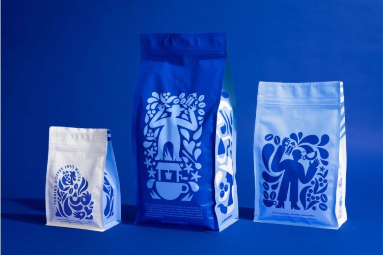
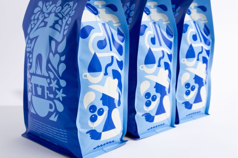
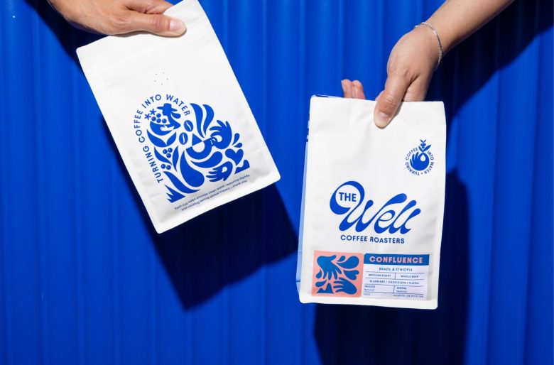
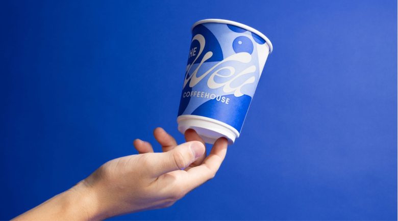
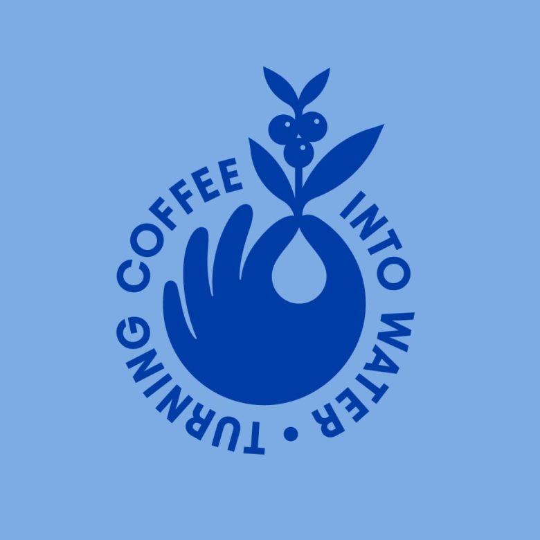
The Well Coffeehouse, in collaboration with Carpenter Collective, did something genuinely unusual: they stripped out every shade of brown, kraft, and cream that the coffee industry has relied on for decades and replaced the entire brand identity with a bold, electric blue. No coffee-brown anywhere. Not even a hint of it. For a coffee brand, that’s practically a provocation.
And it works. Brilliantly.
The Blue Cup Paradox
Here’s what’s fascinating from a packaging standpoint. Blue, as a color, is traditionally associated with water, not coffee. Most food scientists and brand consultants would warn you away from it for anything warm and caffeinated. The thinking goes: consumers expect warmth from warm drinks. Brown, amber, terracotta, cream, these are the “safe” signals.
The Well flipped this logic on its head and made it the entire point. Blue isn’t just a color choice here. It’s a thesis statement. Every time a customer picks up one of those cobalt cups, the brand is subconsciously whispering: this cup of coffee is connected to water. It’s not a coincidence. It’s the mission made visible.
That’s extraordinarily difficult to pull off, and most brands attempting this level of conceptual depth end up with something that feels forced or over-explained. Here, it feels inevitable.
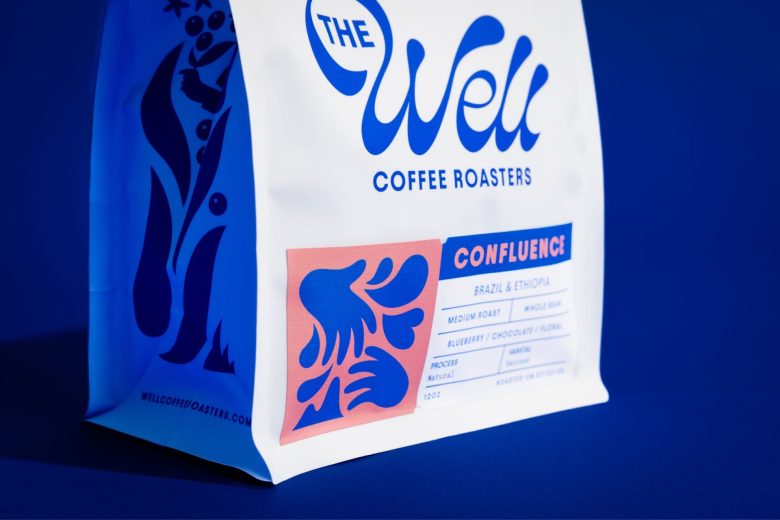
The Label System Is Doing Heavy Lifting
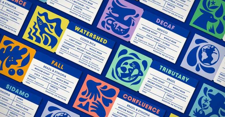
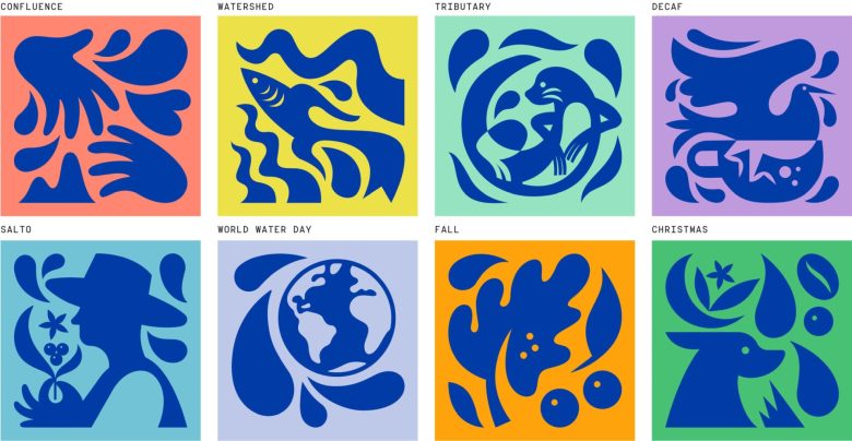
Look closely at the roast label cards and you’ll notice something that sets this apart from virtually every other specialty coffee label system in the market: each roast gets not just a name, but what feels like its own little painting.
The illustrated vignettes, Confluence, Watershed, Tributary, Fall, Sidamo, these aren’t decorative fillers. Each one is a two-color composition that feels like a Matisse cut-out had a conversation with Latin American folk art. The figures are loose, gestural, almost mythological. A fish caught in water currents. A farmer beneath a coffee plant. An otter spinning in a whirlpool. A globe wrapped in a water drop.
What’s clever here is the restraint in the color pairing. Each illustration is rendered in just two colors: the cobalt blue and a single background pop (coral, yellow, mint, lavender, orange, sage). The result is that the system feels rich and diverse, eight completely distinct personalities, while remaining unmistakably one brand. That kind of controlled contrast is genuinely hard to design and even harder to maintain across a system this size.
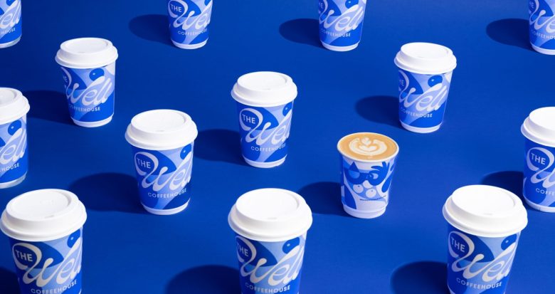
The Typography Choice Is Underrated
Most people will look at this project and talk about the illustrations. But there’s something the text doesn’t mention that deserves attention: the wordmark. That flowing, almost liquid script treatment of “Well” is doing enormous work. The letterforms feel like they were drawn with water, loose and curving, not with a rigid pen. It’s the kind of custom lettering that, when scaled up across a large cup sleeve, creates a wave-like repetition that almost moves.
Paired with the tight, utilitarian all-caps label typography on the roast cards, the brand occupies two distinct registers at once: expressive and poetic on the outside, clear and honest with the information. That dual language is smart branding.
What Nobody Else Is Talking About: The Cup Hierarchy
One detail that easily gets missed: the three to-go cup sizes each carry a different design variation. On the surface, that sounds like a lot of production overhead. In reality, it’s a genius retail strategy. When customers in line scan the counter, they’re not looking at a single repeating cup. They’re looking at a whole visual ecosystem, different sizes carrying slightly different expressions of the same blue world. It creates the impression of depth and variety without the brand ever losing coherence.
The espresso-sized cup even gets a completely different treatment with the illustrated character vignette on its body, as if the smallest drink gets the most intimate, personal story.
The Bigger Picture
What Carpenter Collective achieved here goes beyond a nice rebrand. They solved a genuinely difficult brand strategy problem: how do you make a mission-driven coffee company’s social purpose feel like a design asset rather than a marketing message?
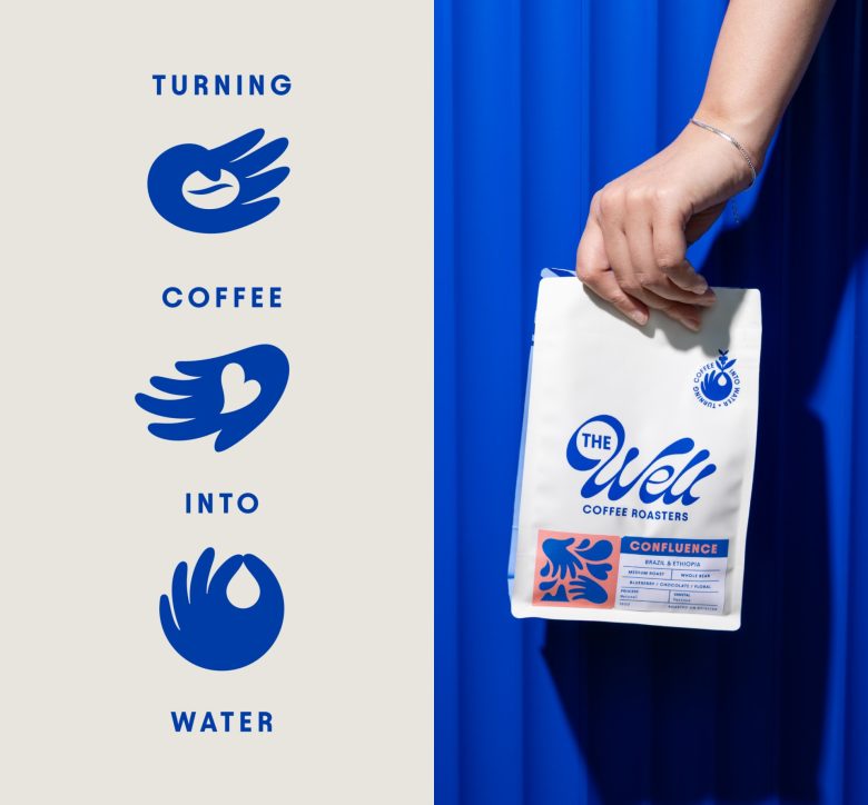
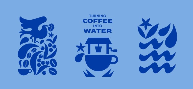
The answer was to make water the aesthetic foundation, not just the story. Every element, the blue, the fluid icons, the water-derived roast names (Watershed, Tributary, Confluence), the flowing wordmark, all of it makes you feel the mission before you read a single word of copy.
That’s the difference between branding that tells and branding that shows. The Well does both, but the showing comes first. And in a market overrun with brands that talk about purpose but package it like an afterthought, that clarity of vision is as refreshing as a clean glass of water.
Designed by Carpenter Collective
Add to collection