





Add to collection
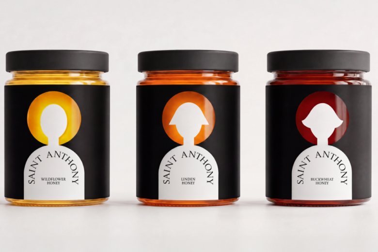
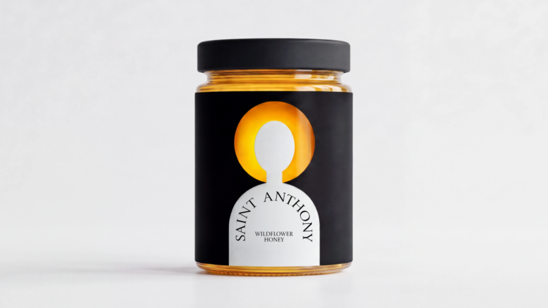
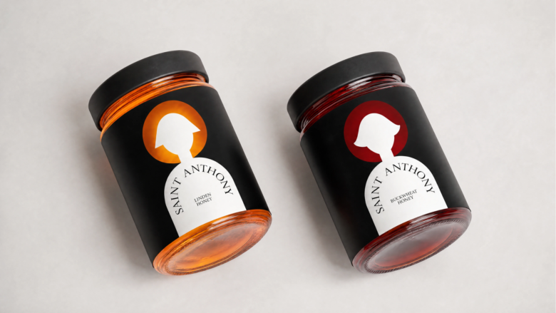
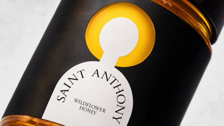
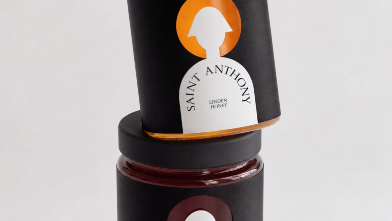
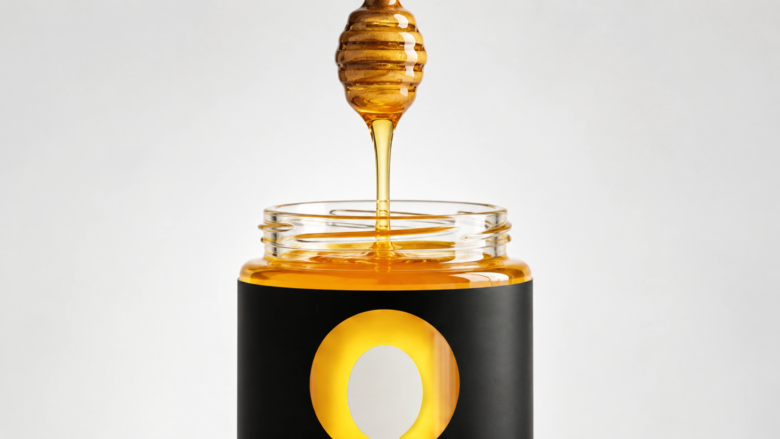
The packaging concept for “Saint Anthony” monastery honey is based on the image of the halo — one of the key symbols of the saint’s iconography. The absence of a back label allows light to pass through the glass: under certain lighting conditions, the halo seems to glow from within, enhancing the sacred character of the packaging. The SKUs are differentiated by the hairstyle of the figure and the natural color of the halo, created by the unique shade of each honey variety.
Curator’s Insight
What makes this work is how much the design leaves to the product. The black label and lid act like the dark panel of an icon, and the figure is simply a white paper shape set against it, so the only color on the shelf is the honey itself. That keeps the range cohesive without extra inks, because the variation comes from what is inside the jar. The arched nameplate does double duty as the figure’s shoulders and as an inscription, borrowing the logic of a niche or altarpiece without any ornament. Small shifts in the silhouette, from a rounded head to a bell cut to a flipped bob, give each variety a personality at a glance. The restrained serif keeps the tone quiet.
Designed by Eva Chistyakova

Add to collection