
When the office space adjacent to Pinkeye’s headquarters became available, the crossover design studio jumped at the opportunity to expand into the space that was formerly occupied by fashion designer Veronique Branquinho. Pinkeye’s former office had become too cramped and it didn’t exactly match the needs of its varied workforce.

‘We are a multidisciplinary design studio, with various in-house specialisms – product developers, graphic designers, interior architects, marketeers – so our way of working is very dynamic and our output is highly diverse,’ says Pinkeye’s Creative Director, Ruud Belmans. ‘We can just as easily satisfy a brief to develop a retail interior as we can fullfil a commission to conceive a total identity for a brand.

It would be a shame not to use all the different talents and expertise we have on board, but working in a multidisciplinary way demands an office that allows you to do that.’ This calls for a communal area that facilitates interaction to a certain extent, with smaller workstations to group together and brainstorm about a certain project. ‘A graphic designer regards a briefing for an interior project from a different perspective to an interior architect. Under the right conditions they enrich one another, which leads to novel solutions that you wouldn’t normally come up with.’

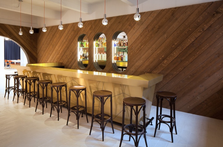
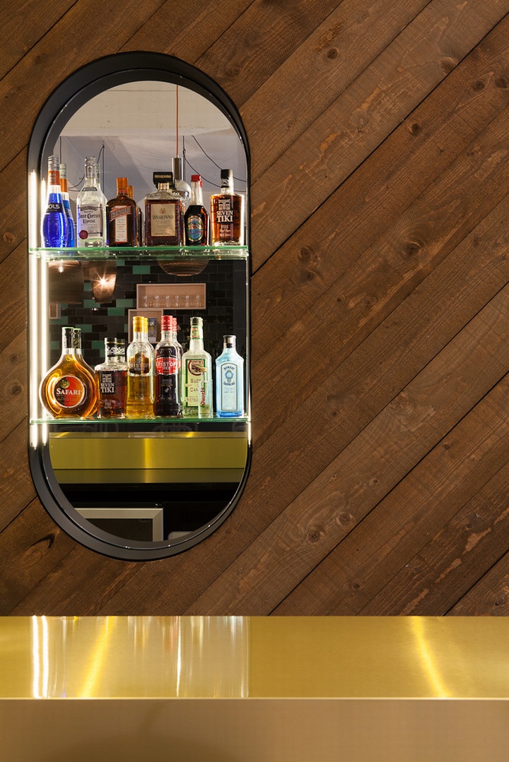
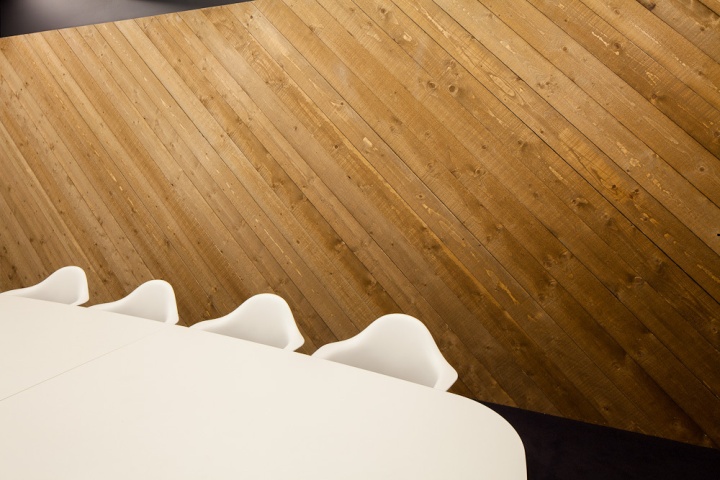
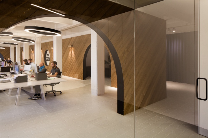
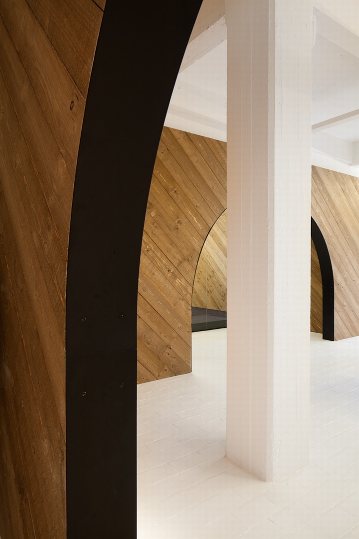
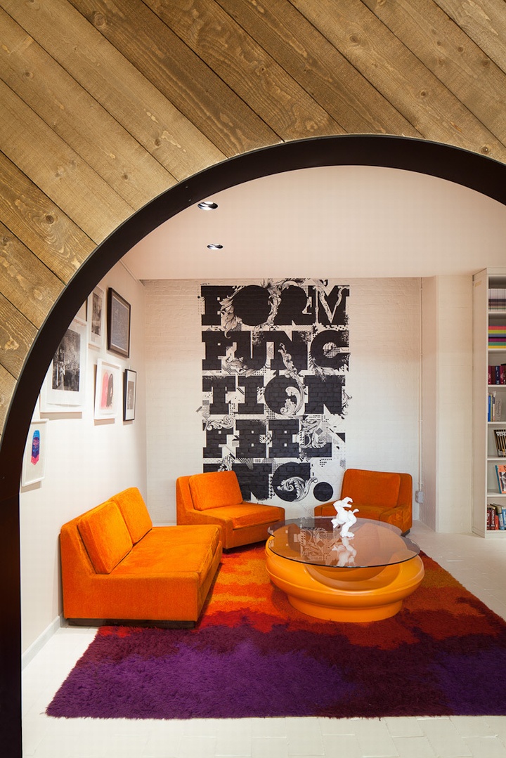
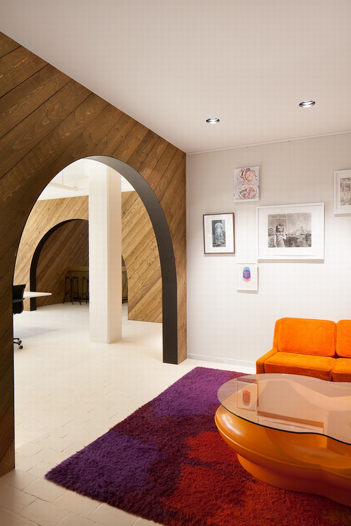
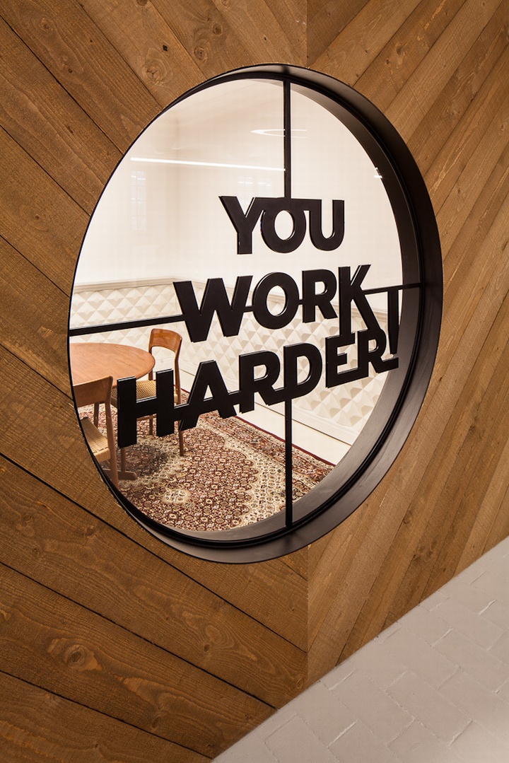
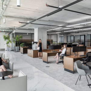
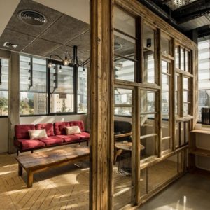
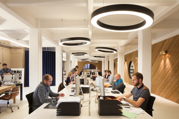
The central element in the design of the 600-square-metre space is a dividing wall that runs the length of the work space. Clad in diagonally framed wooden beams, the wall’s interplay of lines creates structure and atmosphere, providing a framework that accommodates several more intimate spaces. Half moon shaped cut outs make for windows that reveal more intimate rooms, an intervention to create quiet, private work spaces in the overall open office design. An elongated office table houses 18 monitors, mice, graphic pads and keyboards for as many creative heads.

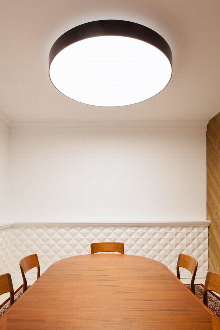
The interior is a mixture of design and no nonsense. The pinewood struts that support the wall are intentionally left raw and the four perfectly curved openings in the tall wall are placed symmetrically, which gives the entire space a funny ‘sacred’ feel. Belmans doesn’t think it’s church-like, but a childhood filled with building treehouses that lies at the root of the design. Black-and-white hanging lights hover above the central work table like UFOs.

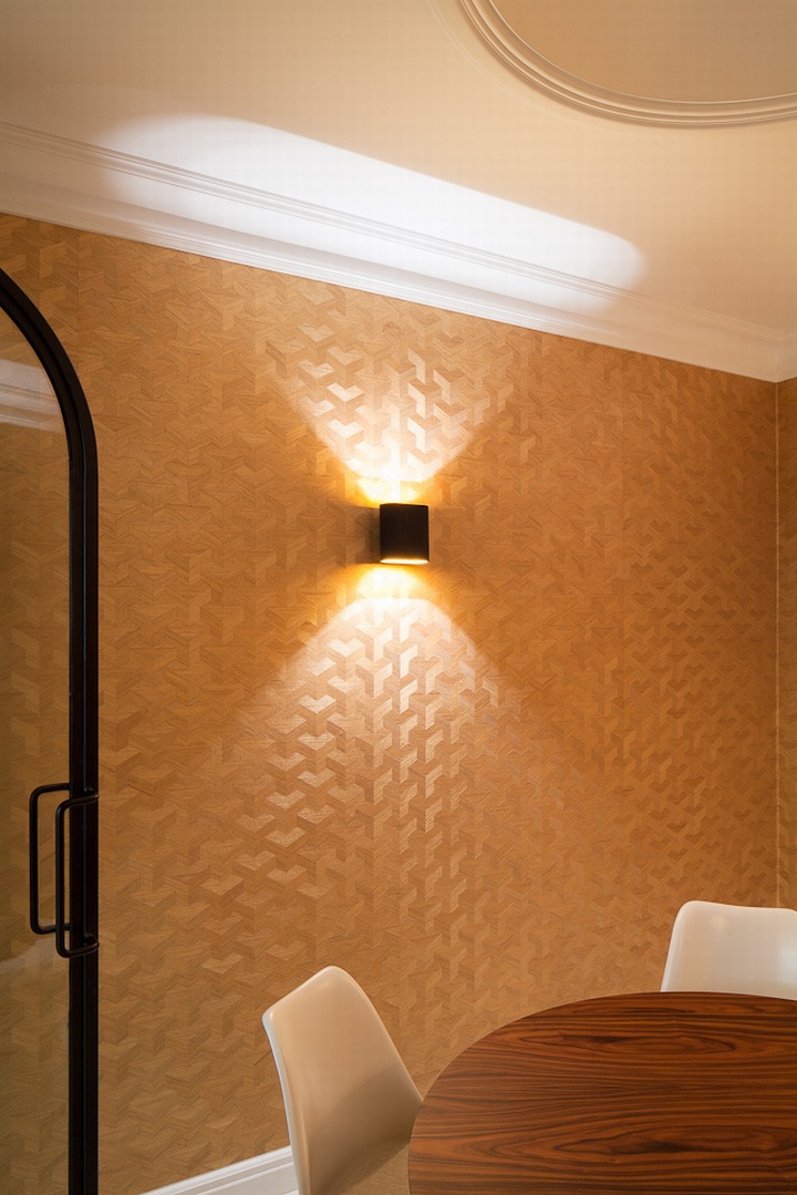
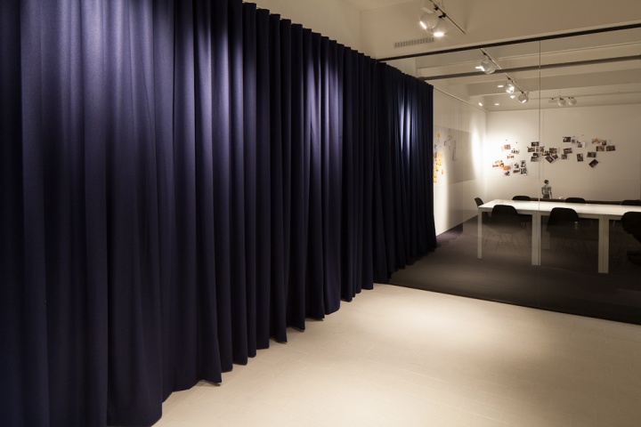
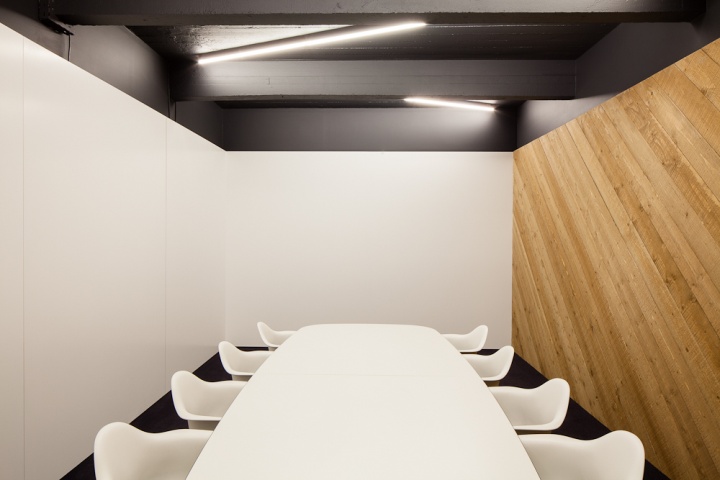
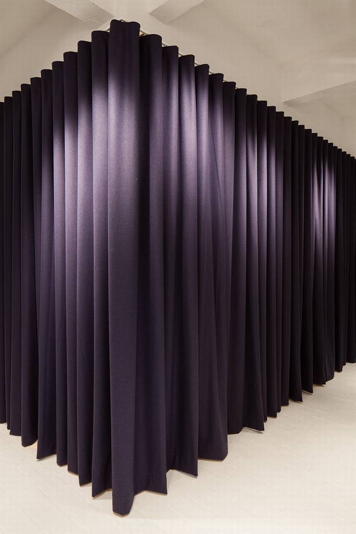
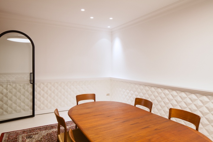
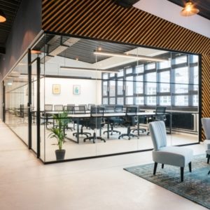
‘We had the ridges painted the same matt black as the metal sheets which clad the curves in the wooden wall.’ At the near end of the room there are two spaces set behind glass doors: a rather sober conference room and a more decorative creativity room. Vintage furniture evokes emotion, most of which comes from vintage shops. Petrol-blue curtains can be used to hide away the whiteboard walls, a smart invention to keep discussions with clients out of sight where necessary. ‘We installed a beamer, so you can actually write on the wall via the projector.’

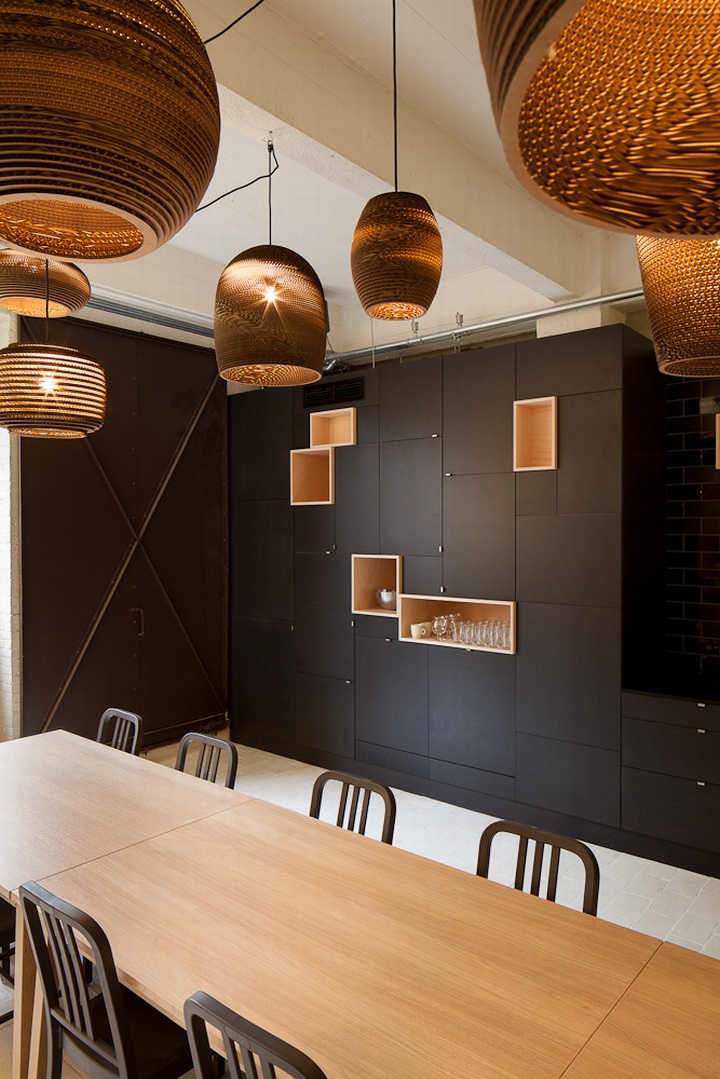
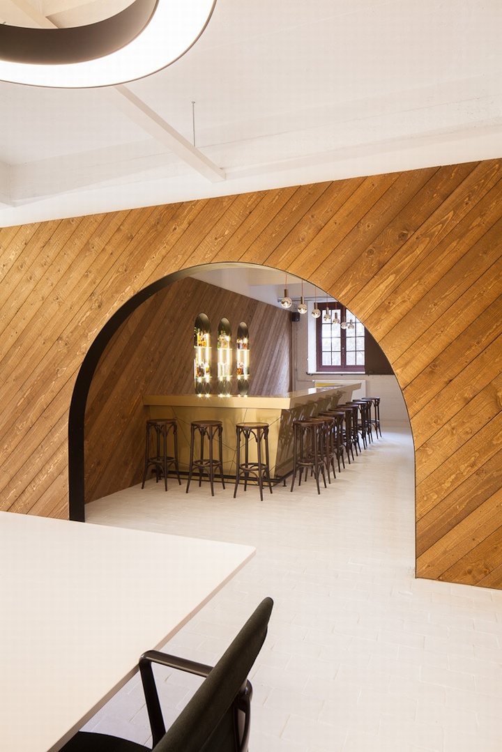
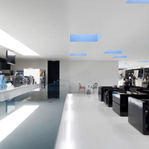
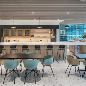
Parallel to the work island, the smaller units house a room for conference calls, a meeting room and a library. The spacious lunch area, a space that could equally serve as a bar, is set to the rear. The bar itself is clad in gold, with diamond-shaped cut-outs outlined in black. ‘I thought it was important for us to all be able to eat and sit together,’ Belmans explains. Opposite the bar there are several smaller tables with Emeco Navy chairs. Hardly the worst place to enjoy your sandwich.

As I was heading out my eye was drawn to a text in one of the windows of the smaller workspaces. Sculpted in matt black metal, it says ‘You Work Harder’. It is a message so direct that all you can do is smile. Goal achieved, I thought, as I left the office to catch the train home.
Photo’s by Frederik Vercruysse
