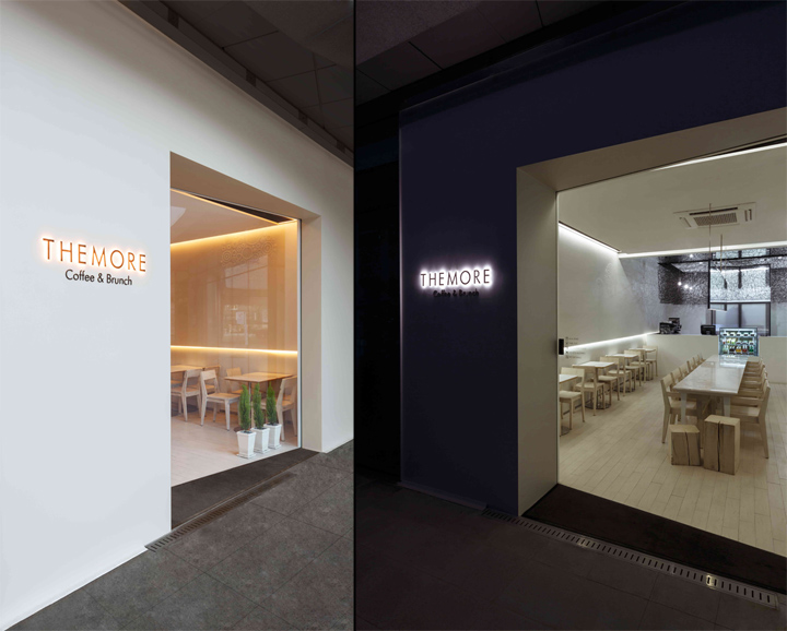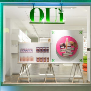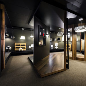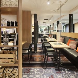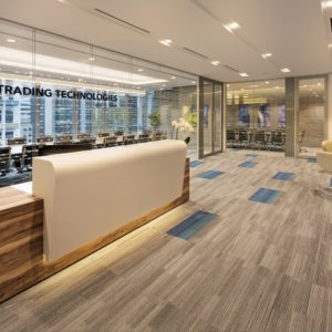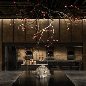
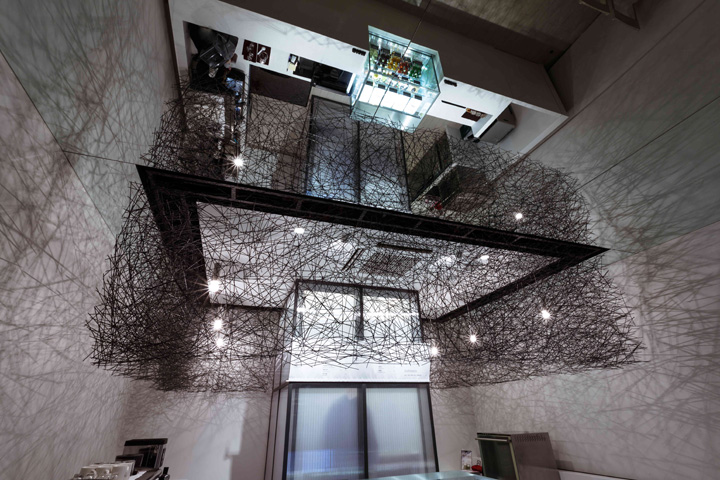

Café ‘THE MORE’ project, a client with a modern minimalist sensibility began with a visit to a holding company named ‘THE MORE’. Cafe called ‘THE MORE’ but people like frills space suitable new space. ‘Refined chic to, but was working on a project space in the direction of a little space where you can feel the comfort and richness of contradictions.

Project “One unique element is the symbol of the brand.” Space from the start. To release much want. 53.4 ㎡ to share space in the compartment, but the assignment to the various elements that narrow space even more frustrating to only one of the formative elements ‘THE MORE’ to express. Upright base space required for these plans. Space and the whiteness of the square assignment, but only the necessary functional elements were behind the scenes.

Functionality through the forms themselves exposed from the wall niche The SIDE TABLE LIHGTING, CENTER MIRROR PENDANT does not resolve. FAÇADE In addition, there is no boundary of door and window.
Each element is placed in the required position, but does not highlight the form of the function solves. This is the most prominent symbols to be focusing on in the design process the most part had a lot of troubles.

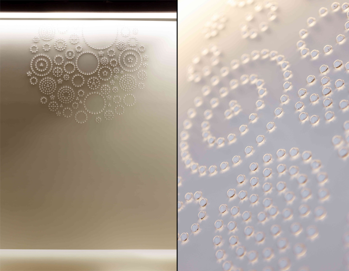
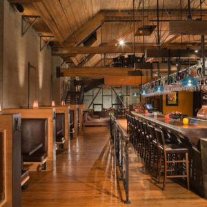
Bar counter, the upper part of the objects were having to lump the face of tens of thousands of thin round bar one of those lines and connect the elements and Chubby Made of mass lump line between light escaping effect enrich the fullness and the emptied space more than anything else, has made

In space for the first time when you came in, some of the planning table, marble countertops line the lower part of the space on the table, using one of Natural sit lower eye ‘moment’ to be comfortable so that you can feel the atmosphere, but you can feel the cold atmosphere.

Uniform …
Nowadays cafe always look and the way we’ve seen products such as repetitive. Against such appearance is the trend these days is like a dip. Now ride the trends that you think you need.
Design Office: Betwin Space Design
Photographer: Lee Pyo-joon
