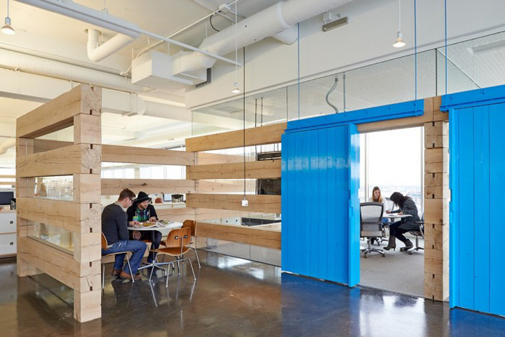

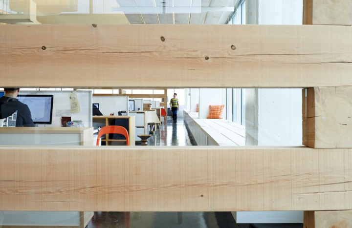
Minneapolis-based advertising firm mono recently moved into a new 20,000 sqft office. Following a period of large growth, the new space is designed to maintain the unique culture and working model which has been central to the firm since it opened its doors in 2004. mono’s previous office has perennially been one of my favorites because of its collaborative layout and simple aesthetic – all of which seem to have made themselves into the new uptown office.
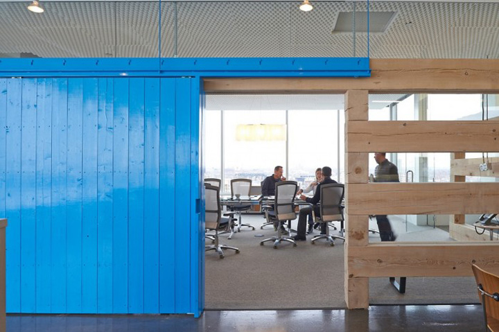
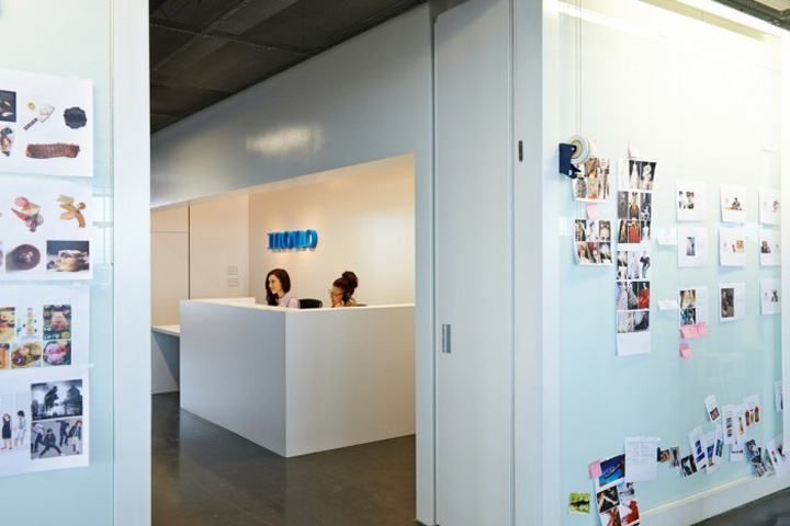
The new office’s design is centered around the idea of attaining innovation and functionality through simplicity – rather than gimmicks, trends, or quirky design choices. One interesting design choice is to not adorn the office with past company work in order to look to the future rather than dwelling on the past.
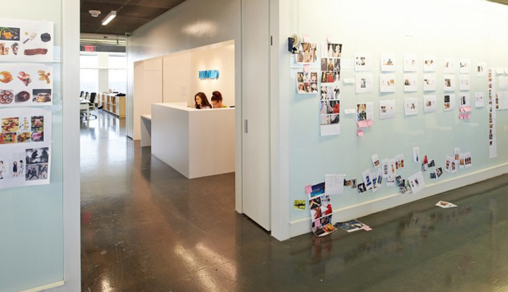
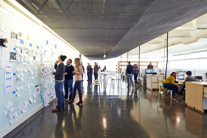
Collaboration has found a home at the 75 foot surface dubbed, The Wall. mono explains that, “The Wall has always been core to mono. It is where the team’s thinking happens – where briefs are posted, strategies sharpened and ideas born and nurtured. It is also a place where everyone has input, regardless of level or role, as mono believes that the greatest ideas come from everywhere.”
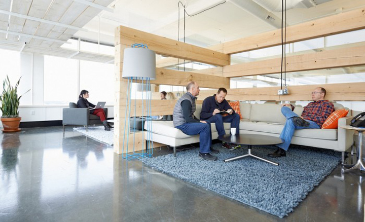
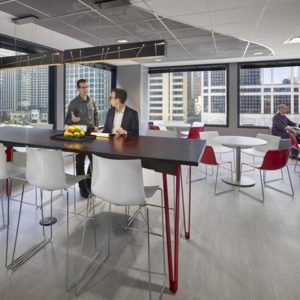
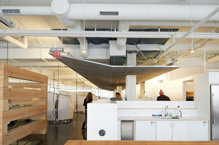
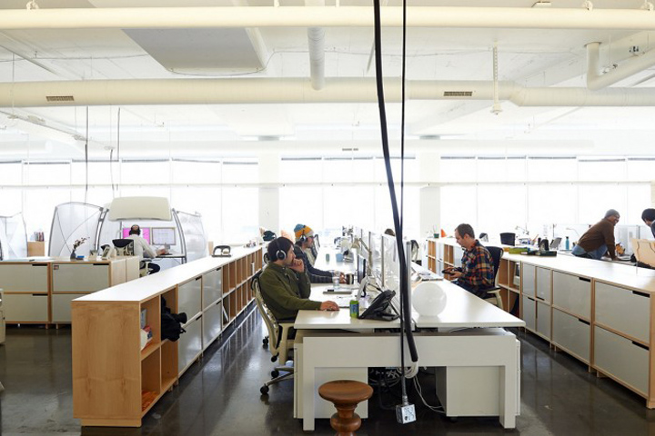
Employees are stationed in an open workspace which the firm has crafted to foster connections and interactions. Smaller private spaces and meeting areas are located nearby for quick private conversations. The layout of the office has no stark division between departments because mono wants the lines between them to be blurred so employees see themselves as “part strategist, part designer, part account manager and part creative.”
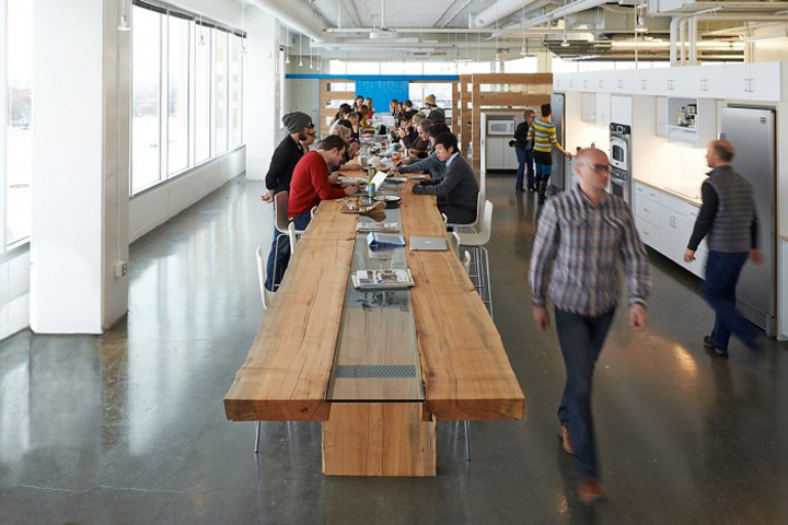
mono has also seen fit to create a huge kitchen space with a beautiful 50-foot maple table. Kitchens and staff rooms are often fairly unusable, but this kitchen can be used for everything from social gatherings to company-wide meetings.
Designer: Charlie Lazor
Architect: Alex Haecker




http://officesnapshots.com/2013/04/15/monos-new-office-design-culture-creativity/


Add to collection
