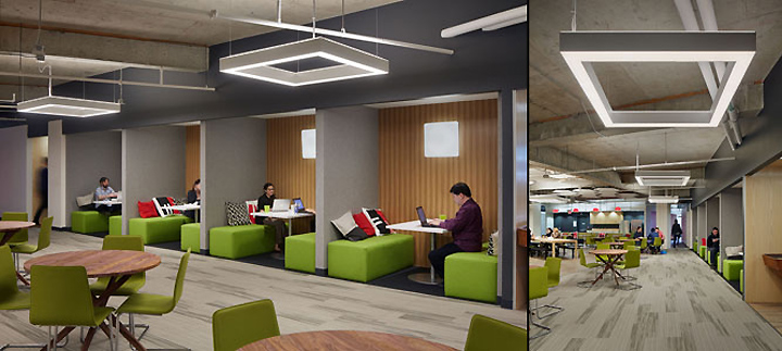

While Silicon Valley has long been known as the hot spot for tech companies, in recent years San Francisco has been rising as a contender when it comes to tech-savvy cities. The completion of SquareTrade’s new office on Third Street gives San Francisco yet another prominent tech HQ to claim as its own. SquareTrade’s 53,000 square foot office accommodates up to 500 employees and demonstrates an intelligent, modern design that reflects on the company’s core values.

SquareTrade, a company which offers extended warranties for smart phones and electronics, had outgrown its old office and needed a larger, future-proof headquarters that would demonstrate the company’s democratic structure and collaborative work process. SquareTrade hired Design Blitz architects to envision the new space, all within a tight budget and on an incredibly short schedule.

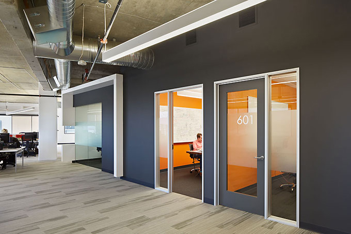
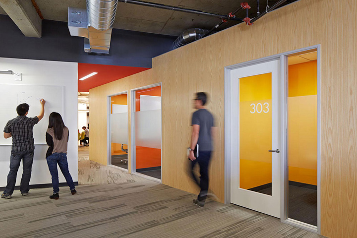
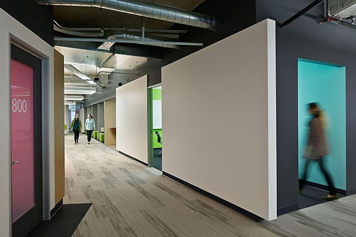
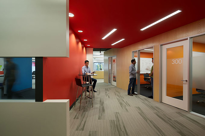
Blitz designed the overall space to reflect a modern, bright, and simple style which would be befitting of an established, yet innovative and growing tech company like SquareTrade. The focus was on clean, white edges. To keep things both simple and interesting, the architects chose a monochromatic color scheme for the exterior walls of rooms, and then specified warm, vibrant colors for the interiors of rooms. A total of fifteen colors were used in the project, but the end result is sophisticated and sleek.

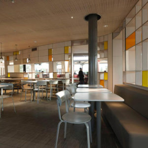
The heart of the office lies within a central hive area, where cafe and dining functions are housed. Blitz also designed the hive to accommodate multiple other functions, such as all-hands meetings and presentations. For this space the architects specified natural wood and warmer color temperature lighting, to give the hive an inviting, social feel. But since the hive is in the center of the office, and caters to social and dining activities that create noise, Blitz needed to organize the limited amount of remaining interior space in a way that would mitigate the acoustics between the open office and the hive.

To achieve this, the architects created two large banks of conference rooms at a 20 degree angle to each other, which run parallel to the hive and buffer it from the open office area. The result is a visually and functionally impressive design element. Not only do these bars of conference rooms create an acoustical barrier, but their placement also achieves unique sight-lines and divides the open spaces into additional breakout areas.

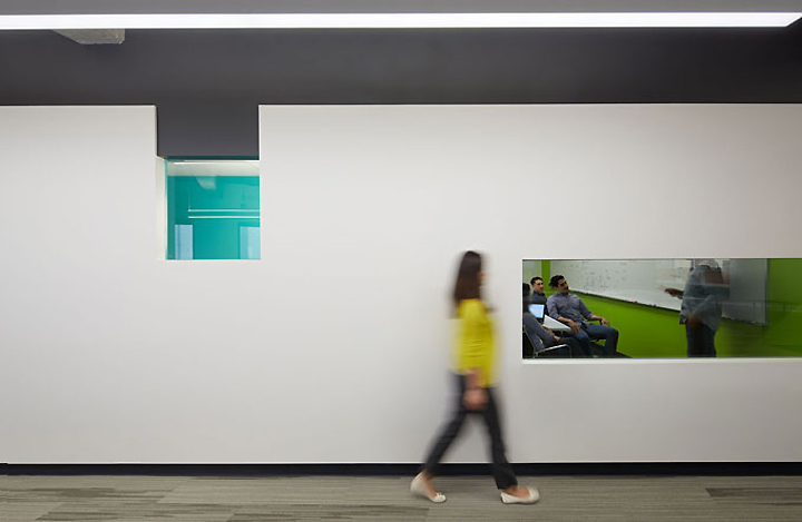
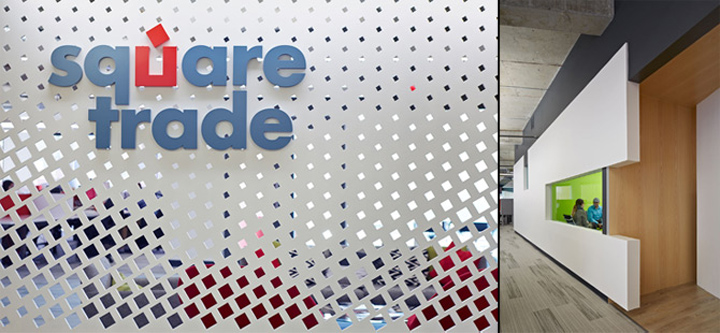
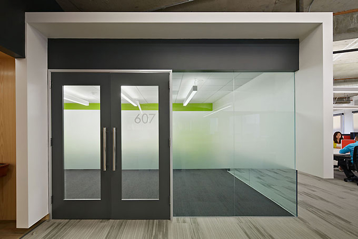
To give the bars an architectural, three-dimensional quality, Blitz applied walls as a “skin” element to them. The architects used a dark gray finish at the tops and bottoms of the bars not only to conceal mechanical systems and ducts, but also to draw the eye to the clean, simple area of the skins. The skins extend several inches from the edges of the conference rooms, creating a floating, architectural effect.

Perhaps the most important quality of the skins, though, is the glazing feature that the architects designed. Offering visual appeal in addition to functionality, the conference rooms have glazed slits at varying heights according to each room’s purpose (ground level slits for high privacy, desk level for medium privacy, and standing height for maximum privacy), creating an architectural permeability that corresponds with the function of each room. For example, SquareTrade’s design team needs separate office space but not a large amount of privacy, and as a result is housed in the rooms with desk-level glazing. Training, on the other hand, takes place in conference rooms with ground-level glazing to give everyone more privacy.

