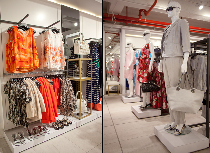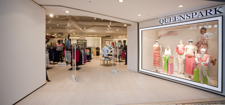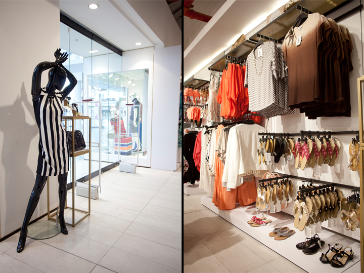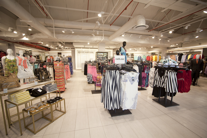


Exposed ceilings and services, a monochromatic white-on-white palette with subtle touches of gold and black and clean, crisp lines all make up the fresh new look for South African national clothing retailer, Queenspark.

The latest flagship store in Cape Town’s fashionable V&A Waterfront opened its doors in August 2013, ready for the busy summer tourist season. Taking a step away from their Sandton Concept of 2011, the brand wanted to create a look specifically for an international customer. The design brief was to conceptualize a store that is modern and elegant, uncluttered, with all sub-brands sitting comfortably next to each other. The store was to be a sophisticated but unintimidating retail space with subtle textural references to international retail design.

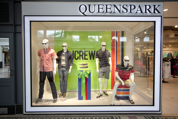
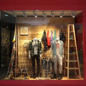
The completed project boasts an expansive shopfront with an unexpected angled window, clad with Surrino® solid surfacing and finished off with a delicate brass trim. Striking beveled LED light boxes frame the large show windows.

White Porcelanosa ceramic tiles together with the white ceiling void create a clean background for the simple black steel fixtures. Wall bays are framed with white textured surrounds and LED light strips create a warm edge glow along the perimeter of store. Both wall- and floor fixtures are fully adjustable to assist with merchandising flexibility and ease of shopping.

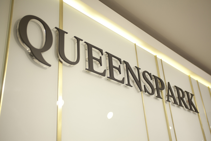
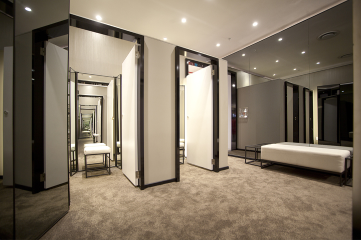
The white glass point of sale counter is set against a back-lit white glass and brass linear focal wall, a striking feature in an otherwise understated environment. A peek into the fitting rooms reveals plush carpeting with full height adjustable mirrors in each cubicle and a beautiful smoked mirror-clad wall.
Designed by TDC&Co.
Designer: Germarie Bruwer
Creative Director: Neville Wills
Project Manager: Wayne Willetts
Photographer: Johan Wilke

