
Choosing a name – as part of the interior design process I accompany my clients to start a business from finding and inventing the unique concept til the first customer arrives. Together we realized that the place should also be used as a coffee and a light Italian-style ice cream place. in one of the many visits to Italy, to learn how to prepare a fine ice cream, we picked the name “Afogto” meaning in Italian espresso with ice cream inside. Hebrew word called “afoga” is a break, pause. Because the two words sound the same and the place should be used for taking a break, a pause during a busy day with espresso and ice cream, the name sounds appropriate to the spirit of the place.
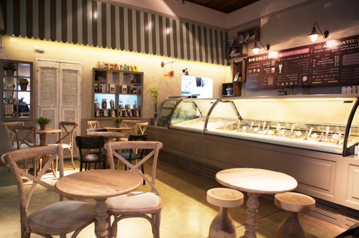
Material: – good ice cream made of components made in Italy and from there I got the inspiration for the design space. I wanted to make it feel like you’re in an ice cream shop boutique in a small alley street in Italian. It was important to me to create a senses of Italian street but without dark wood and density, so from the beginning I realized that the choice of materials is critical.
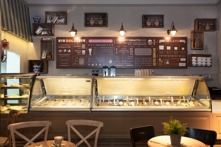
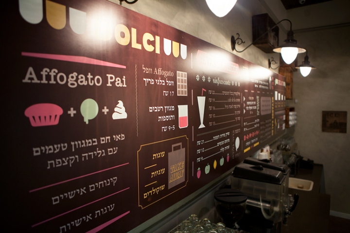
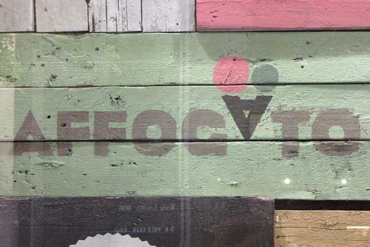
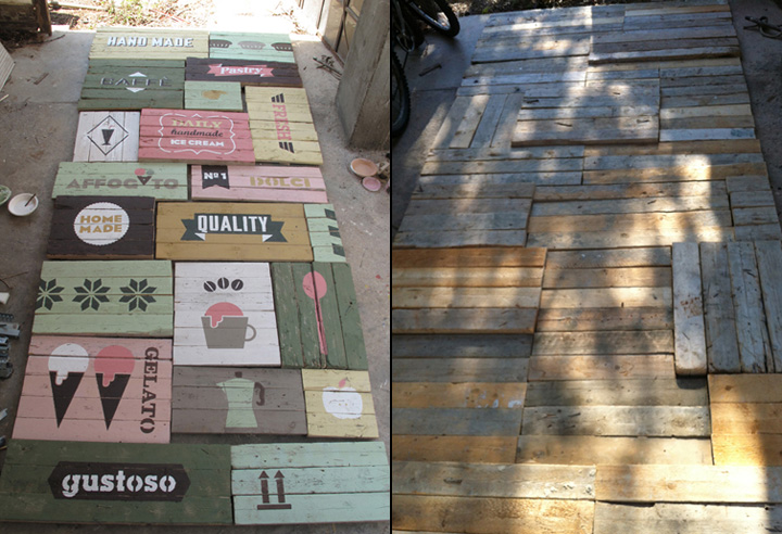
Design space: concrete floor in two different colors distinguish between the serving counter space and seating area. Space walls covered with rough stucco and rough torn look that gives a sense that the place has been there for years. Left wall covers with painted wood that looks like a gate. Above there are wooden shelf niches and integrated mirrors, decorated glass which sometimes reveal the light that comes from the kitchen at the back.
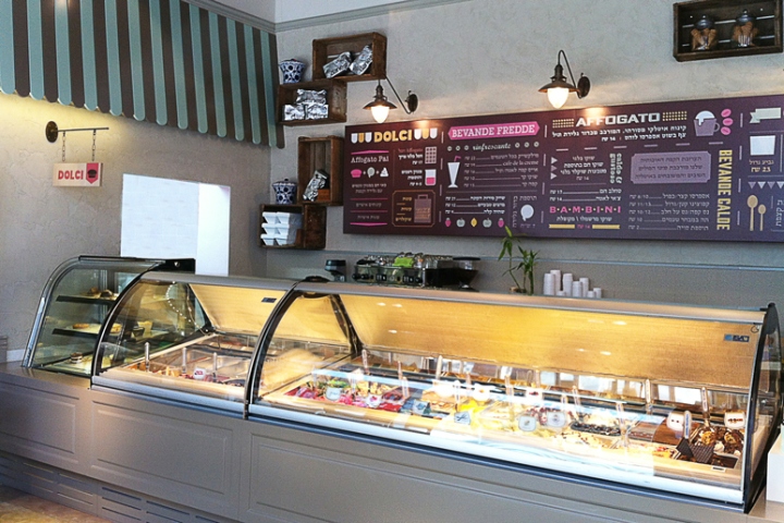
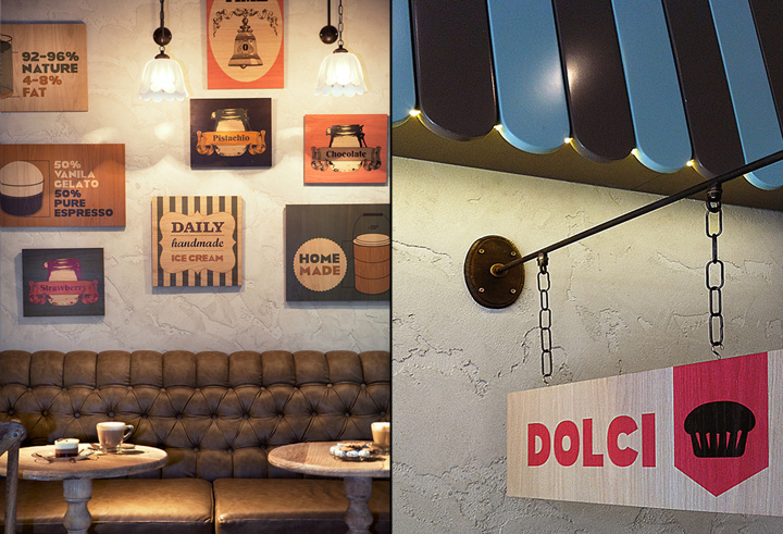
Above designed two-tone colored wooden pergola, so typical to the Italian street. Pergola assignee from the wall, warm incorporated concealed lighting gives depth to the small space. The front door to the kitchen is like a sculpture in itself – an old door from the flea market in south jaffa – Tel Aviv, painted with the various colors of the brand. At the right wall in the space located Sofa designed and manufactured especially by image in full correspondence Italian style. Selected skin too, like the wall, polished and gives a feeling of an old place where you can feel comfortable.
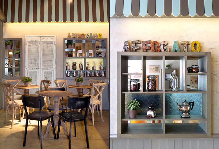
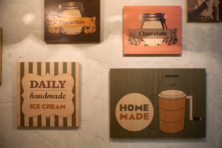
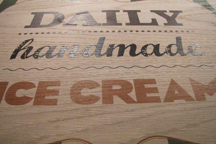
We selected round coffee tables and wooden chairs with straw and similar small wood children stool. Above the sofa we wanted to place pictures fits the Italian style, but with more interesting images, so have designed the graphic artist prints by brand spirit, explaining for example the nature of gelato vs ice cream normal differences in percent body fat, mode of production and so on. We printed the images on MDF wood surface covering oak veneer. Over prints lighting fixtures specifically designed into it.
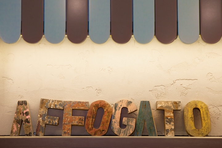
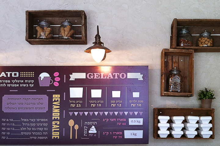
Main wall of old wooden boxes hung from the establishment of the state that were used to transport milk based products. Boxes, also from the flea market, hanging loose with on the wall and used as a storage unit for coffee. Every position in space designed “custom made” to place, including cabinets, wall coverings and painted surfaces several layers of paint and in between were rubbed down to make items look old.
Interior Design – Dana Shaked
Photo – Tomer Rubens
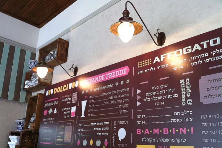
Graphic Design – Studio Anzlevich


Add to collection

