

Hair salon “BARL”, which used to be located on the 2nd floor of a building in the back street just a few blocks from the main street, was renewed when it moved to the main street. Renewing its name to “BARL SALON”, the spatial concept was also renewed as “A salon where creative people gathers, which you can absolutely find one in fashionable cities in other countries”. In other words, a fancy place even remaining a natural mood.

The key of the design was “a feeling of trust and stability”, ”high class”, “friendliness and freshness”. By incorporating the soft touch sculptures and other art works of the owner, who is not only a beautician but also an artist, and maintaining a feeling of trust which “BARL” has built up to date, the design was completed by adding a sense of ”high class” together with “friendliness and freshness” so that new customers can also feel comfortable and welcomed entering the salon.
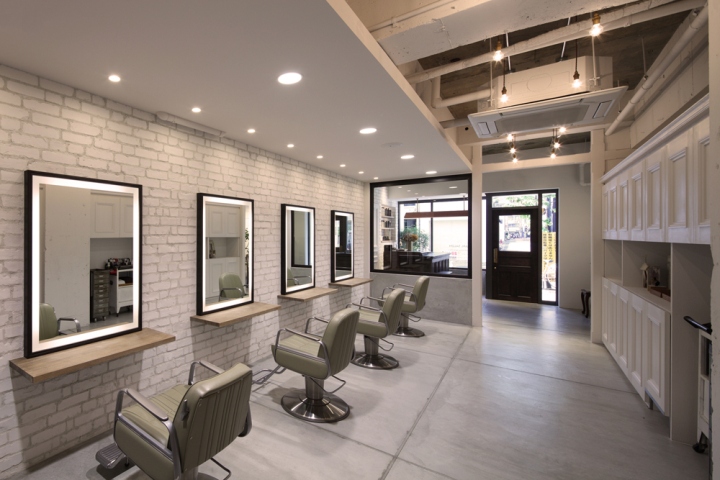
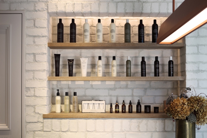
The new site is double-wide compared to the previous site. And its long to the back. We took a venture to divide the space into two. One in the front is a space for young beauticians trained in “BARL” to treat their own customers. So the front area is designed simply using mortal floor, skeleton ceiling, and bricks, unifying the color with white and gray adding wood materials. Finished by leaving a bit of roughness but also adding an essence of youthfulness.

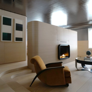
Light bulbs hanging from the ceiling are intend to direct the sight line of customers to the back area to represent the depth of the space. Contrary to the front area, the back area is designed to represent a high quality comfortable space by applying plaster and parquet flooring. In addition with a display of owner’s art works, it gives the impression like invited into a living room of the owner’s house.
Designed by Takashi Mitsuhashi / Pebble
Photography by Kozo Takayama




Add to collection

