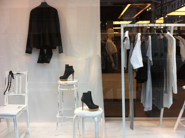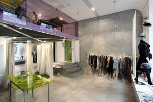


The stark visual contrast and impact of a completely monochrome display works really well here for Topshop, in the first two images and Cos, in the third image. In order for such a simple concept to be successful the composition of the props and clothing/accessories has to be carefully thought out. What both brands have done is used the height of the window display to products at different levels. Topshop’s stacked and balanced props are busier and more compact than Cos’s minimalist chairs, stools and rails, but I think both approaches have a really strong look and work well for their brands.


http://loveofvm.blogspot.com/2010/09/black-and-white-is-best-at-cos-and.html
