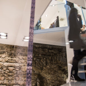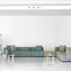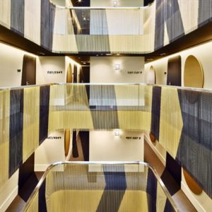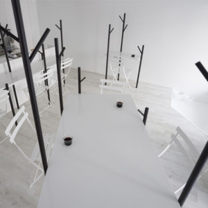


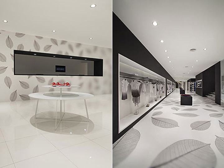
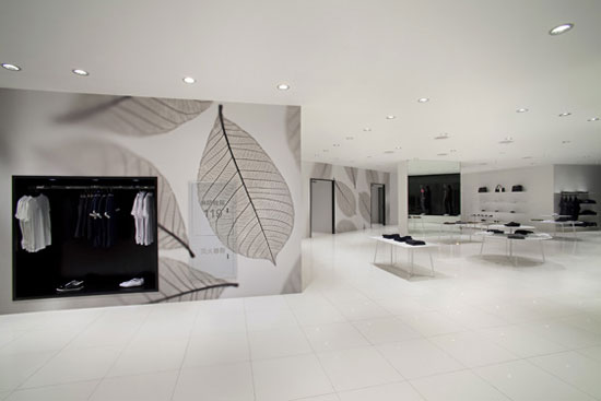
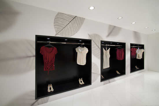
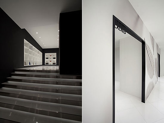
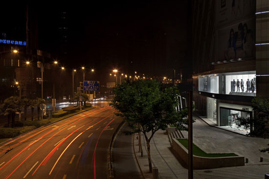
Fashion brand asobio’s first storefront shop designed by nendo, consists of a spacious bi-level interior with a generous opening. keeping with the shop’s theme ‘focus’, they positioned monotone photographs on the floor and walls, and varied the size to imitate the effect of a camera’s zoom lens, and the sharpness to recall the sense of being out of focus. these effects enhance the space with depth and continuity, provide variety and make the products on display stand out by appearing ‘in focus’ in contrast to the shop’s own patterns.


images courtesy nendo





Add to collection


